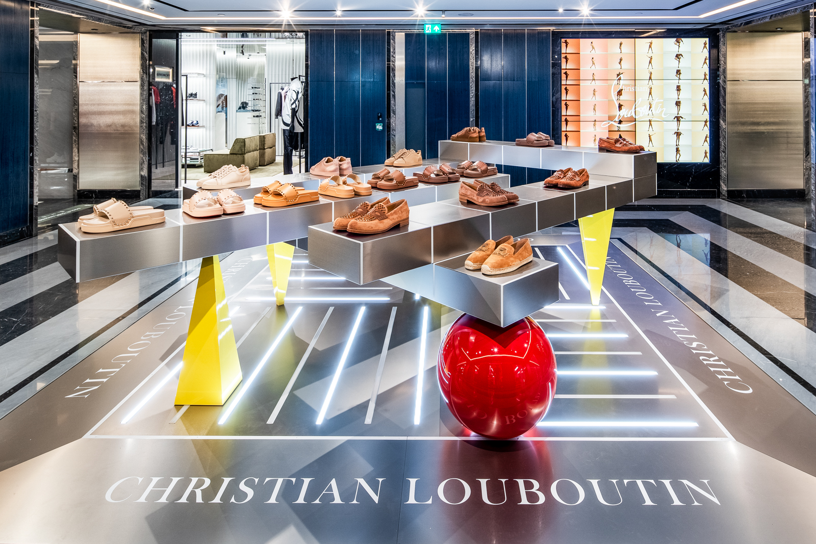
First impression.
Stop shoppers in their tracks, through spectacular visual moments.
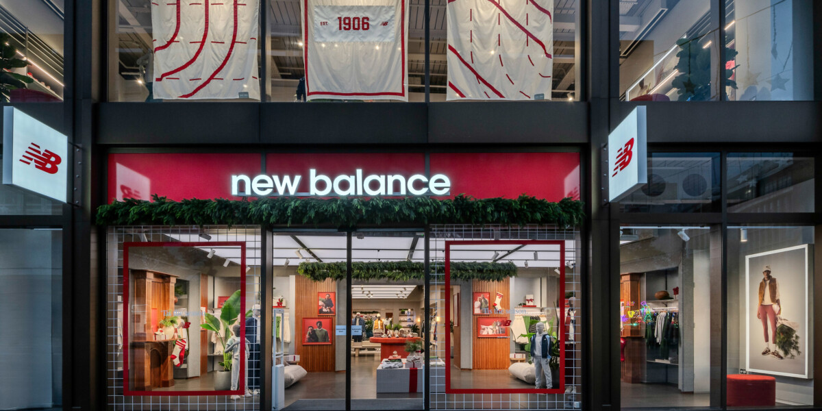
Windows create the first impression, setting the stage for your store’s story. A well-designed retail window display showcases your brand’s personality, sparks curiosity, and invites engagement — driving foot traffic, online interest, and brand equity.
When working on a retail window display each concept is carefully designed to reflect your brand’s core personality whilst also reflecting emerging trends, nods to locality, and wider cultural moments.
For us, window display design is about crafting a singular visual moment to captures your customers’ imagination, turning passers-by into engaged customers.
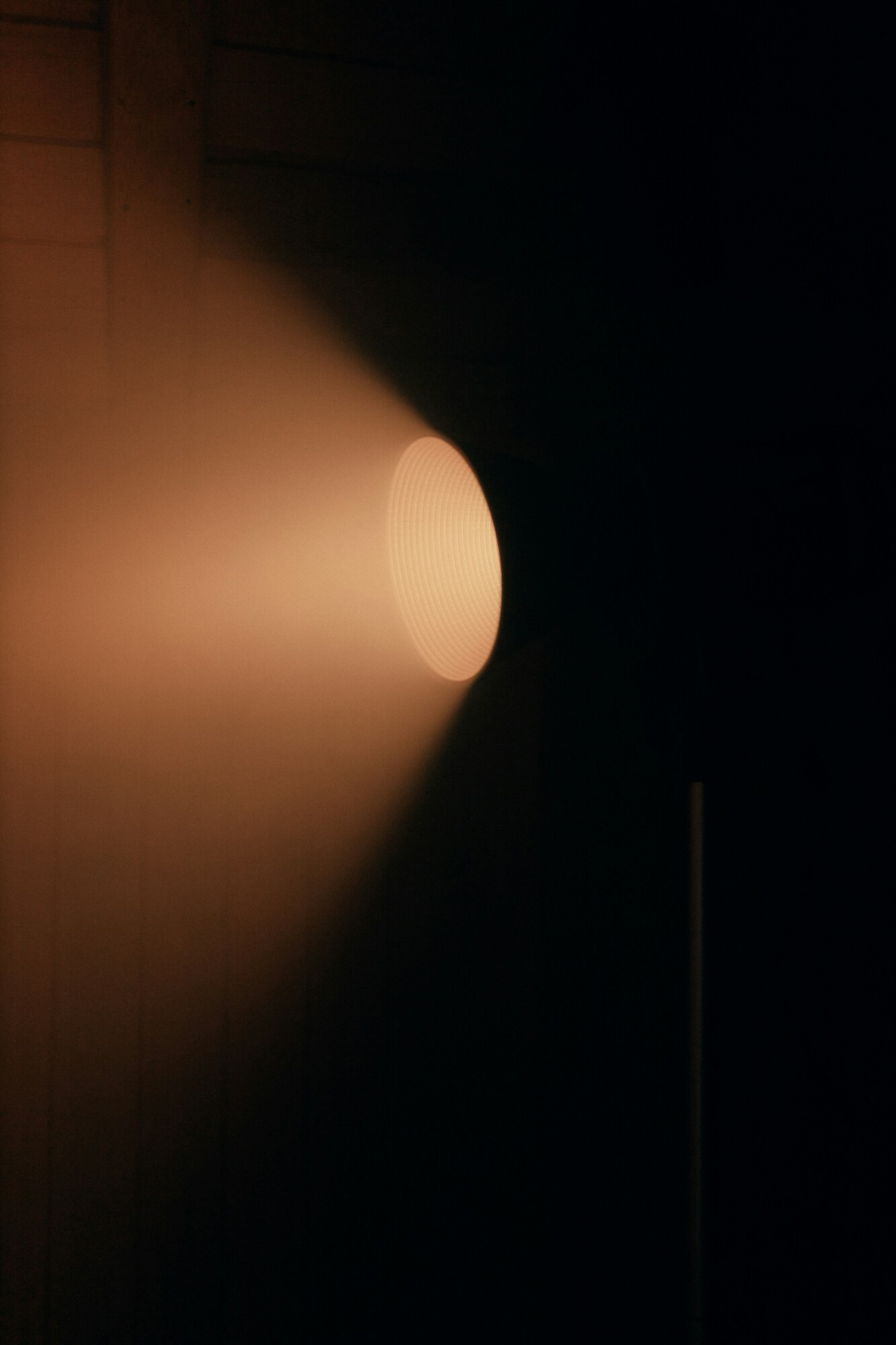
Utilising bold graphics, sculptural elements, lighting, movement, and immersive layers, every detail is considered to create maximum impact. A well-executed window isn’t just decoration- it’s an invitation, a conversation starter, and a powerful driver of footfall in-store.
Stop shoppers in their tracks, through spectacular visual moments.

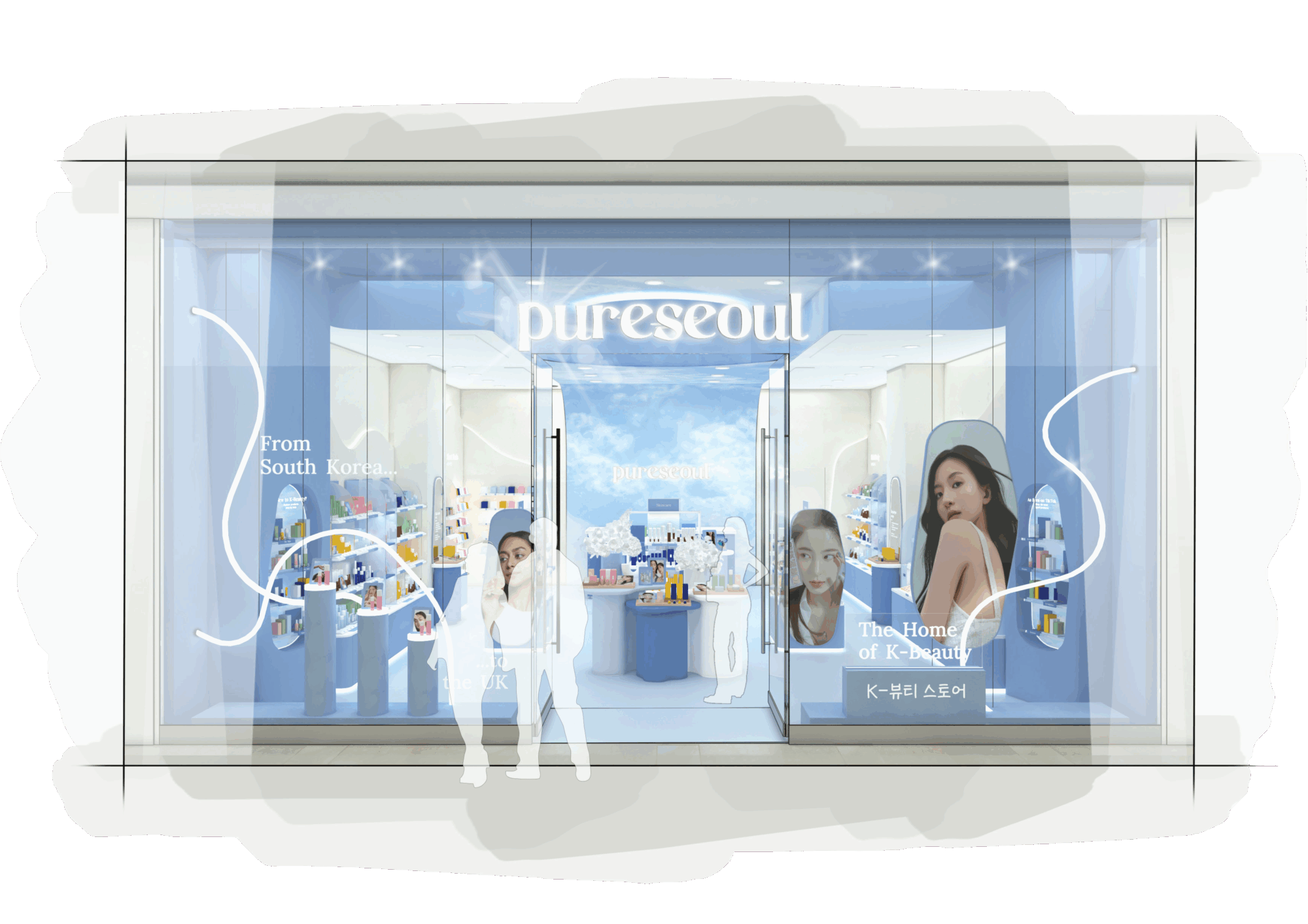
Designing with intention through crafted comms, right message, right time.
Taking campaign stories, key assets and hero products and bringing them to life.
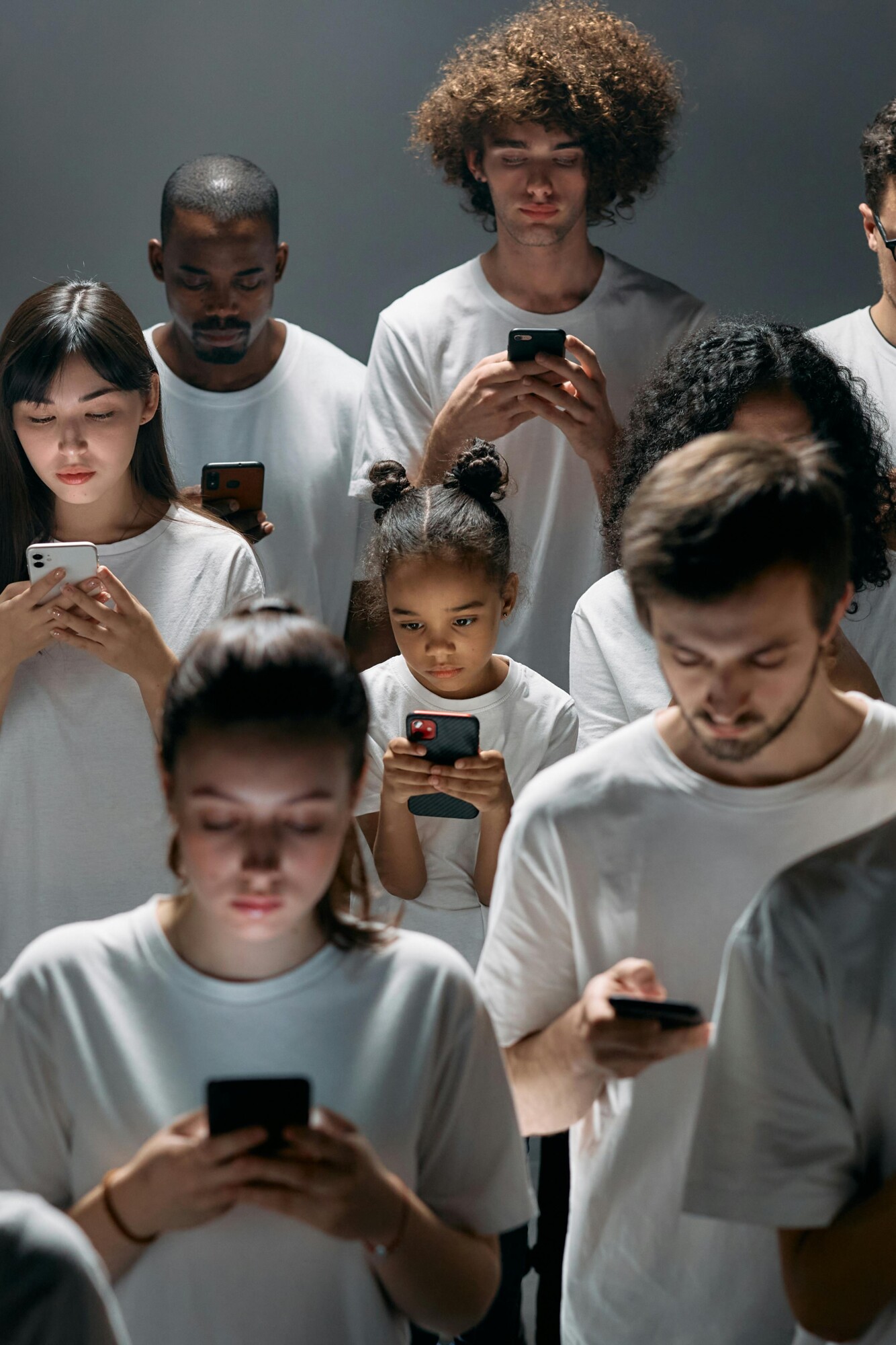
Designing share-worthy moments that light up feeds and turn engagement into action.
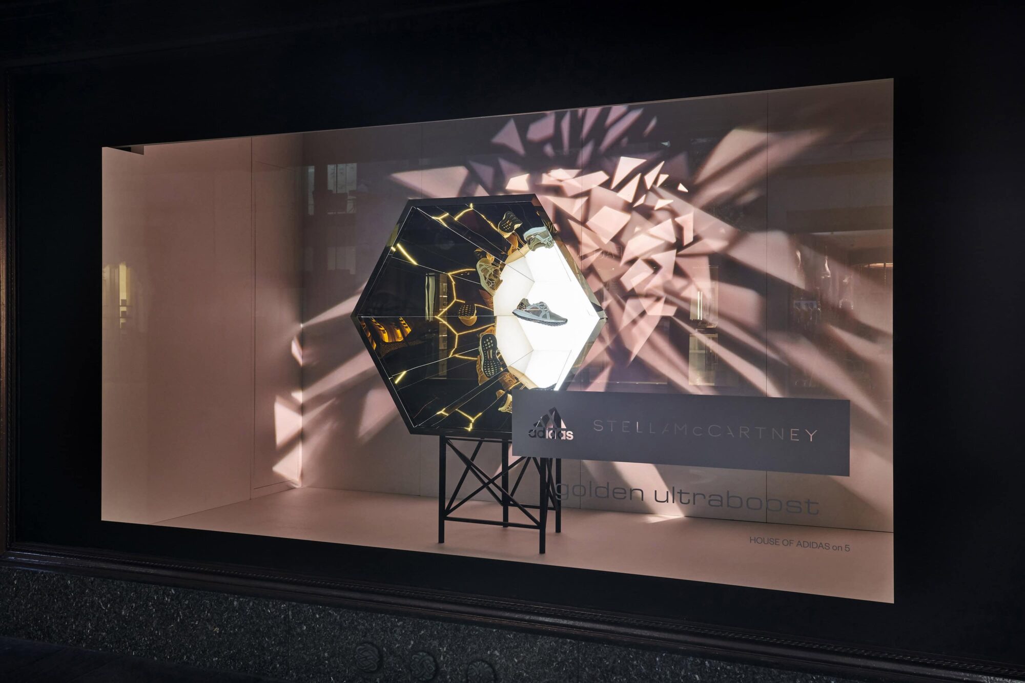
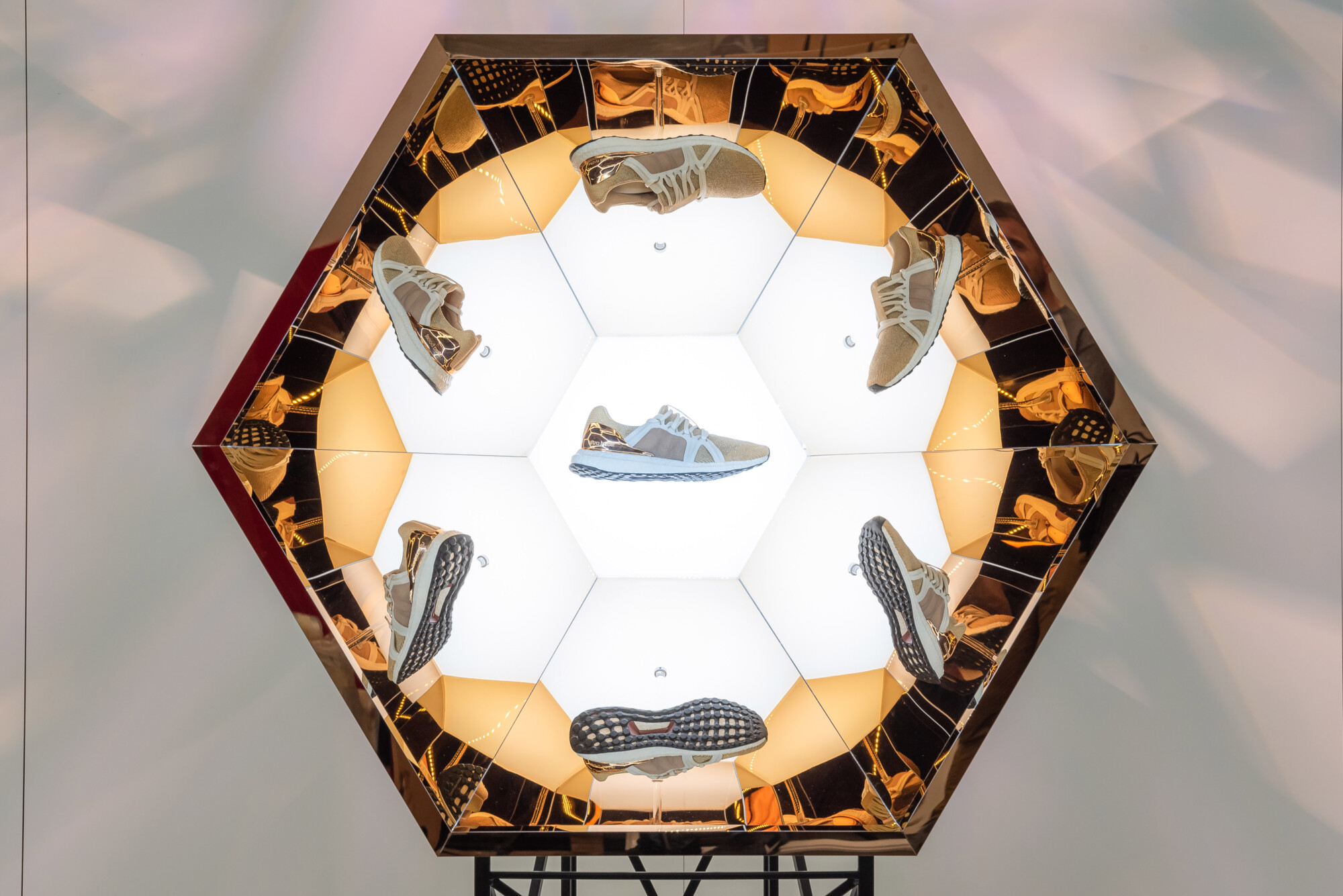
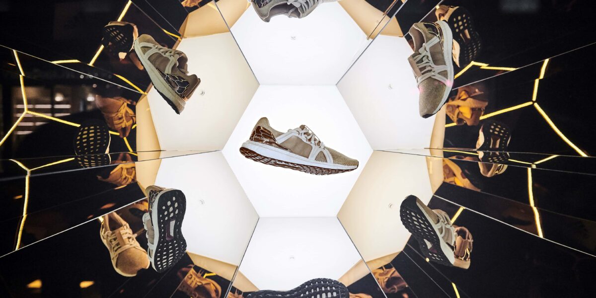
Design4Retail was commissioned to produce a strong, attention-grabbing window display design that would show-off the new golden shoe’s undisputed authority and elegance. Visually striking, yet elegant, the Stella Mainline toolkit would aid Adidas in telling a compelling story, using contemporary movement to really bring the story to life.
Fashion focused, the use of rose gold mirrors and strategically placed lighting created an innovative infinity mirror effect. The ‘shard’ gobos paired with soft lighting forged an awe-inspiring impression of movement, enabling the golden shoe to demand the attention it truly deserves.
This breath-taking retail window display is breaking all the rules and ultra-boosting Europe’s largest sportswear manufacturer into a cosmos of its own.
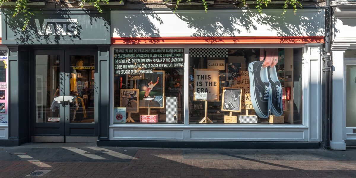
Rising from its original skateboarding roots, Vans has become one of the world’s largest youth culture brands. Worn by skaters, surfers and creatives alike, the Vans Era has held on to its iconic status for over 40 years. It was the first shoe designed by skateboarders, for skateboarders, way back in 1976, and yet today it has a much wider following and is deeply embedded in the art, music and street culture scene.
Working with the toolkit provided by Vans, we created a window display design concept that can be found this summer in three Vans stores in central London – including Carnaby street, Camden and Covent Garden.
Inspired by the relaxed and irreverent spirit of the brand, an eclectic mix of large and small graphic imagery of the print campaign sits alongside brand messages, signatures and iconography. Playing with scale, a giant hand appears to dangle a huge pair of Vans Era shoes in front of passers-by and is guaranteed to raise a smile!
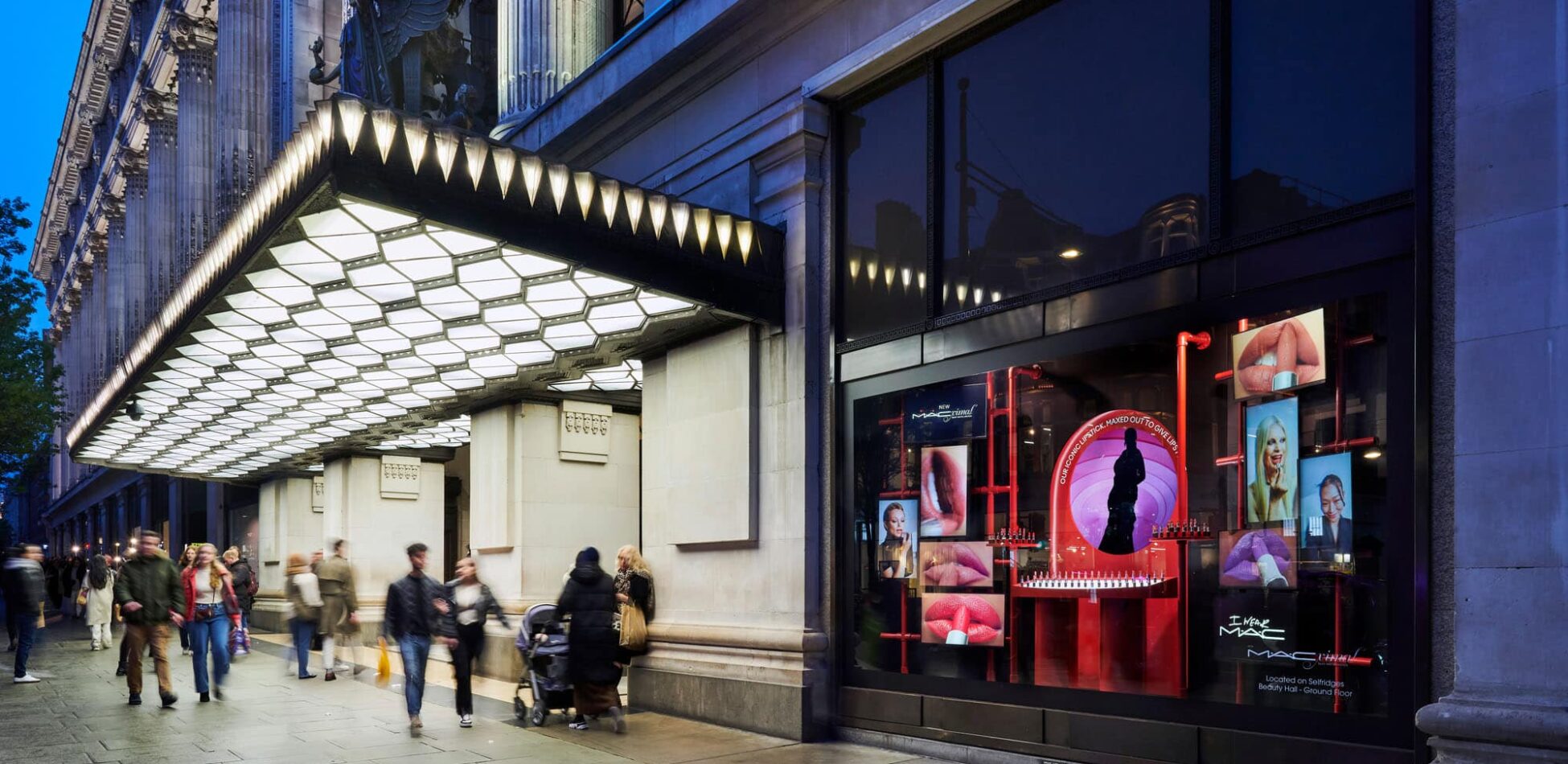
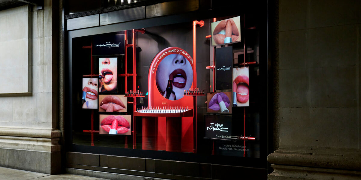
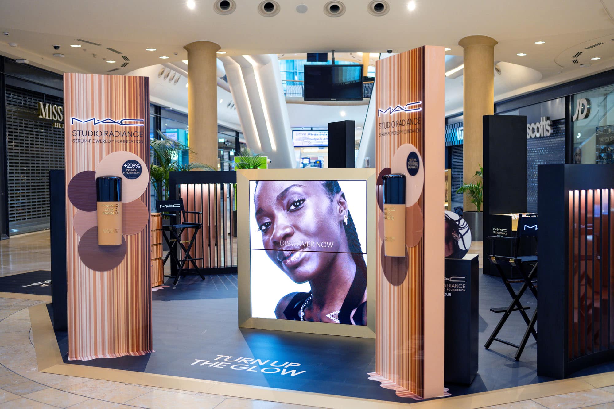
Tasked with creating a premium, dramatic window display design, reflecting the status of M·A·Cximal silky matte lipstick, celebrating MAC’s biggest launch of the year. D4R captured the essence of M·A·C using, including elements of their iconic red hue to stand out in the Selfridges Oxford Street window.
To ensure our display would come to life with the level of polish expected within the vibrant and high-end environment of Selfridges, we prototyped and tested everything we technically developed within our dry-build facility. This enabled the MAC team to see the retail window display in person, collaborating with us to fine tune every detail.
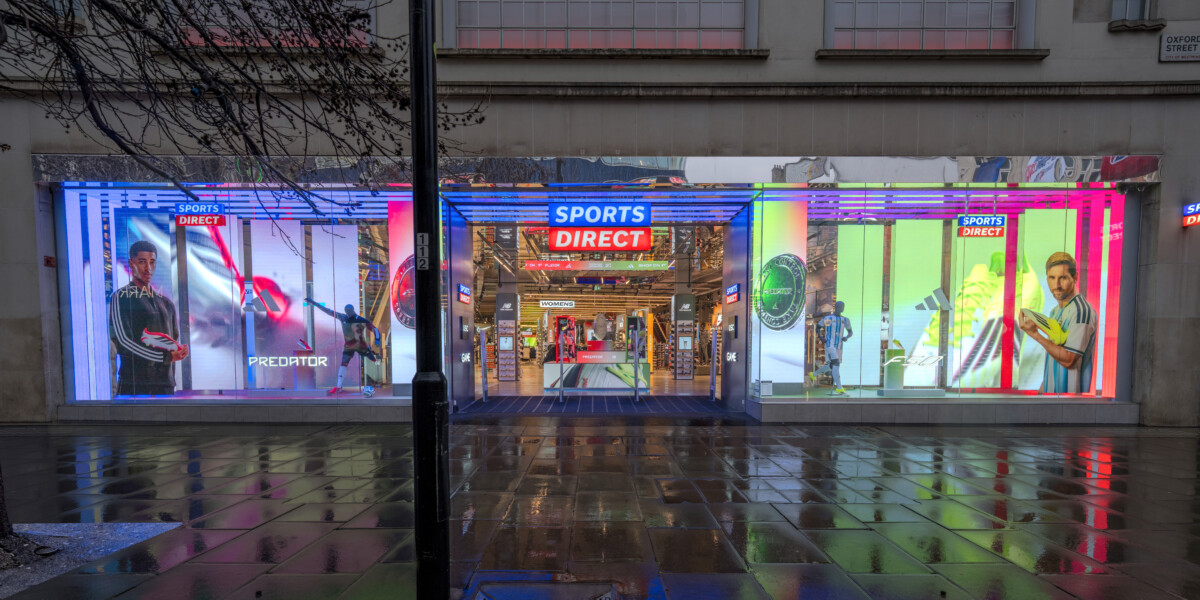
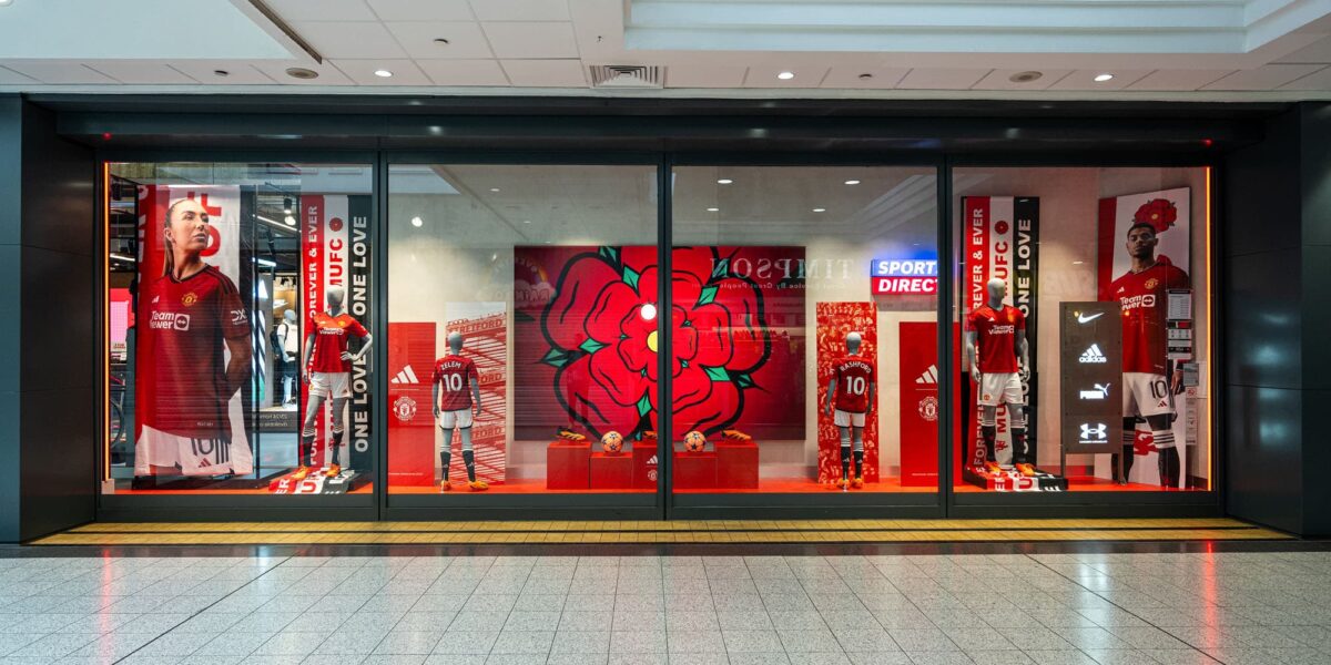
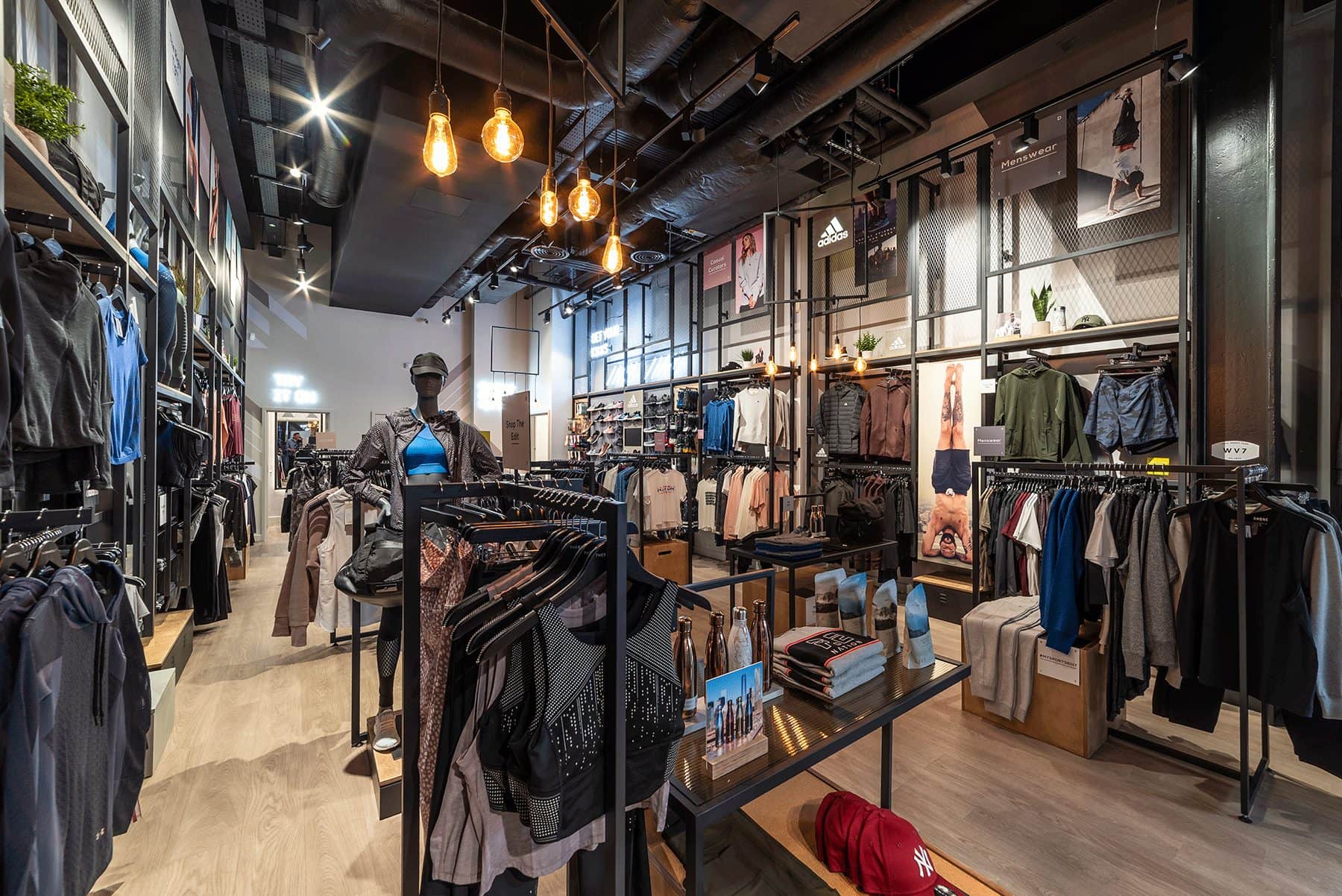
To support and generate hype around the launch of the new Manchester United kit launch, we collaborated with the adidas Western Europe Marketing team once again to deliver a powerful brand presence within Manchester’s Sports Direct that reflects the club’s rich heritage and its vibrant city.
From the entrance launch zones and club plinth to the retail window display and feature wall, we created a concept that could be applied to the existing Sports Direct retail systems and other appointed temporary-use areas within the store. Our 2D and Brand team presented three core design pillars that informed the direction of the campaign, ensuring the required high levels of disruption were maintained, briefed by the brand.
‘Banner Glory’, a window display design concept centered around layering grandiose banners, serves as the main feature of the displays and creates movement within the space. These have been enhanced by hidden airflow fans to create further impact.
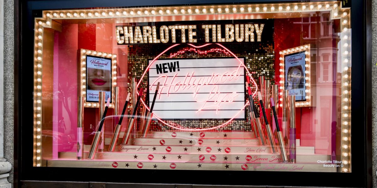
Understanding the fluidity of retail trends, Charlotte Tilbury stay one step ahead of the market; delighting their followers with pop-ups, events and exciting social media content. Hollywood Lips was just one of the thrilling campaigns to be launched, inspired by the ‘timeless glamour of the silver screen starlets’ but created for everyone.
With a concept centralised around Hollywood glamour, we developed a retail design identity which would take visitors on a journey to stardom. The pop-up is a blend of dazzling Hollywood lighting, opulent rich shades of burgundy and pink with moments of glamour thrown in. Subtlety is left at the door, as Tilbury fans take their seat at a chair usually reserved for the Hollywood elite; immersing themselves in the glory of Hollywood Lips.
As they continue their journey to cosmetic stardom, the brand masters the art of pop-up promotional spaces to inspire and delight. Just like Hollywood, this pop-up was the place to be. Taking over Selfridges London for just a week, it stole the limelight (and the hearts of Tilbury fans) with its ultra-glam aesthetic.
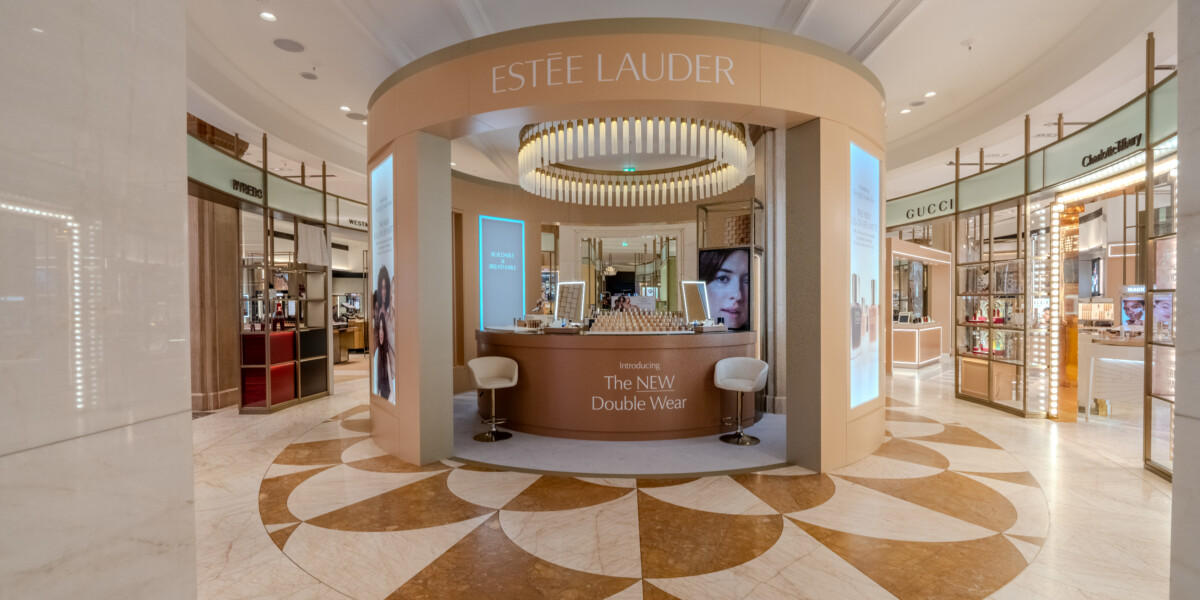
Shaping in-store experience.
Bringing brands to life. Turning ideas into award-winning environments with creative innovation and commercial know-how.
Memorable brand moments.
Turning a transaction into an interaction, an experience, delivers a more rewarding and memorable in-store connection.
Making mindful choices.
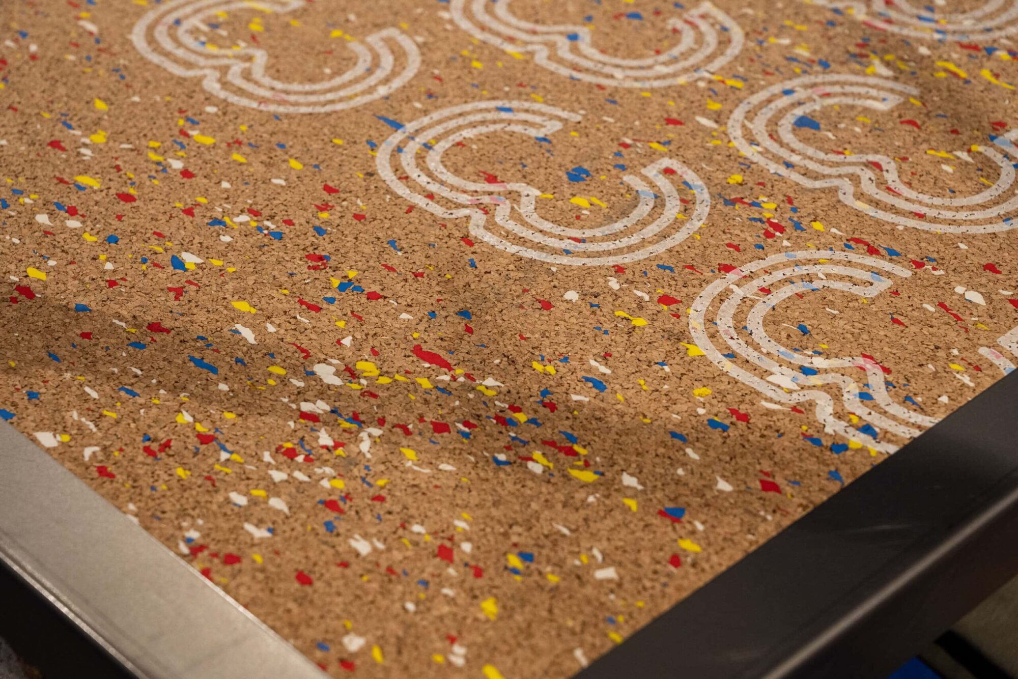
Working toward a more circular and less wasteful way of designing and thinking about retail environments and practices.
Award-winning environments.
With over 20 years of experience, we bring innovation, commerciality, and insight to craft retail designs that perform.
Leveraging FOMO.
Pop-ups offer opportunities for experimentation and can be really effective in making a brand statement with impact to grab attention and create online impressions.
More than just promotion.
With a singular focus and strong central message, activations and events are designed to entertain, to engage, and to leave a lasting impression.
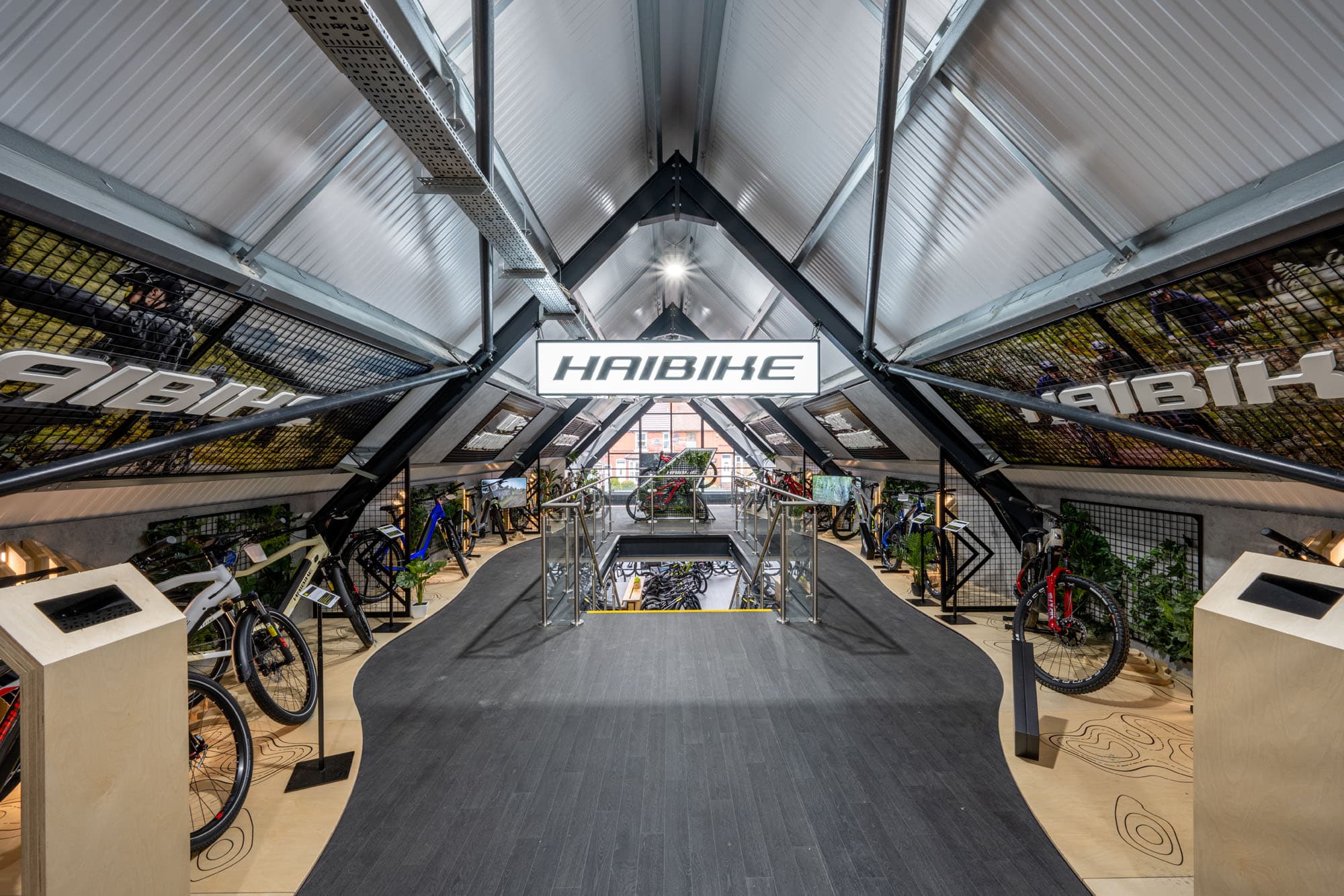
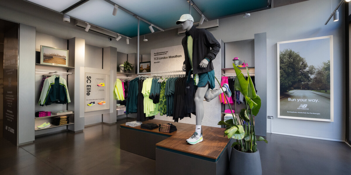
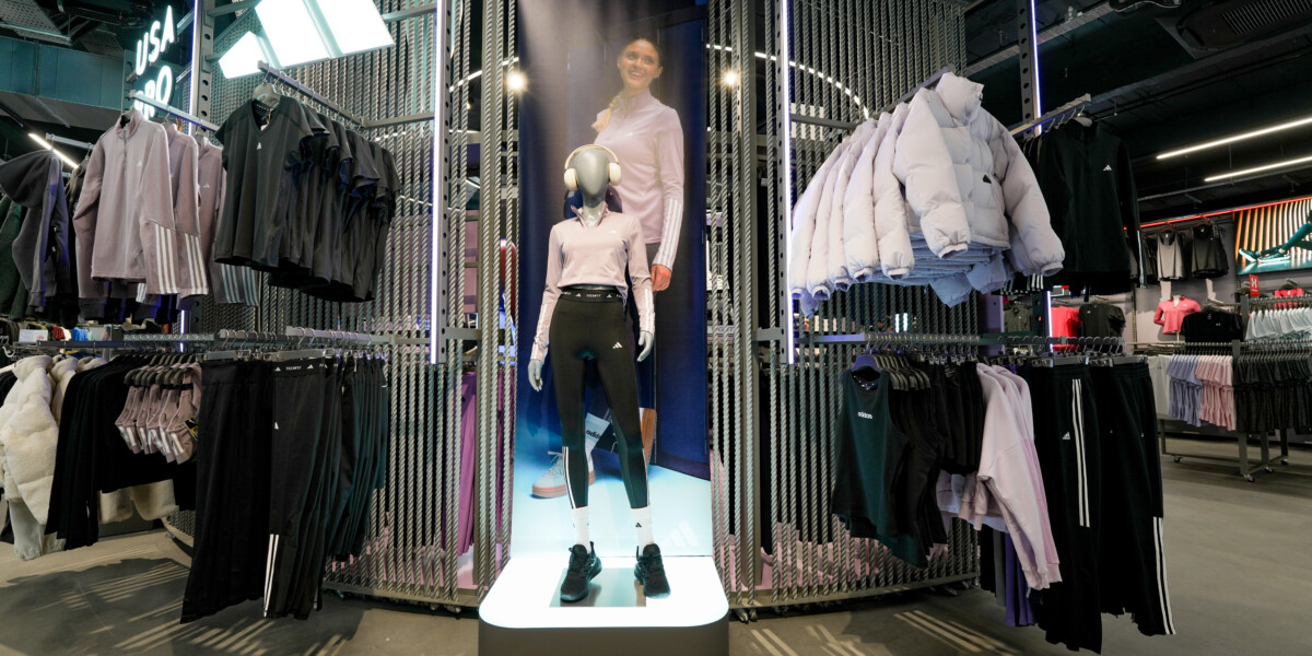
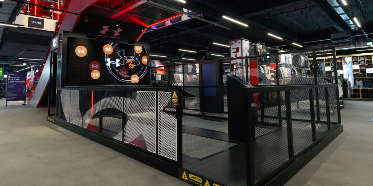
Standing out in store.
We design shop-in-shop concepts that, any scale in store, provide brand recognition and presence with consistency, quality, and identifiability.
Bringing ideas to life.
Our design studio can offer a wide variety of visualisation services, from an initial hand-rendered exploration, right through to an immersive VR walkthrough.
Seamless brand activity.
Brining online identity and experiential direction into physical retail environments. Meeting the expectations of digitally native customers with seamless and easy to navigate multi-channel experiences.
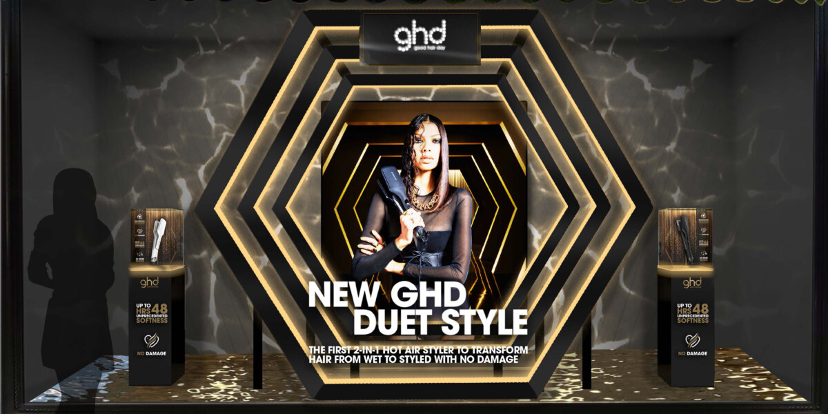
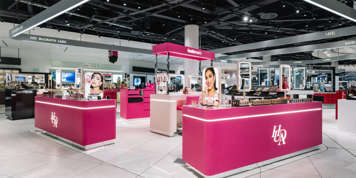
Ensuring brand visibility.
We’re experts in ensuring visibility and credibility at any scale of execution; delivering brand-owned visual and experiential activity that remains representative of the wider brand world in busy multi-brand environments.