Huda Beauty x Harrods
Huda Beauty, known for its signature Power Pink, set out to create a bold new retail concept for its shop-in-shops — starting in the iconic Harrods Beauty Hall, Knightsbridge.
Beauty is self-made
Huda Beauty, known for its signature Power Pink, set out to create a bold new retail concept for its shop-in-shops — starting in the iconic Harrods Beauty Hall, Knightsbridge.
Idea
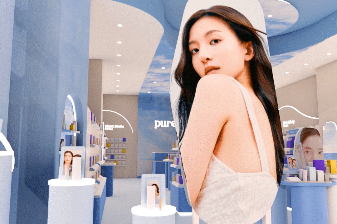
Huda Kattan last year announced a new rebrand of Huda Beauty launching with a new logo and brand colour- an iconic Power Pink. An independent, influential and relatable brand, with 54 million Instagram followers, approached D4R to develop a retail concept for their shop-in-shops, beginning with the iconic Harrods Beauty Hall in Knightsbridge.
This was a full circle moment for the brand as Harrods was the first UK retailer to launch Huda Beauty in 2016. A new location in store provided the perfect opportunity to redefine the brand offering with a more contemporary, sleek retail design.

Insight
We started by thoroughly analysing the beauty landscape to develop strategic recommendations that would shape the brand’s retail presence. Beginning with the new branding playbook and tone of voice this evokes; we developed a concept that would empower the everyday consumer. Following this, we were able to identify the anchors for visual and customer experience consistency, that would confirm the power of Huda Beauty as a beacon brand that resonates with customers across a range of stores.
Working collaboratively with the brand team, we aimed to make the retail experience space a true reflection of their evolving brand, showcasing who they are today and where they’re headed. The objective: to captivate makeup enthusiasts, engage loyal fans of the brand, and attract new customers with a bold and vibrant environment that immerses them into the world of Huda Beauty.

Realisation
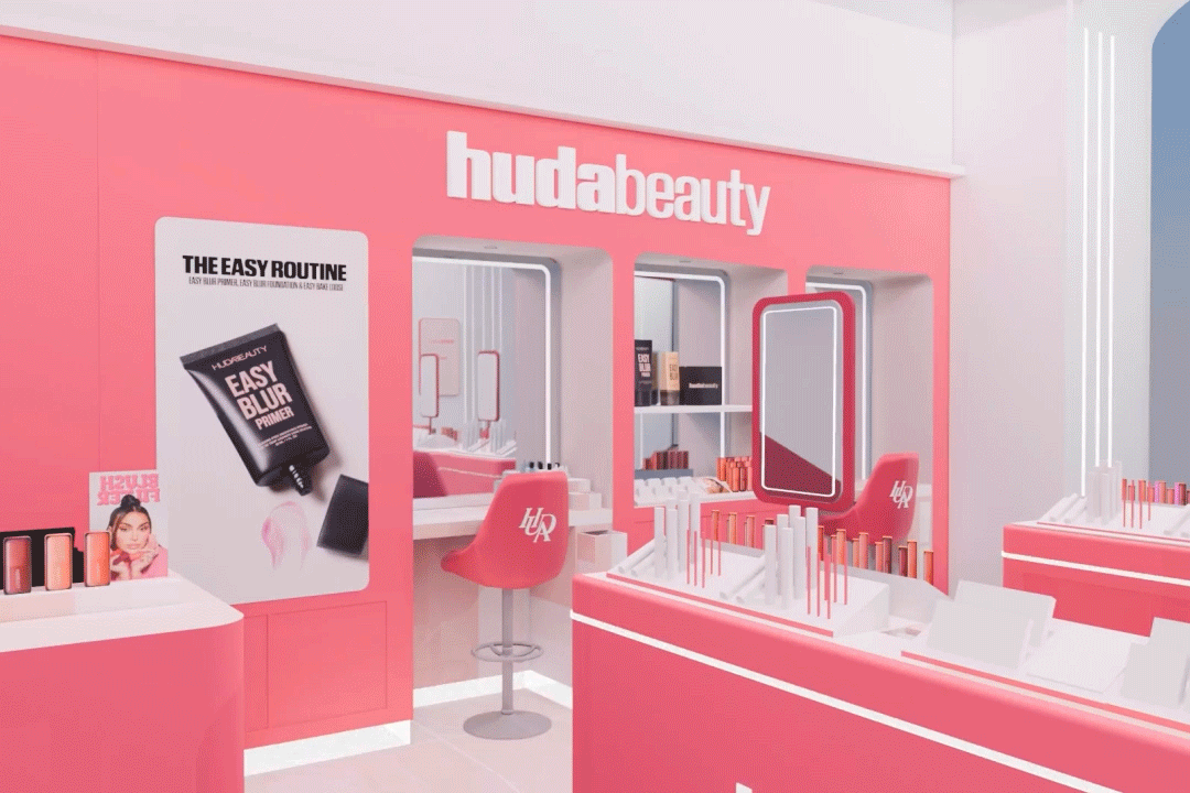
The brief focused on embracing the iconic ‘Power Pink’ as the signature colour, reflecting the brand’s bold new direction while staying connected to its roots. Prioritising model shots and dynamic graphics helped bring the founder’s persona to life and ensured strong visual impact.
Standing out in the crowded beauty hall was crucial; therefore, the concept was designed to ensure maximum visibility with an unmissable statement. Power Pink archways, bold coloured lighting, and a host of dynamic content applications ensured an undisputable and entirely individual space that stands out from neighbouring luxury competitors. Play tables in Power Pink with inlaid nude solid surface countertops provided the perfect backdrop for products to pop. Throughout, illuminated signage ensured the brand shines from every angle.
The retail experience included consultation and testing areas, giving customers space to explore the products, engage with beauty assistants, and fully experience the brand. Branded consultation chairs in vibrant Power Pink perfectly complemented the furniture, and illuminated halos around the mirrors created an inviting, glamorous atmosphere, allowing for the perfect make-over selfie.
By harmoniously blending functionality with a playful luxury that speaks to modern consumers, this Huda Beauty space became a chic and captivating environment for beauty enthusiasts.