Wild Science Lab
Premium Wellness
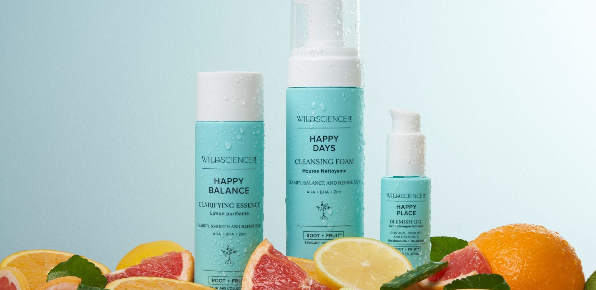
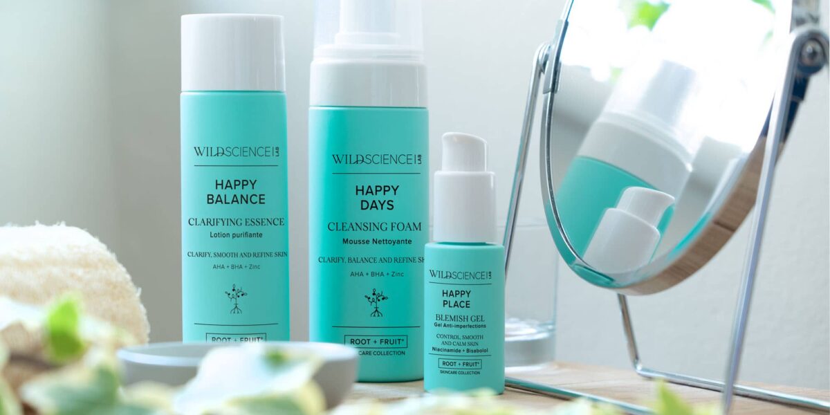
Following the successful translation of Wild Science Lab into Printemps Doha, D4R diversified our collaboration with the brand and created the packaging for their latest range, ‘Happy Skin’.
Idea
As with all Wild Science Lab products, the ‘Happy Skin’ range uses natural ingredients to tackle skin woes.
From organic aloe vera to delicate linden oil, the range needs minimalistic, wellness-focussed packaging, communicating its vegan, natural and balanced makeup.
Insight
To kickstart our creative process, we created a series of tailored moodboards, a thoughtful approach that enabled us to discern and align with the client’s intentions. These moodboards served as powerful visual tools to communicate ideas, inspirations, and concepts, allowing us to build a more comprehensive and detailed brief and onward process that precisely captured the client’s vision.
Central to our design strategy was a profound understanding of the brand’s core identity, with a strong emphasis on their commitment to using vegan ingredients. This ethos became the foundation upon which all our moodboard explorations and concept work were built, ensuring that every outcome adhered faithfully to the values of this Leaping Bunny approved brand.
Our task was to create a holistic, cohesive packaging solution for the ‘Happy Skin’ range, incorporating the clean and understated assets already established by the brand. In a saturated market, we needed to ensure that the product had on-shelf stand out, leading us to utilise the brand teal in an all-over approach.
This limited colour palette and minimalist design communicated the purity of the product and allowed the brand logo to have the gravitas it deserves.
Realisation
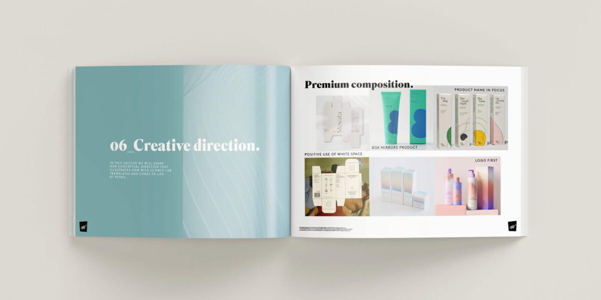
During our research and moodboarding process, we explored various packaging executions, and understood the importance of elegant print processes to elevate the brand’s positioning to a premium level.
With the client’s approval, we took on the responsibility of creation of print assets in-house. This allowed us to maintain a tight grip on the creative and ensured a seamless and consistent vision from concept to execution.
Our attention to detail and meticulous process resulted in a sophisticated packaging solution that effectively communicates the brand’s natural, premium ethos.
Testimonial
Related Work