D4R AT LONDON DESIGN FESTIVAL
It’s been a couple of weeks since D4R headed to the capital to experience London Design Festival in all its creative glory. Our latest post focuses on our highlights of the festival, with WGSN’s Interior Trends Report from Gemma Riberti ranking highly in our opinion!
100% DESIGN SHOW
This year’s 100% Design entranceway began with a stunning ‘Design Path’ created by Hakwood out of wood tiles and it set the precedent for a beautiful show! Further into the Olympia, within the Design and Build section, Hakwood had their own stand which featured a tree made from their own wood tiles and the quotation ‘Great Vertical Statements’. This brand were one of the most eye-catching at 100% and a consensus revealed them to be one of the D4R team’s favourites!
Throughout the show it was clear that lighting played a big part and this was highlighted the greatest in the 100% Darkroom on the first floor. The biggest feature here was LG whom once again displayed their OLED Light (also used for the screen in the Auditorium) but a small number of other brands also took up space in the darkroom to showcase their products. The effect of this darkroom was quite drastic as the lighting was a focal piece in an otherwise plain black room – something which is not always achieved throughout the rest of the well-lit building with numerous stands competing for attention.
D4R also recently visited IFA in Berlin and it was great to see the difference in stand design when comparing the two. Being primarily focused on digital technology, brands at IFA displayed strong woods, concrete printed walls and stark or bright colour schemes. However, 100% Design had softer textures such as felt, muted colours such as gold and some use of cork – which is often referred to as a prominent 2017 interior design trend.
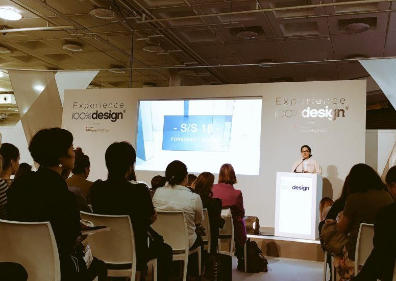
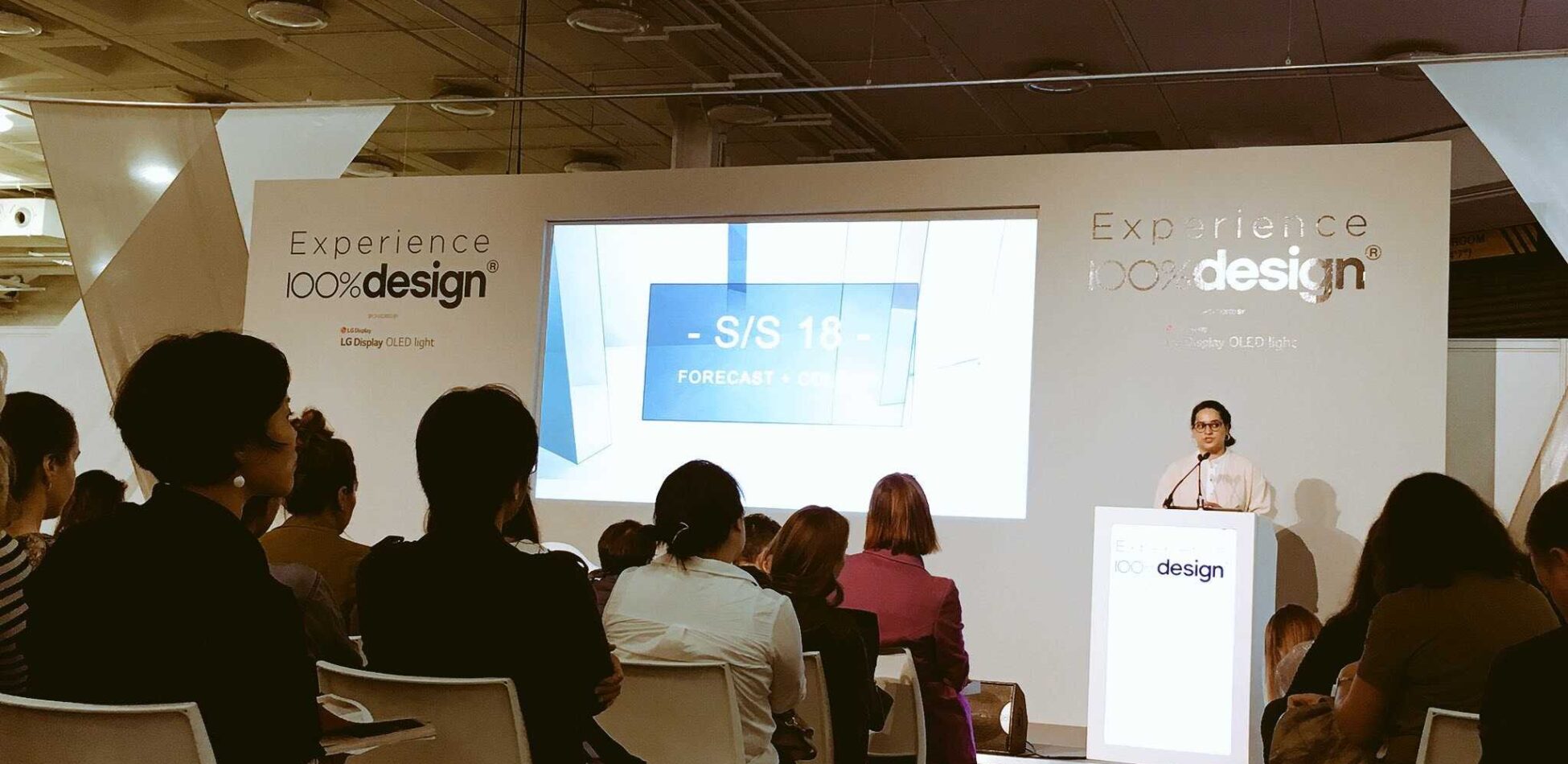
WGSN:INTERIOR TRENDS
Speaking of trends, a few of the D4R team experienced Gemma Riberti’s talk on Interior Trends for Spring / Summer 2018 on behalf of WGSN. It really was a fantastic presentation and she whizzed through around 90 slides, going into real insight detail for each major trend. Here are some of the key points we took away from her presentation:
Slow Features – Less is more, industrial and tech with warm and pastel colours, putting more into materials which last longer, one bold accent colour to balance with pastel.
Kinship – Physical togetherness, technology collaboration with people, distressed textures and materials, highly pigmented colours.
Psycho-tropical – Bringing the outside in, bold colours, geometric and exotic prints, theatrical lighting and a big focus on sense with touch and smell.
Youth Tonic – Personalisation, augmented and virtual reality, mobile with space, stripes and above all: expressive but playful.
For a team of retail designers, this kind of talk was incredible to listen to and the detail involved in their trend predictions was certainly noteworthy.
THE STREETS OF LONDON
Whilst visiting the show was a fantastic experience, it was also good to get out into the streets of London as many stores had embraced LDF by updating their window displays. A few key window displays caught our eyes:
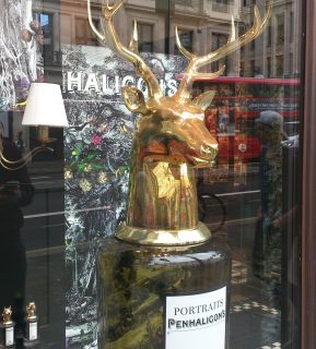
PENHALIGONS
We were really intrigued by Penhaligon’s window display which promoted their new Portrait’s Collection. Inspired by the British aristocracy of the Victorian period, the collection revolves around the family of Lord George with four key scents: The Tragedy of Lord George, The Covered Duchess Rose, The Revenge of Lady Blanche and Much Ado About The Duke! The signature aspect of the display (other than the perfume itself) was the gold stag’s head which is synonymous with the guilded animal stoppers for each perfume bottle. The print used in the display uses imagery of woodland in the winter and is perhaps hinting at the aristocracy’s preference for hunting? An imaginative and incredibly British display, which suits the brand and the scents.
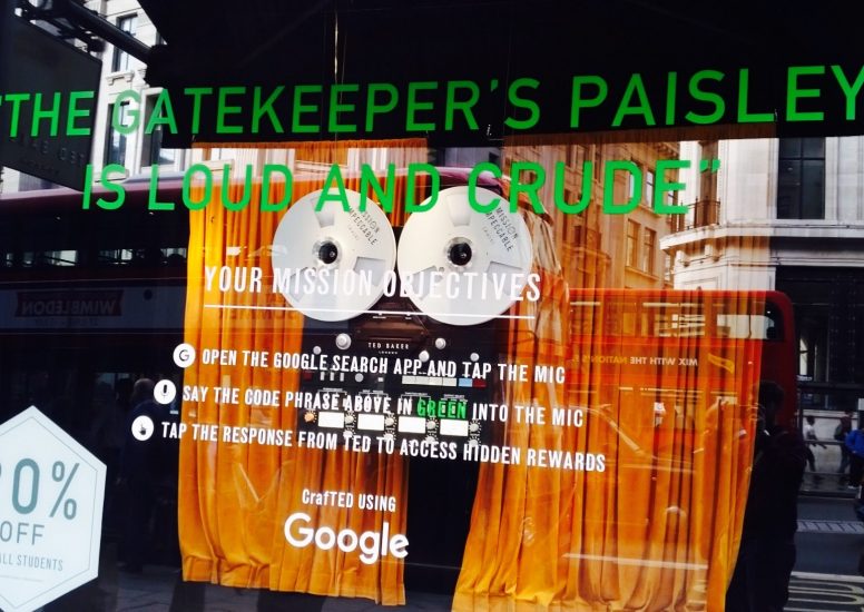
TED BAKER
Ted Baker have partnered with Google recently, reinventing window shopping entirely by featuring Google’s Voice App Search. The window display features a phrase for you to announce into your phone whilst walking by the store and it unveils all kinds of fun including competitions and Ted Baker products! It is all part of their #MissionImpeccable campaign which you can read more about here. And apparently more information will be released in November!
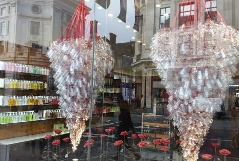
MOLTON BROWN – RIBA REGENT STREET
In aid of RIBA 2016, Knox Bhavan and Susie MacMurray designed a beautiful window display for Molton Brown. Three chandeliers made from packaging bottles are hung from the ceiling with red ribbon, above roses which were made of metal. The design was in-line with their new Rosa Absolute scent and the impact of the display was striking with its luxurious edge.
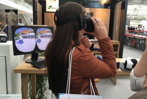
From show to street, the D4R team gained a plethora of information to bring back to the office with the biggest impacts being lighting, virtual reality, materials and fantastic trends for 2017/18. We’re excited to incorporate our findings into our work and head back next year!