Reinvention and renewal
This Spring, we’re looking past the florals (mostly). Explore our analysis of the global retail landscape and the brands redefining new beginnings through structural reinvention and sustainable design.
Entering a post-seasonal era?
Beyond the bloom.
Introduction
Spring has always been the retail world’s shorthand for new. Traditionally, that meant dusting off the florals, bringing in the pastels, and leaning into the literal symbols of a new season. But at Design4Retail, we’ve noticed a shift. The brands truly leading the way aren’t just decorating for a new cycle; they are reinventing their very foundations.
We’re moving away from the seasonal refresh, those disposable, trend-led moments, and entering an era of intelligent renewal. It’s a design discipline that values material honesty and structural permanence over fleeting visual highs. This Spring, it isn’t about the flowers on the window; it’s about the new life baked into the brand’s actual infrastructure.
For a deeper look into these shifting landscapes, you can explore our full Retail Highlights here.
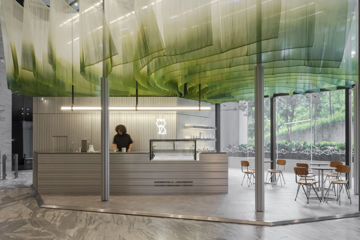
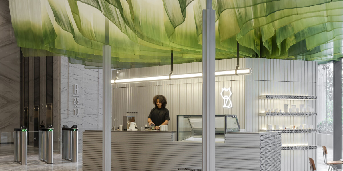
Niko Neko 5.0
I’m obsessed with the store design of Niko Neko 5.0. In a world where Spring usually means an avalanche of plastic ivy and pastel vinyls, this Malaysian matcha bar is a breath of fresh, whisked air.
It defines the future of retail interior design by proving that new beginnings don’t have to be literal or floral. Instead, the designers used a dramatic kinetic ceiling made of hand-dyed silk that undulates to mimic the fluid movement of whisked matcha.
From a store design perspective, the magic lies in the tension: the softness of that ephemeral fabric set against the cold, hard-edged metal of the bar. It creates a mindful pause. It’s a sensory experience that evokes a more potent sense of rebirth than any traditional bouquet ever could. The store is a living and moving representation of the product itself – genius.
This is creative window display ideas and interior storytelling taken to the next level, moving away from the cliché and toward something much more fluid and intellectual.

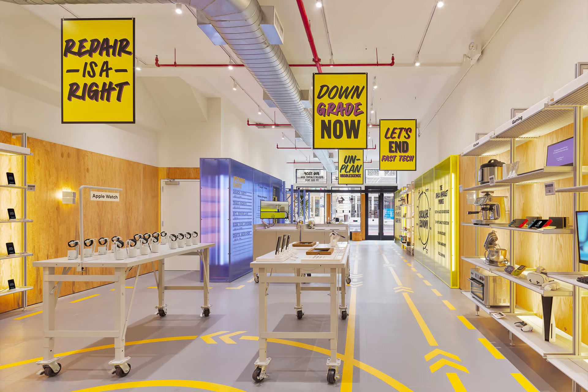
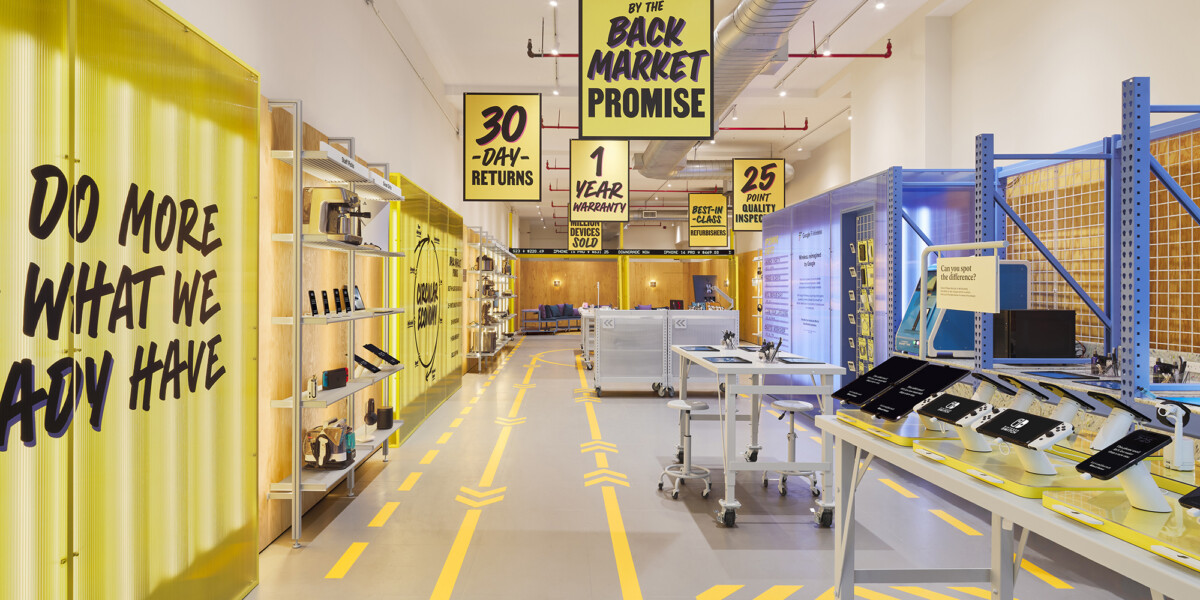
Black Market
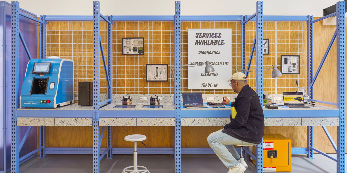
When you think of a tech flagship, you usually picture clinical white walls, blinding LEDs, and a desperate sense of brand new. But Back Market’s inaugural flagship in NYC completely subverts that temple of newness, and honestly, it’s a breath of fresh air for sustainable pop-up design.
What I love most about this space is its ecological honesty. Instead of hiding the bones of the building, they’ve used recycled materials and kept the structural elements exposed. It feels less like a showroom and more like a manifesto. By elevating the repair process into a performative centrepiece where you can actually see the renewal happening, they’ve managed to frame refurbished devices not as second-hand, but as ethically superior artefacts.
In terms of the future of retail interior design, Back Market is proving that durability is the new luxury. They are rebranding the act of consumption into a gesture of preservation. It’s a powerful example of how a brand can stay true to its mission through every beam and screw in the store’s design.
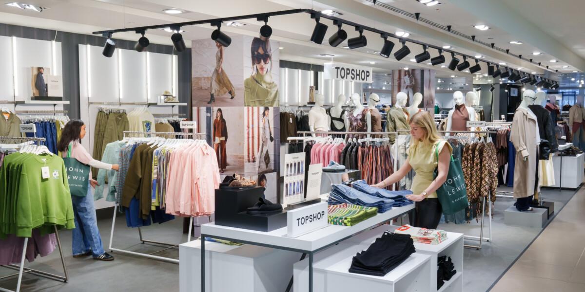
TOPSHOP PARTNERSHIP WITH JOHN LEWIS
If you’ve been following the high street over the last few years, you know that Topshop’s return was always going to be a moment. But what I find so fascinating about their residency at John Lewis is how they’ve completely avoided the sprawling, fast-fashion flagships of the past. It’s a total strategic reinvention.
Instead of trying to reclaim the massive square footage they once had, they’ve leaned into a model of shop-in-shop display trends that prioritise a premium edit. It’s a generational synthesis, taking Topshop’s youthful, slightly rebellious edge and embedding it within the trusted, heritage-rich walls of John Lewis.
Topshop can be seen as a space that balances nostalgia for older fans with the curation that Gen Z craves. It proves that renewal for legacy brands doesn’t have to mean starting from scratch, it means finding a symbiotic partnership and elevating the store into something more sophisticated and intentional.
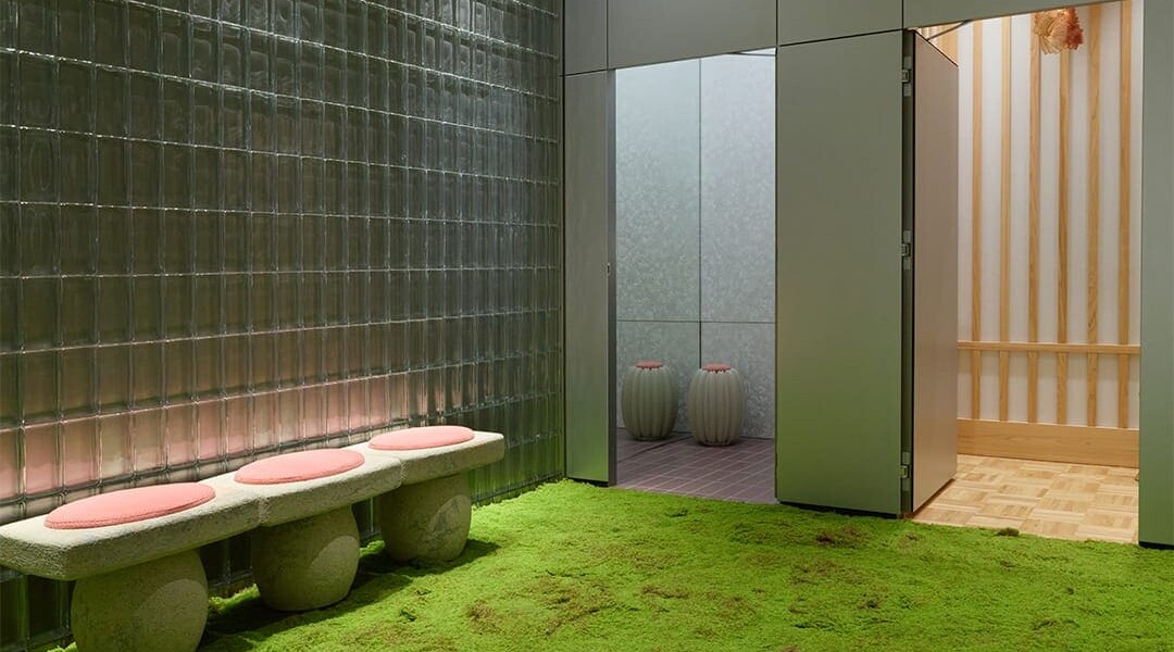
adererror
What I find so refreshing here is the anti-garden aesthetic. They use hyper-isolated botanical elements, a single sprout or a fragment of moss, encased in clinical resin and steel.
I love the Y2K hyper-realism and this emerging Y3K vibe here. It’s a futuristic, metallic aesthetic that feels very Matrix-esque, a mix of high-tech surrealism and organic life. Seeing raw wood and tiny moss fragments juxtaposed with industrial glass and stainless steel is just wonderful to the eye. It proves that a minimalist, almost clinical floral language can actually be more evocative of rebirth than a traditional bouquet.
It celebrates the invisible systems of growth, the microscopic world hidden within, rather than just the surface-level cliché.
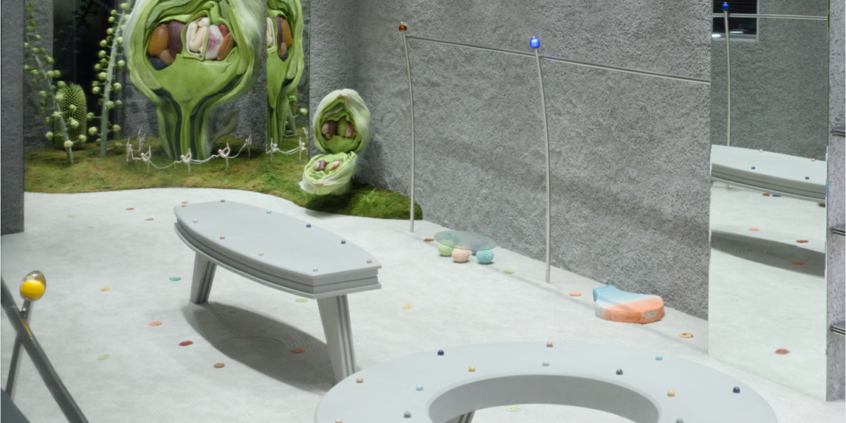
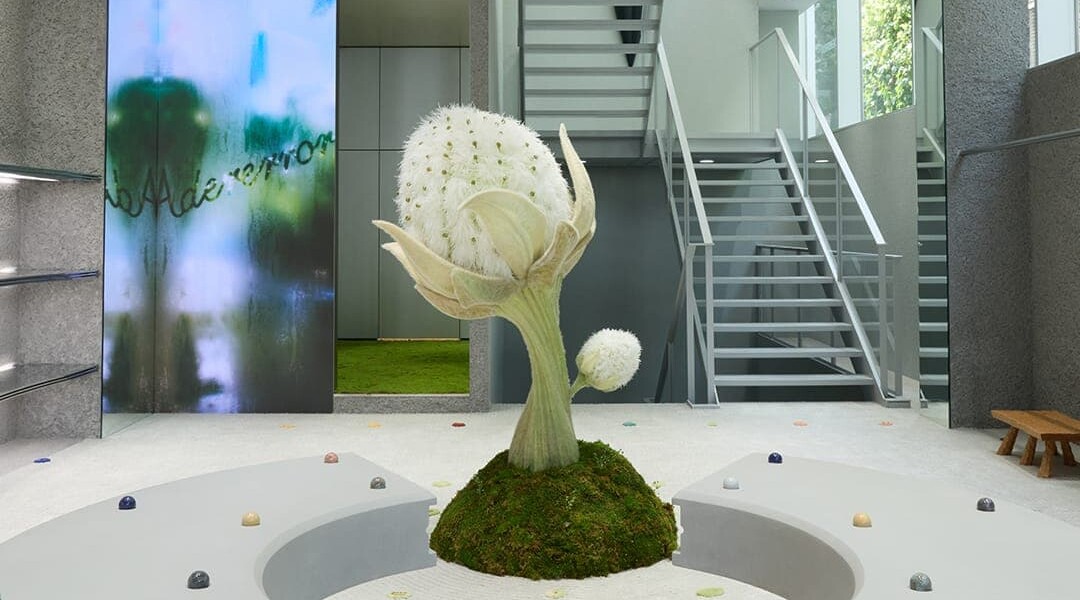
The space is referred to as ‘Continuum’ which represents a multidimensional ecosystem where small lifeforms and plants intertwine, coexist, and expand infinitely, symbolising ADERERROR’s boundless potential and creative energy.
– superfuture
Final thoughts
I truly believe that what sets these brands apart is how they are embodying reinvention and renewal through a lens of distinct, personal style. Whether it’s the high-shine, Matrix-y futurism of ADERERROR or the fluid, silk-draped minimalism of Niko Neko 5.0, they aren’t just following trends, what is the norm for their niche; they are building recognisable worlds.
In a crowded market, these are the spaces that stand out from the competition. They create that rare, memorable experience that people actually want to talk about. When a customer feels that mindful pause or is struck by the tension of steel and green, it translates directly into word-of-mouth marketing and, eventually, long-term profit. It’s no longer enough to just have a shop; you have to have a signature, which these brands do, and they do it well.
Let’s carry on the conversation….