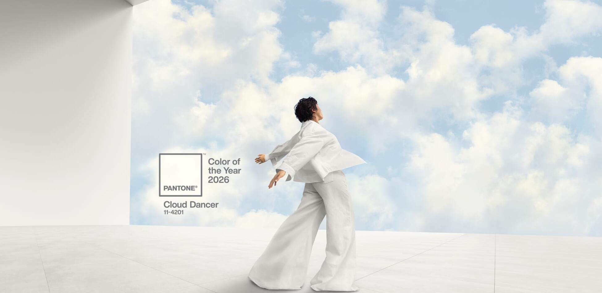
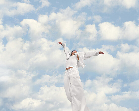
PANTONE’s colour of the year 2026
With Pantone’s choice regarded as a swing and a miss, we asked our team for their predictions on what’s going to be hot next year.
a blank canvas to create?
Pantone Cloud Dancer 11-4201
Our take
Like many other artists and designers we’re disappointed with Pantone’s colour of the year choice. It’s a nice neutral accent (just ‘nice’ is a term we hate) and fine as an accent or background. But choosing such a muted shade when so many vivid, inspiring colours exist feels disappointingly safe. Pantone have presented Cloud Dancer as signifier of a great cultural reboot. A calm, liminal space in an era of AI-driven acceleration and digital overstimulation.
The soft white is described with poetic optimism- fresh starts, a new page, rebooted simplicity. It’s marketed as a signal of calm, clarity, and a collective desire for a fresh start. But calling white “the colour of the year” in 2026 isn’t defining a new era. It’s just… white. And the distance between Pantone’s prediction and what people actually want has never been more obvious.
This is just a little teaser of some of our Studio picks, request the full report here!
Our team’s selections for 2026 move far beyond the safe and predictable, offering a palette designed to provoke emotion and inspire tangible design.
These are more than just nice accents; they are defining hues with character, depth, and human resonance.
Andrea Robinett
Director of Creative & Strategy
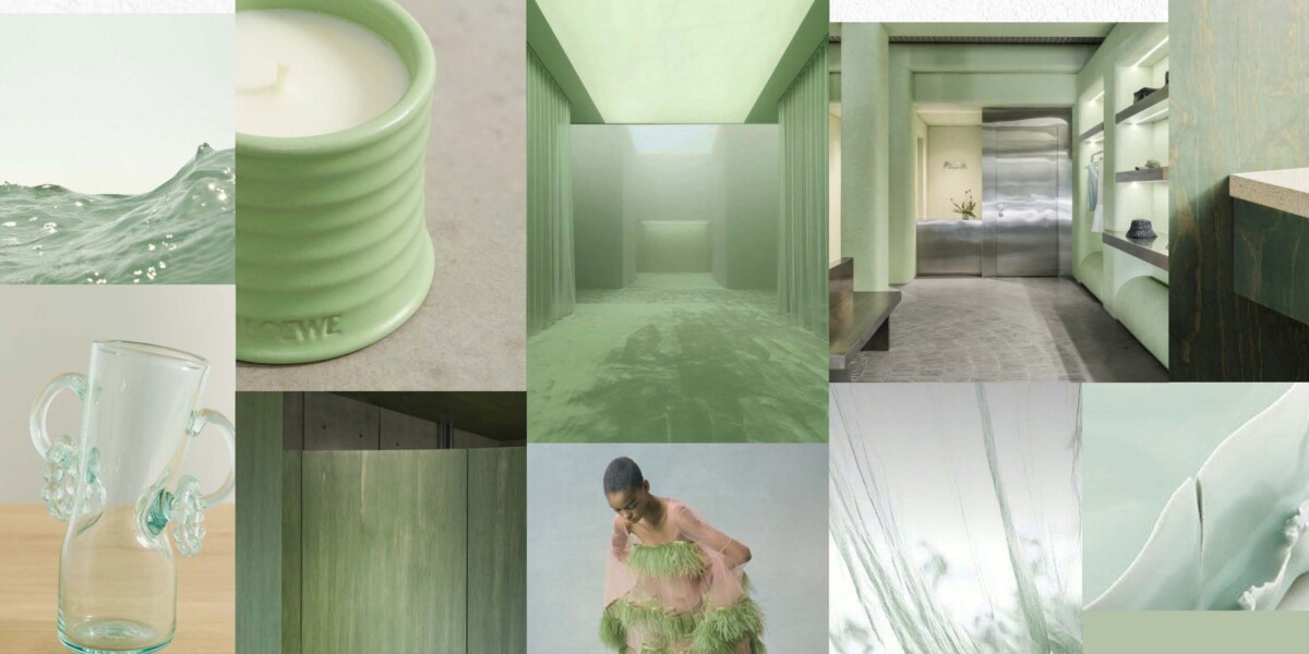
Celadon Green
My choice for a colour of the year echoes the ideals of Pantone’s choices implicitly, fresh beginnings, reflection, serenity- but with more character.
Celadon is a gentle evolution from the whimsical pistachio palettes of Wes Anderson towards nature- quieter, more soothing, more subtle. Its ethereal green tones recall ancient craft traditions, translucent, glassy glazes with depth and complexity that shift in the light.
Celadon wraps spaces in a quiet, inviting calm in an age of permacrisis. Whether appearing as a mist-like wash of colour or as a diaphanous material catching the light, it offers respite: a breath, a pause, and a subtle reminder of balance.
Josh Knox
Associate Creative Director
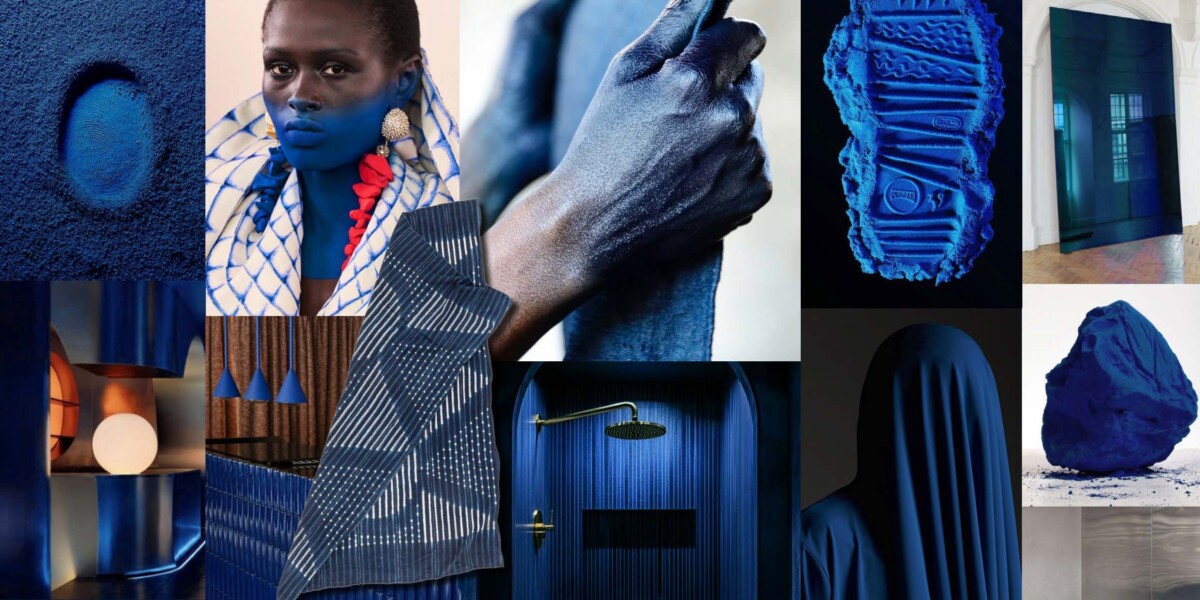
ERUDITE INDIGO
Monochromatic steel and white have ruled for far too long; it’s time for a surge of rich vibrancy. Colour carries emotion, culture and meaning, and its deeply human resonance is what drives this shift.
Enter what I’ve coined, ‘Erudite Indigo’, a luxuriously enrobing blue that nods to Japanese selvedge and the elemental dye traditions of West Africa. Drawn from the alchemical intelligence of the Yoruba, Hausa and Tuareg, this deep blue embodies wealth, protection and spirituality.
I love this colour for the way it cloaks everything in velvety twilight, it’s transcendent, otherworldly and almost atmospherically regal. It radiates a discerning confidence born from the vibrant, textural process that creates it.
Rosie Preston-Cary
Senior Brand Designer
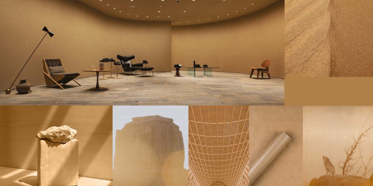
Dune
My defining hue for 2026 steps away from the ubiquitous digital sphere and occupies a more human, material realm. While I agree with Pantone’s hypothesis; the cross-cultural desire for detox and the resulting pull towards airy, achromatic shades like Cloud Dancer, I find resolution lies in Earthly depth, notably: Dune.
A rich, nuanced caramel meets terracotta brown that serves as a powerful analogue counterpoint to the ever-encroaching AI landscape and all that it brings.
Its an intentional embrace of Terra Firma and human authenticity; a colour that provides visual weight and tactile warmth.
Akin to the comforting heft of handthrown clay, the organic texture of natural fibre, or the patina of sepia photography. ‘Dune’ is a grounding shade that anchors spaces and designs in craftsmanship and an enduring, earthy humanity.
Ashley Roberts
Retail Designer
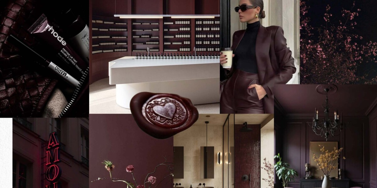
GILDED NOIR
A saturated, slow-burning burgundy with the aura of darkness brushed by warmth, tones of a deep red wine, cacao, and shadowed florals fuse into a quietly commanding presence.
For me it carries the weight of quiet luxury, evoking dimly lit rooms with shadows that behave like velvet, and confidence that moves without sound. This colour doesn’t announce itself; it really pulls, creating an atmosphere that’s just so magnetic, intimate, and subtly dangerous, the visual equivalent of a held stare.
It’s refined yet primal, romantic without sweetness, and unmistakably built for spaces and silhouettes that want to feel both grounded and irresistibly compelling.
Final thoughts…
These are just a couple of the D4R picks we’ve gathered from the studio, representing just a small glimpse into the vibrant and deeply human directions our retail design team is exploring for the year ahead. From the nature-inspired serenity of Celadon Green to the regal, cultural depth of Erudite Indigo, our multidisciplinary team of trend-hunters and innovators has identified a full spectrum of inspiring hues.
To see our complete vision for 2026, including more unexpected shades like Future Chrome and Solstice Orange, request the full Insight Report here.
Let’s carry on the conversation…