PANTONE’s Colour of the Year
Pantone’s Colour of the Year reflects societal trends, offering a hue that embodies comfort, sophistication, and modernity.
2024 COLOUR OF THE YEAR – 13-1023 Peach Fuzz
“In seeking a hue that echoes our innate yearning for closeness and connection, we chose a colour radiant with warmth and modern elegance. A shade that resonates with compassion, offers a tactile embrace, and effortlessly bridges the youthful with the timeless.” – Pantone Executive Director
WHO ARE PANTONE?
The Pantone Colour Institute is a revolutionary printing service that leverages X-Rite technology to achieve colour consistency across various materials and digital platforms. The institute launched ‘Colour of the Year’ in 1999 to engage design communities and colour enthusiasts worldwide, creating an educational conversation around colour.
Their drive was to draw attention to the relationship between culture and colour and how almost everything can be expressed via the language of colour itself. Every year, the colour is selected from a range of influences and trend drivers that define the upcoming year. This may include but is not limited to the entertainment industry, travel, artists, fashion, technologies, materials, and sports.
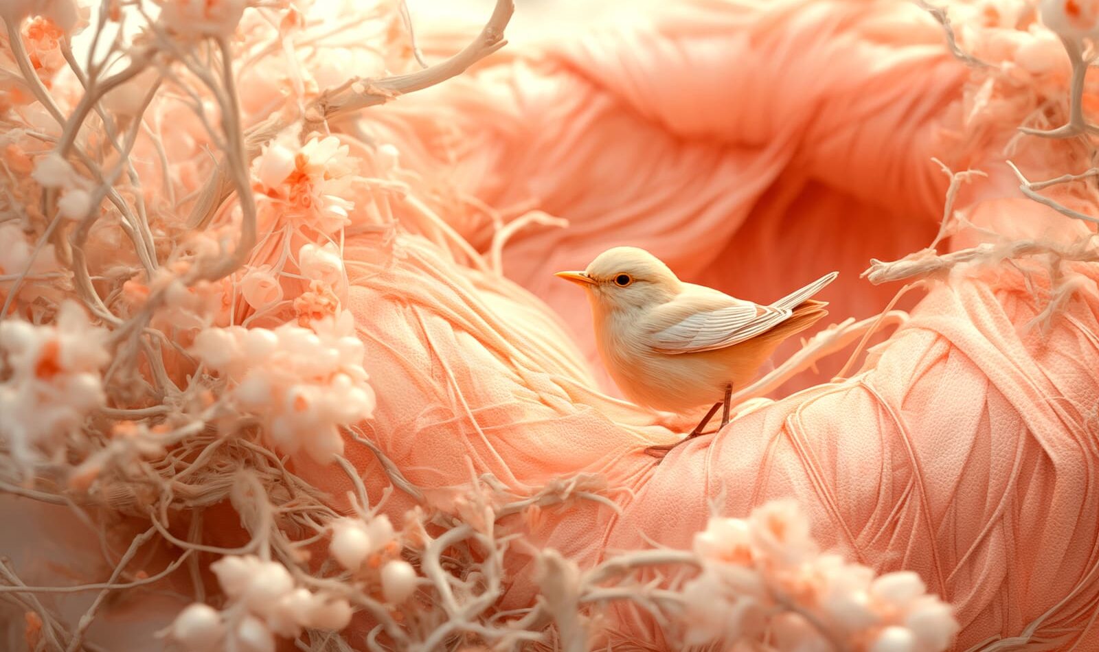
Pantone 13-1023, aka Peach fuzz, is a hue that resonates with our subconscious behaviours.
The soft peach shade celebrates a moment of zen; with an emphasis on togetherness, tenderness, and enlightenment.
This year’s colour emerges from years of social turmoil, a shade nested within hues of pink and orange, which offers us a space of escape and comfort. The calming ambience surrounding the tone provides quiet sophistication with hints of depth and mystery alongside the pairing of poetic and romantic connotations. The impact of this enriched colour allows us to project our thoughts and feelings into it in return for finding peace from within. Giving us an opportunity to acknowledge the importance of our well-being whilst paying homage to new modernity.
In our current societal climate, the evolving consumer seeks success and achievement through productivity, health, and relationships – longing for the perfect work/life balance. With surrounding ourselves in chaos, we begin to recognise the importance of security and calm in our personal lives and having a safe place to fall back on in times of confusion and uncertainty. As we navigate our lives, we take greater care in looking for places or moments of refuge. PANTONE 13_1023 Peach Fuzz provides that sanctuary we are looking for, allowing us to savour moments of peace and serenity.
[Image Credit: PANTONE]
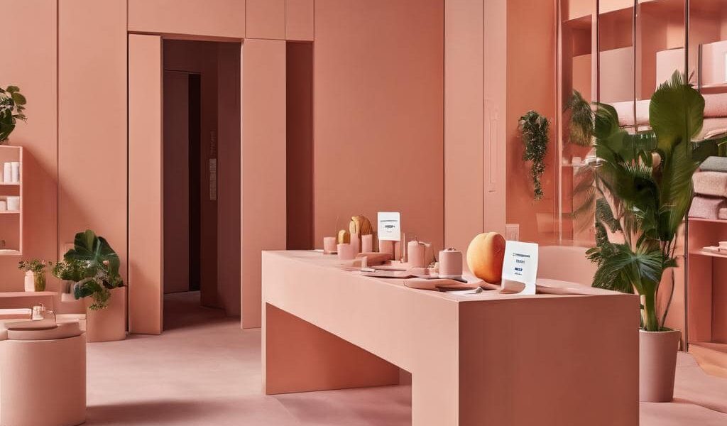
Pretty in peach
Colours play a vital role in design and everyday life, with the ability to emit specific emotions and change the mood of an atmosphere. In our current retail landscape, we are constantly seeing brands and retailers use colours to help create unique experiences and provoke new emotions along the way. The valuable use of colour gives retailers the opportunity to be ahead of the curve and look as if they are responding to industry trends. This year’s colour, Peach Fuzz, is already being used by some of the most contemporary designers, creating an impact wherever it features.
[Image Credit: Pantone]
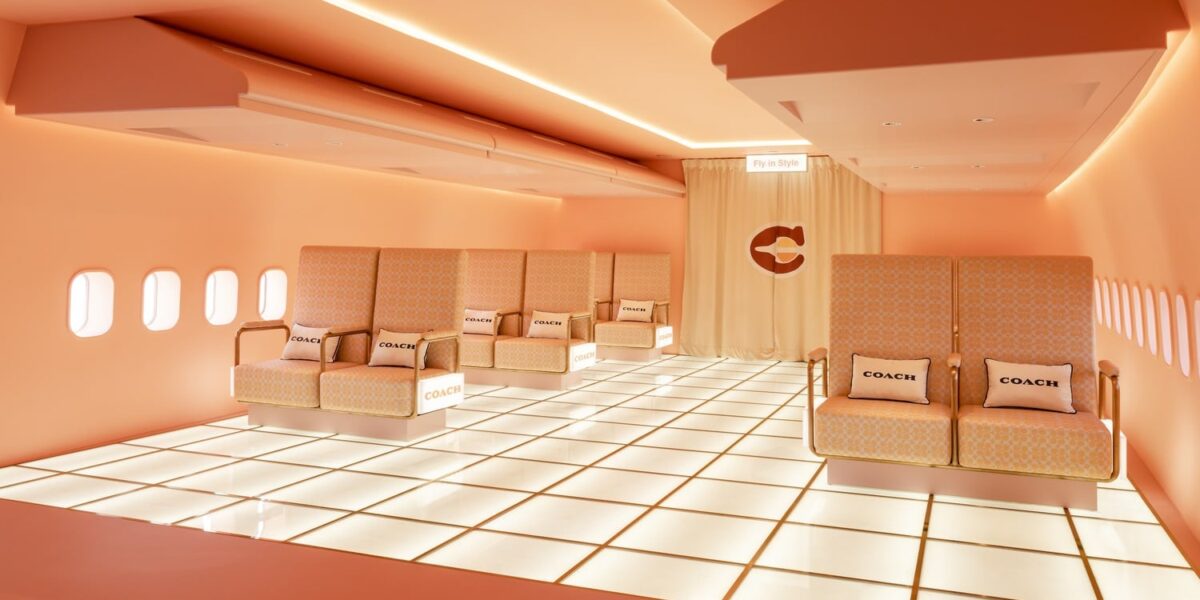
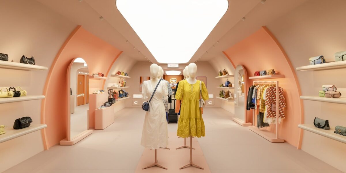
COACH
Featured in our most recent trend report, 2024 Forecast, the pop-up concept shop – Coach Airways – invites passengers into a first-class experience. The aircraft transports the customer’s back in time as it celebrates the golden era air travel of the 1970’s bringing retro-futurism to the heart of the Boeing 747 jumbo jet. The eccentric design is home to not only a retail experience but also a café, allowing passengers to indulge themselves into every aspect of retail therapy.
The peach ambience of the experiential space projects luxury and sophistication. A journey that experiments and brings new interactions to the retail landscape whilst repurposing a once-abandoned Jet in Malaysia. Not only does the hues of Peach Fuzz give us a feel of exclusivity, but it also provides us with a minimal, sleek aesthetic creating a balance between old and new.
[Image Credit: Coach]
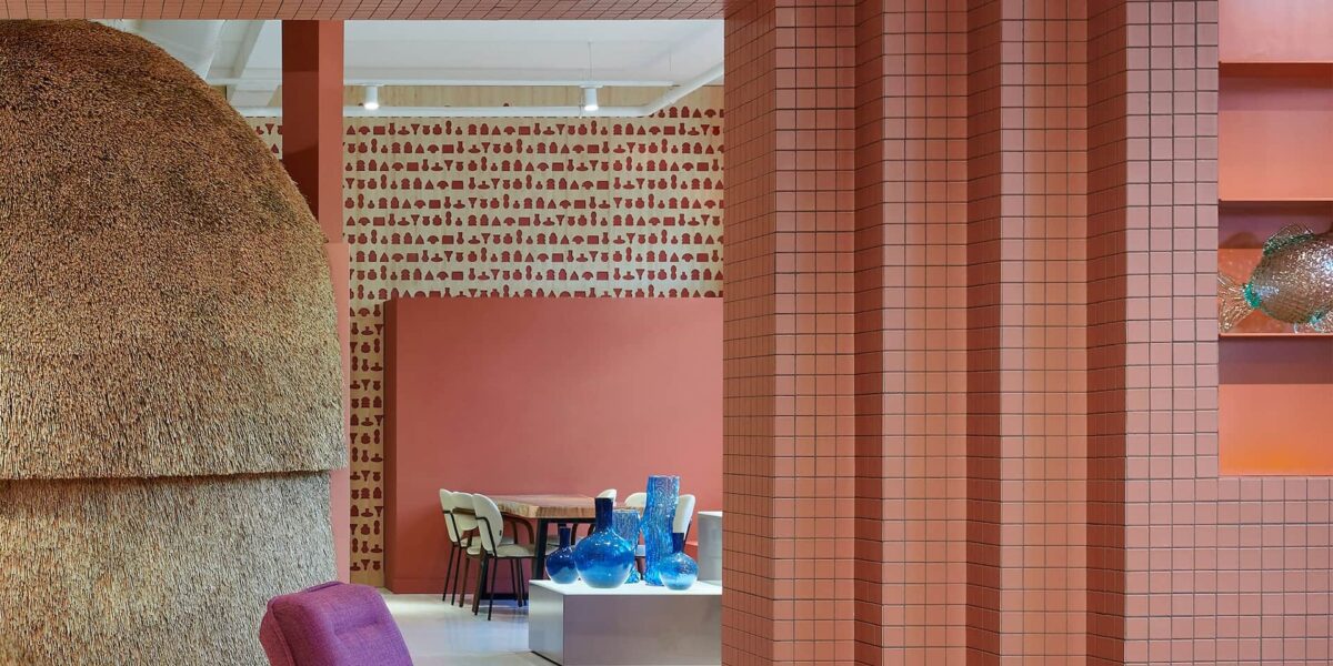
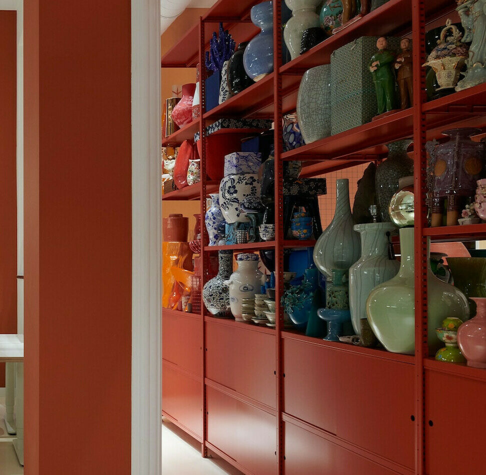
Polspotten
Home accessory and interior brand, Polspotten, recently unveiled a new fourth space for their brand located in central Amsterdam. The store, designed by s-p-a-c-e Projects, blurs the lines between workspace and retail, adding an element of play into the office environment. The main focus of the space is to highlight the eccentric products incorporated within the terracotta-inspired displays. The deep hues of pink and orange within the design pay homage to the brand’s first product, potten, which features the indistinguishable shade. The introduction of the soft and cozy shade promotes feelings of warmth and enrichment, whilst also helping to provide their employees with a focus space for a productive and distraction-free office. This store recognises the importance of well-being and building a better workplace relationship through the use of colour.
[Image Credit: Polspotten]
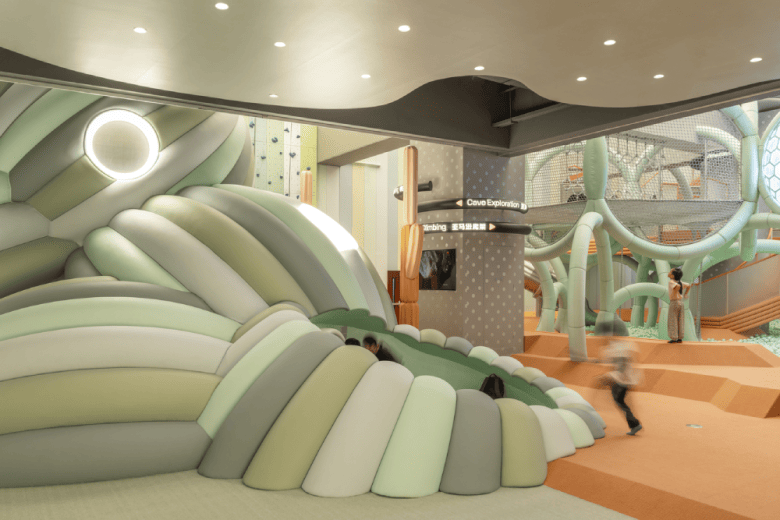
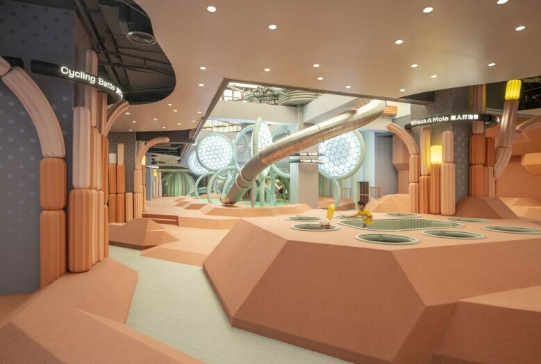
An Atlas of superpower by Waa
Waa (We Architect Anonymous) is a collaborative design team that portrays stories and narratives that originate from authentic experiences within the world. Their most recent project, working alongside the family centre, ‘an atlas of superpower’, is a sports location designed to celebrate superpowers of all age family members. The concept focuses on a peach-toned fictitious mythical island split into individual areas that embody unique qualities. Activities include that of yoga and exercise classes, VR and AR group games as well as more traditional games with the involvement of physical obstacles throughout the space.
The initial design encapsulates the balance of architecture and toy integration, providing a safe yet aesthetically pleasing environment for all the family. Throughout the design, climbing apparatus, functional lighting, and abstract forms in the warm tones of Peach Fuzz inhabit the space creating a welcoming environment. PANTONE 13-1023 exudes all things community and expresses an ongoing desire to be close to those we love, extremely fitting for this family fun experience.
[Image Credit: Fangfang Tian]
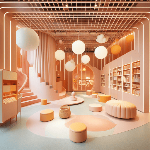
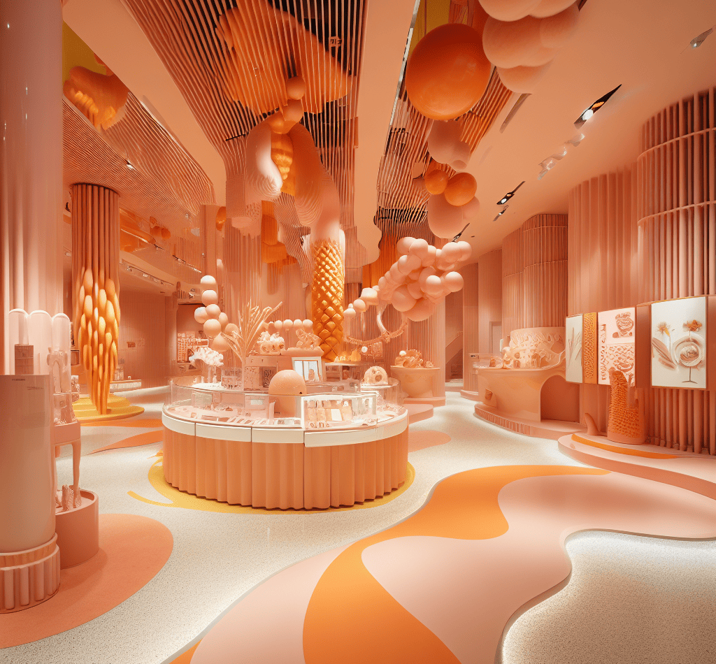
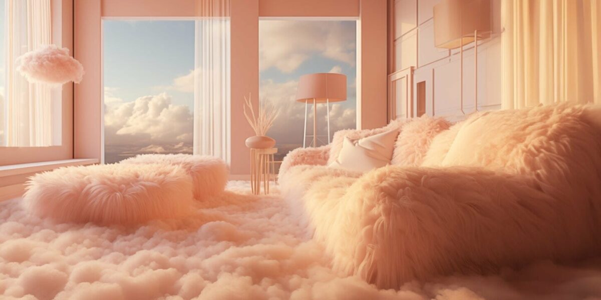
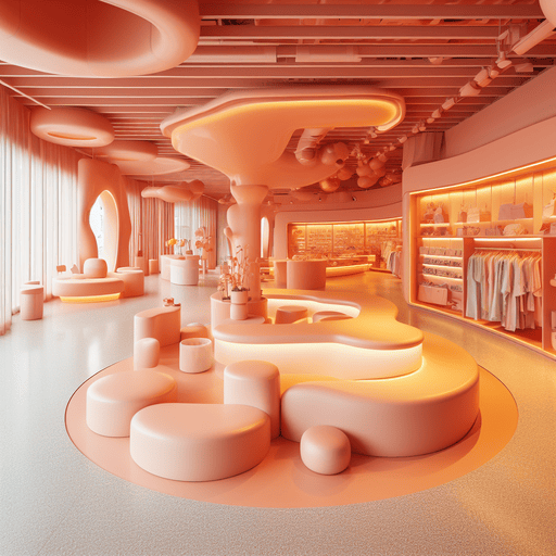
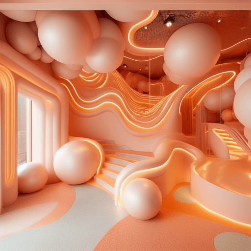
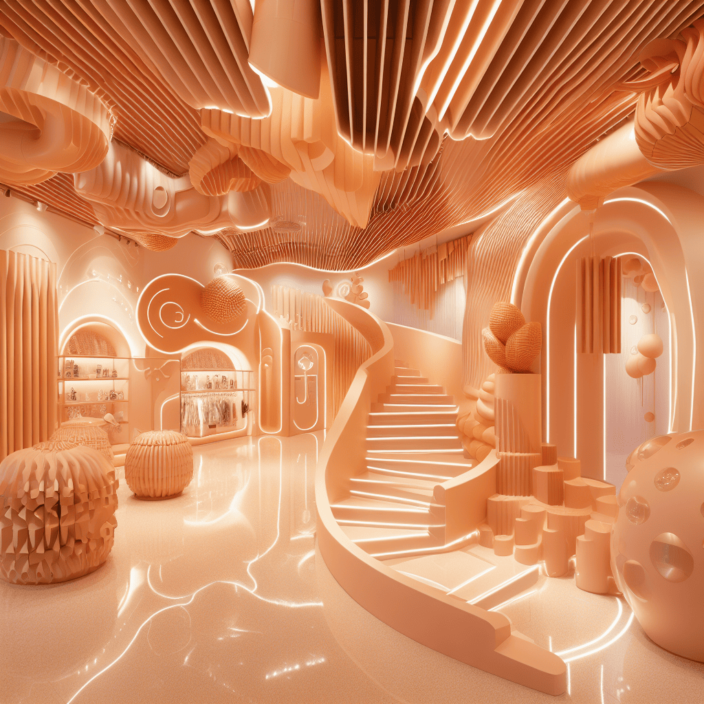
Where could it take us?
Just as the experts say, the velvety, gentle peach tone ‘enriches the mind, body and soul’, and if we were to immerse ourselves in this hue, it would bring kindness and tenderness as well as peace and serenity. Peach Fuzz helps us to connect to each of our senses.
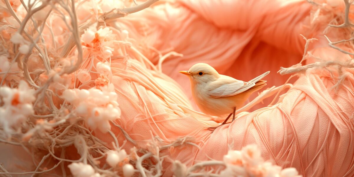
With the help of AI-generated images, we can realise new concepts in PANTONE’s colour of the year, giving us a further look into how the infamous shade could shape our retail landscape in 2024 – as we have done throughout this article. We predict that this year, we will see more extravagant and meaningful experiences within retail, evoking emotions that we wouldn’t usually expect, and this can certainly be achieved through colour. From a visually arresting and inviting space to luxurious textures, PANTONE 13-1023 promotes a new beginning for the retail landscape.
FEELING PEACHY?
Are you a brand or retailer and think you could play a part of the future of retail? Here at D4R we have all the knowledge to help design and realise a retail concept that would take your physical space to the next level.
We push boundaries and we’re ambitious for our brands…could yours be next?