read
Wild Science Lab Product Packaging Design

January 25th, 2023

Happy Skin Acne Range Packaging Redesign

Intro

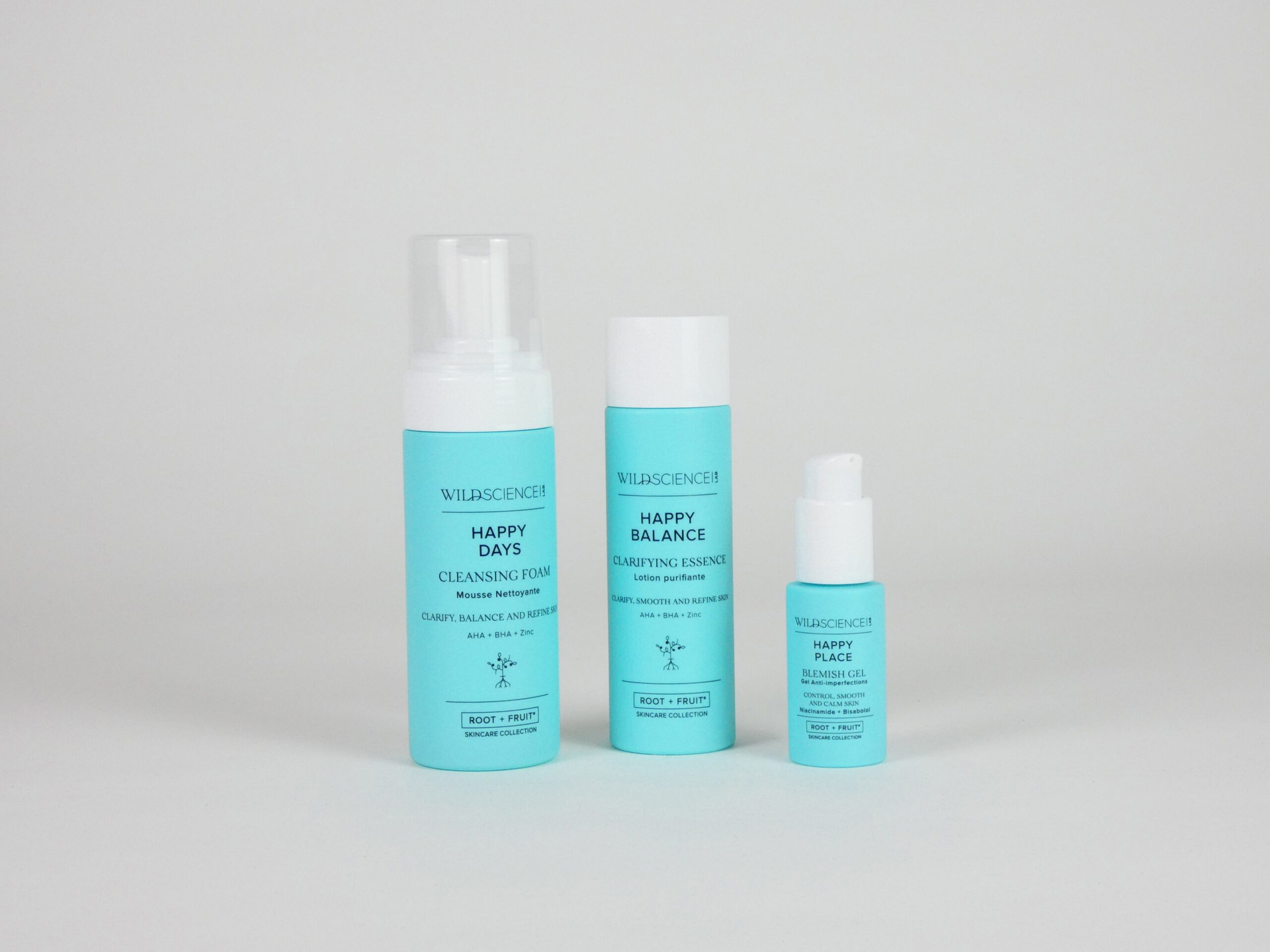
Following our previous retail activation work with growing skincare brand, Wild Science Lab, D4R were asked to translate their ingredient-focussed luxury aesthetic into a premium packaging concept for the launch of their brand-new Happy Skin range. The key objective for the project was to uplift and affirm the strength of the Wild Science Lab brand, using the refreshed packaging to propel the brand whilst taking the current position of the industry into consideration.
Wild Science Lab - Packaging Design

Insight

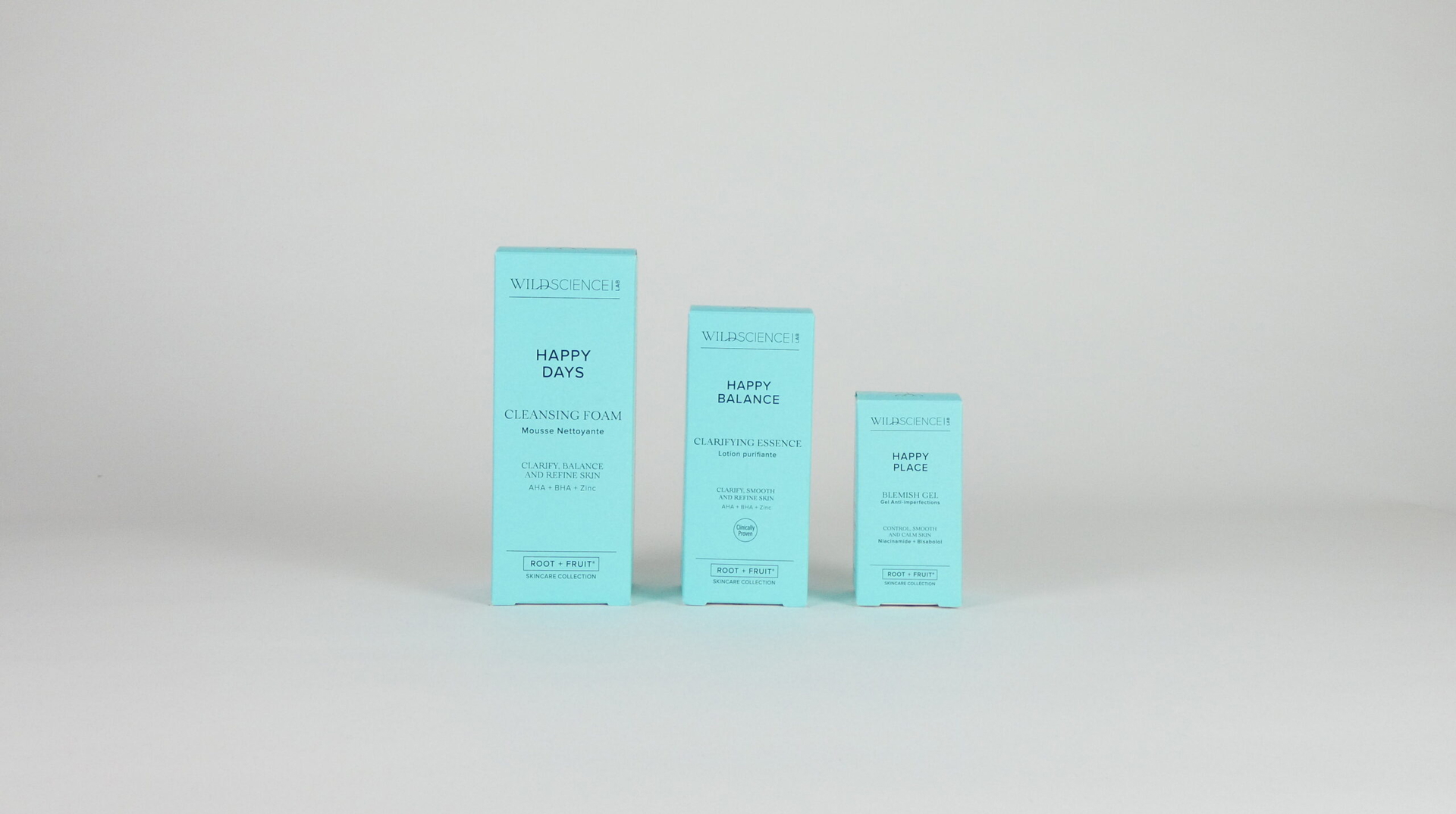
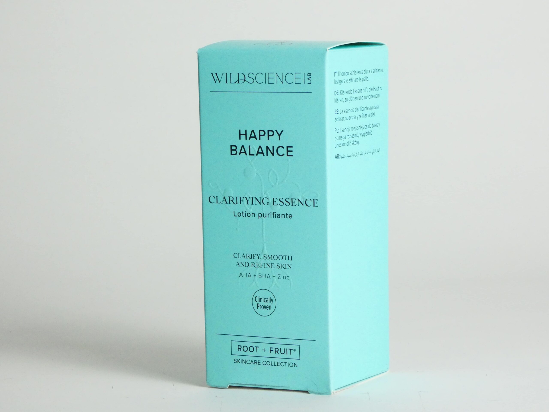
Our 2D designers set about the project by exploring the skincare marketplace, which included a full interrogation of competitor skincare brands that sit alongside Wild Science Lab and their packaging identity. Our focus was centred around the composition of the information on the exterior packaging, as well as the product-containing bottles themselves. We explored a colour palette that could be used across the Wild Science Lab product range, and print techniques, such as spot UV embossing which allows for a tactile and eye-catching USP, that could be used to help elevate key brand and product information.

An important part of the redesign consisted of altering the hierarchy of the key product details to help draw the eyes of customers to the brand’s top line information with the aim of increasing the product’s desirability for purchase among shoppers – a priority for skincare brands as the market becomes more and more saturated, making it increasingly difficult for customers to choose between the multiplicity of skincare products on offer.

Wild Science Lab - Packaging Redesign

Realisation

The reimagined packaging took a more considered approach, with the Wild Science Lab logo becoming the apex of the composition, followed by the product name, and the nature of the product, which provides instant acknowledgement of the product’s purpose. The large and vibrant cyan packaging, now only showing the key product information (similar to the bottle), has created a positive use of negative space, which characterizes the luxurious nature of the product.

Testimonial

“We couldn’t be happier with our experience working with Design4Retail. They truly captured our brand image and values in the design of the shop-in-shop concept, with the Leaf + Seed and Root + Fruit themes which clearly reflected our preventative solutions for scalp, hair and skin . The outcome of the design work is stunning and we’re looking forward to seeing it in more stores soon.”

#Ideasmadepossible