The Leicestershire Police service continually support the local community and when they desired to relaunch a dedicated evidence centre for children, we were honoured to be appointed as the creative agency responsible for their branding.
Branded as ‘The Lighthouse’, the centre is a safe space for children who have been victims of assault or the witness of a serious crime / event. The location is kept discreet and the Leicestershire Police team strive to maintain a relaxing environment with the centre, ensuring that every young person feels as comfortable as possible in what can be a very distressing time.
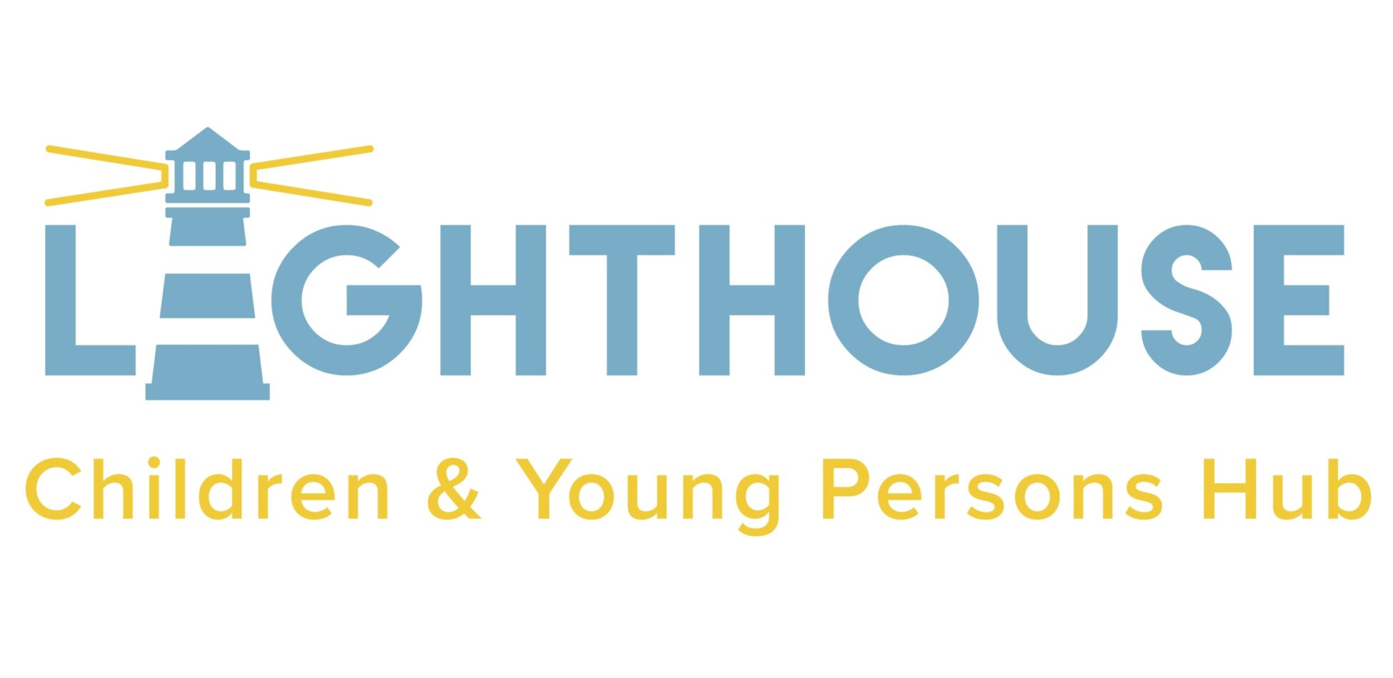
Originally launched as the St Bernard’s Centre, the safe space required modernisation and this is where our creative agency came in. We defined a brand identity for The Lighthouse, creating a logo which would become the firm stamp for this revitalised project. This identity expanded to include letterheads, business cards, artwork for the building interior and signage for the exterior; but at the forefront of our design thinking were the children who would be supported in this centre. The exterior signage needed to be discreet but clear and welcoming, the colourways required thinking when it came to positive connotations and the overall branded aesthetic was centralised around the safe environment. Providing this brand identity for such a pivotal branch of the Leicestershire Police not only involved our creative strategy, but also thoughtfulness for its key visitors.
We were invited to the launch of The Lighthouse on the 3rd September, meeting the team behind this fantastic project within Leicestershire. The impressive building, a collaborative project between the police force and external bodies including D4R, is now open and will continue to thrive as a welcoming environment to young people across the county.
“The team’s skills of enabling an idea to come to life and be the face of an inspiring project is truly commendable.
They put great efforts into ensuring the imagery mirrored what we as an organisation were set out to succeed. Therefore, it is no surprise to hear the high volume of positive and complimentary comments we have received proving the generous contribution has not gone unnoticed.” Millie Gant – SARC Manager