Pantone Colour of the Year 2016 has been Announced

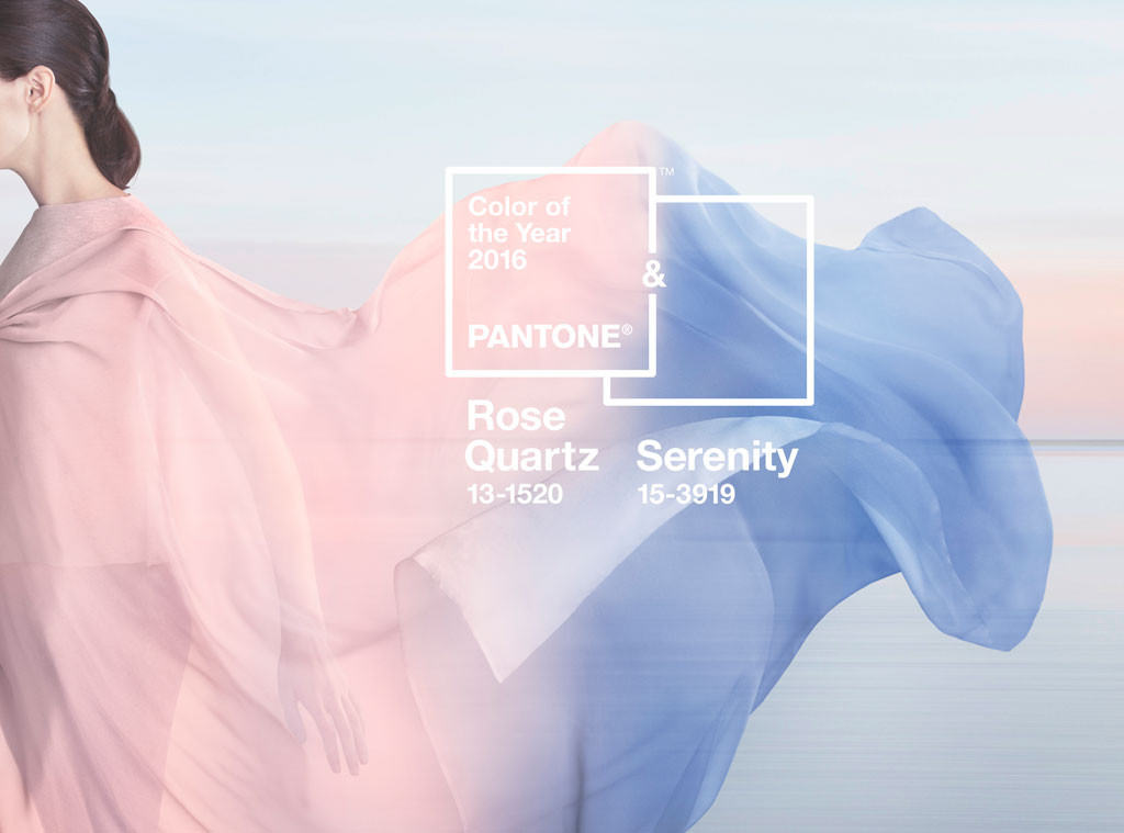
Pantone have now announced their colour of the year for 2016 and for the first time ever they have picked two colours to be their signature shades. The two colours that they have chosen are Rose Quartz (PANTONE 13-1520) and Serenity (PANTONE 15-3919) and many business are rushing to get products in these shades ready to launch early next year.

Doing their bit to further the gender equality Pantone have picked shades that are both stereotypically male and female colours and combining them into one blur, challenging the traditional perceptions of colour association. The two colours will also act as a soothing counterbalance to all the stresses of the modern world and evoke a feeling of tranquillity and inner peace.
Rose Quartz is a soft pink shade that gives a gentle tone, conveying compassion and a sense of composure while Serenity is weightless and airy and brings a feeling of relaxation even in troubled times.


Pantone say that joining together “Rose Quartz and Serenity demonstrate an inherent balance between a warmer embracing rose tone and the cooler tranquil blue, reflecting connection and wellness as well as a soothing sense of order and peace.”
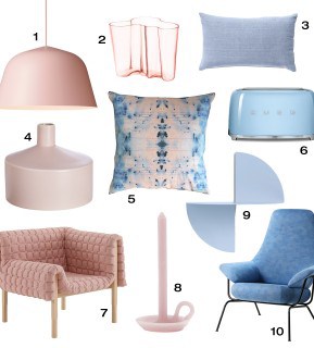
Both colours have already been spotted on the runway at New York Fashion Week in September and there are already many items out on the high-street available to buy now for your home: http://design-milk.com/pantone-color-year-2016-serenity-rose-quartz/