Part Two of Four
Our Top Picks...
In this next chapter of our month-long exploration of minimalism we look at the movement’s various expressions at retail.
(Image courtesy of Jacquemus)
In this next chapter of our month-long exploration of minimalism we look at the movement’s various expressions at retail.
(Image courtesy of Jacquemus)
You may think that ten minimal retail spaces may not be the most interesting read as the style has often manifested as white-walled rooms, stark lighting, and a lack of details. But, in exploring minimalism this month, we have discovered a wealth of ways that this style can appear. Minimalism doesn’t have to look any specific way and even spaces that follow many of the core principles of the movement- scarcity of detail, clean lines, and a sense of purpose- can express personality, emotion, and even playfulness. Minimalism, when interpreted as a desire to be mindful, can be evoked in many different ways; here we explore ten diverse interpretations of the movement that have caught our eye.
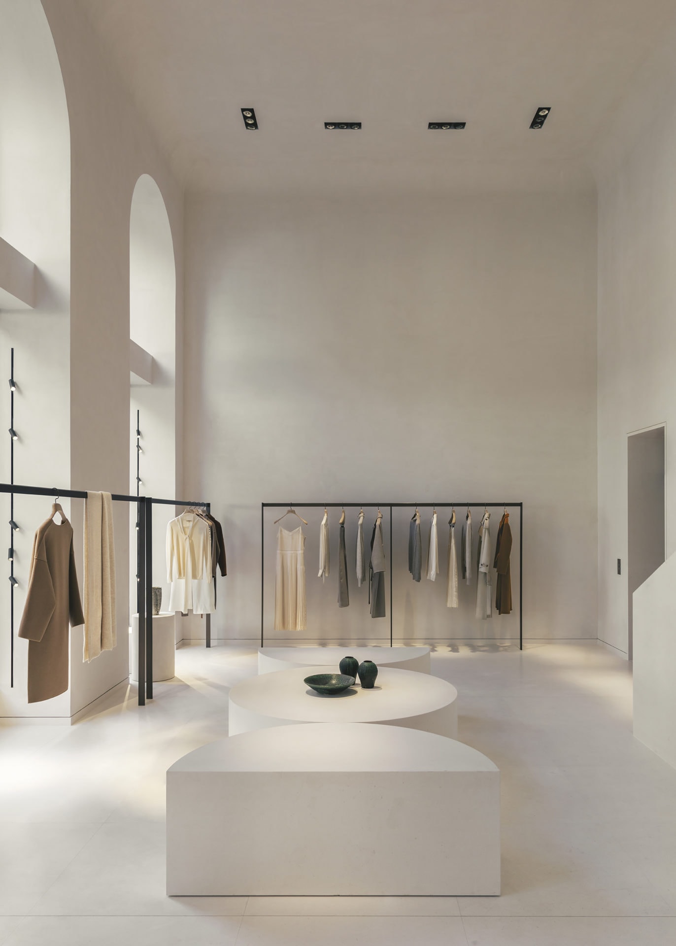
This store, for Chinese fashion brand Icicle, is on the surface minimalistic as we would traditionally expect. But investigate further and we find a richness of texture and juxtaposition of materials to inspire. The concept draws on the locality as well as the brand ethos to deliver an environment that is stripped-back but full of considered references. Set in the centre of Paris, the retail space envelops the customer in a rich cream-coloured palette that directly references and celebrates the soft warmth of the city’s most recognisable buildings. In using Saint Maximin stone, a French limestone sourced from a nearby quarry that is synonymous with Parisian buildings, the concept blends the 19th-century exterior with the interior though a continuation of the same honey-coloured sandstone finish. However, the architect has eschewed the layers of extraneous detail that typify the Parisian architectural style, using only clean, curvilinear surfaces, and a singular natural material- floors, walls, ceiling, and the monolithic three-story staircase are all sculpted from the honed stone. We love how the store environment brings the brand ethos and purpose to life. Icicle’s clothing is mindfully crafted from vegetable-dyed denim and organic cotton and the conceptual interior reflects this ethical, natural philosophy as the connection between store space and product is organic- one defines and enhances the other.
(Image courtesy of Romain Laprade)
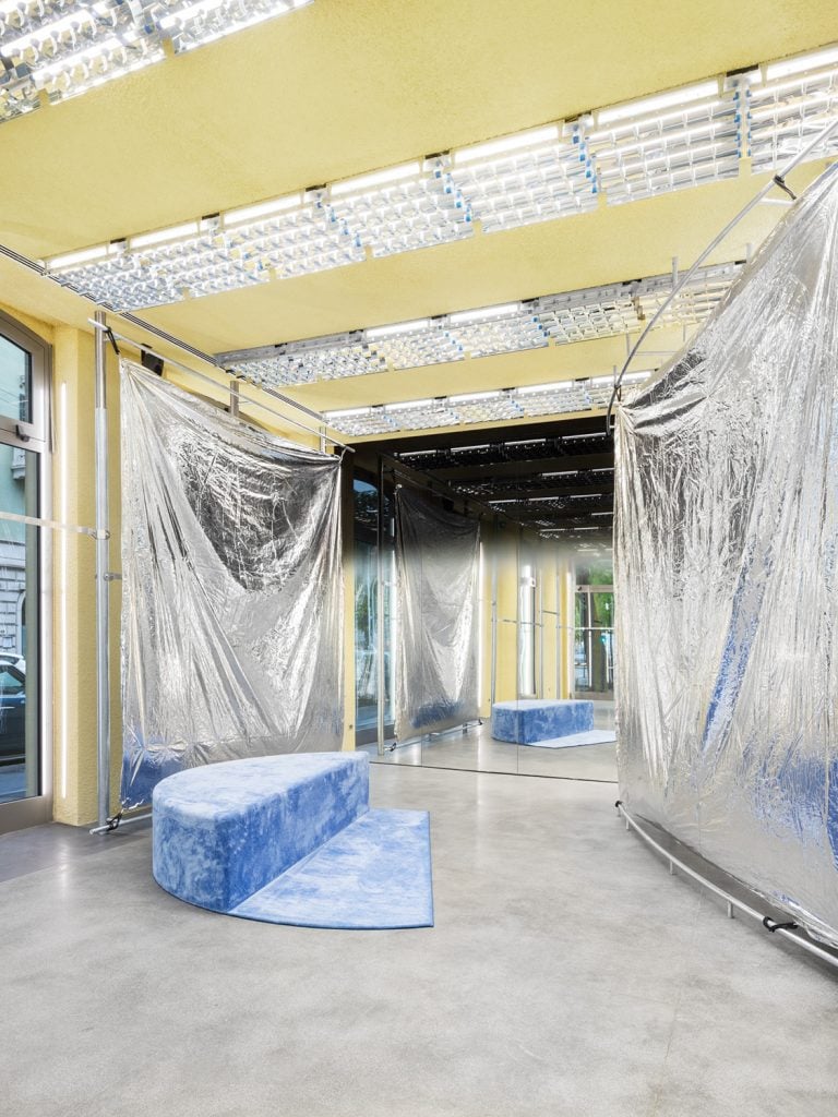
This store, for fashion retailer Modes, is a very modern interpretation of minimalism. Although it doesn’t look like a space that we would traditionally think of as minimal it follows some core principles of the movement- a sense of purpose, and mindfulness around material use. The store, in Milan’s most fashionable district, has an aesthetic far from the typical or expected fashion retail experience. Repurposed materials are layered over existing elements as, rather than gutting the heritage space and starting anew, the concept retains the shell of the space and augments with a layer of new furniture, partitions, and decorative elements. The visible sustainability and commitment to circular design is most obviously demonstrated by the reflective silver drapes, recycled from previous use as part of an inflatable canopy at a 2022 installation by the brand.
(Image courtesy of Melania Dalle Grave and DSL Studio)
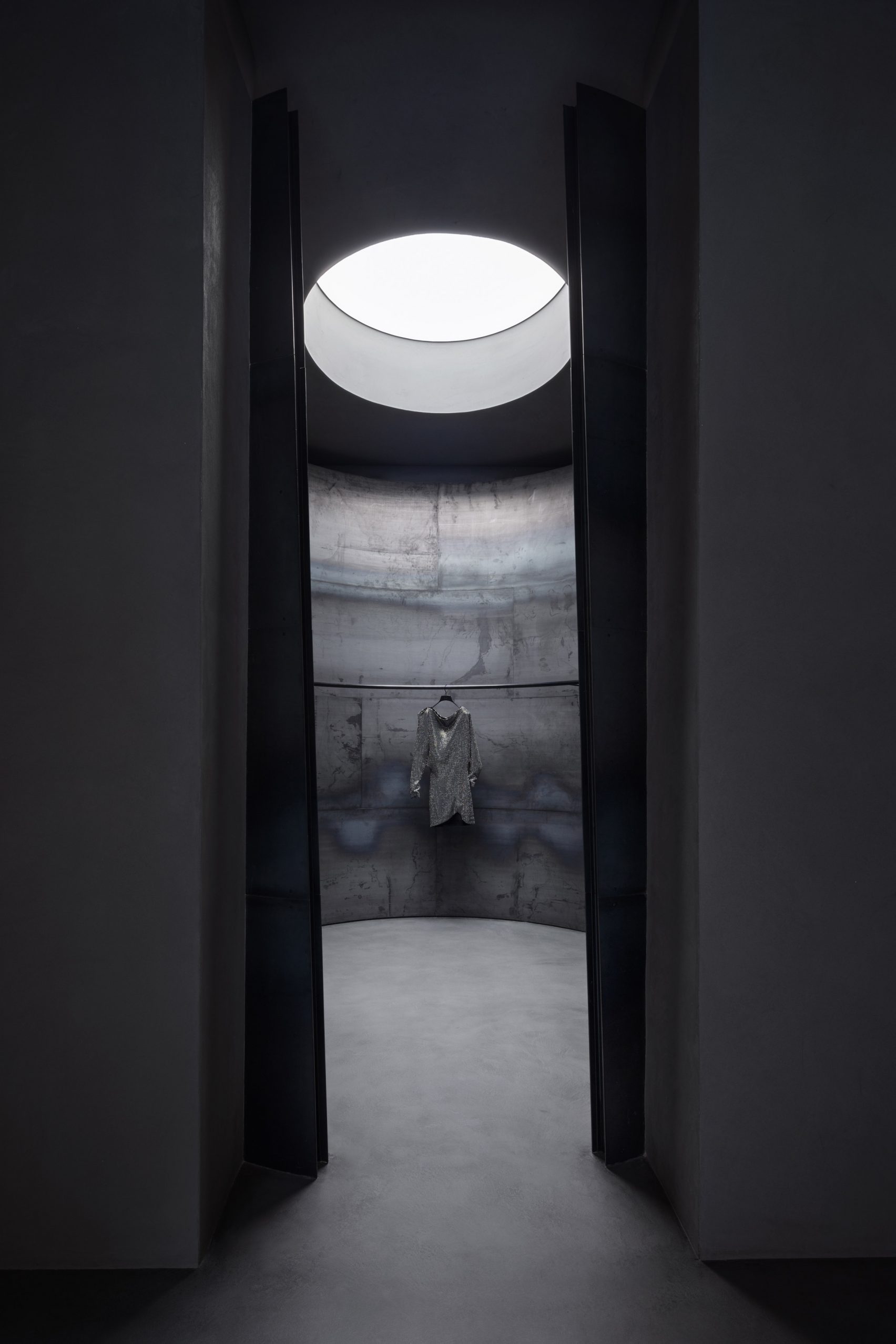
This store is a great example of the subtle similarities and connections between minimalism and brutalism. Although historically linked, where minimalism looks to simplify and remove extraneous detail, Brutalism is a more utilitarian aesthetic that celebrates raw materials and exposed construction details.
Clothing label Khaite’s New York flagship occupies a traditional Corinthian cast-iron column-clad SoHo building and is designed to capture this cultural heritage and legacy whilst remaining true to the brand’s clean and contemporary aesthetic.
The space is clad in materials referencing the city environment such as poured concrete, trowelled cement, and rough plaster, with colossal curving steel partitions through the store to both conceal and display the brand’s simple apparel collection. This palette brings robust industrialism that spotlights unique textures and preserves their imperfection. We love how the concept also adopts elemental qualities such as natural light, so that despite the soaring scale of the store, there are still intimate spaces. This juxtaposition of both tone of voice and physical touchpoints- warm contrasting with cool, architectural scale against human and tactile moments- is shown most clearly where two skylights bathe key areas of the space in warm light, allowing a sculptural olive tree to flourish at the heart of the store. These balancing moments inject slices of colour and a necessary organic element to the otherwise restrained, almost austere, scheme.
(Image courtesy of Khaite)
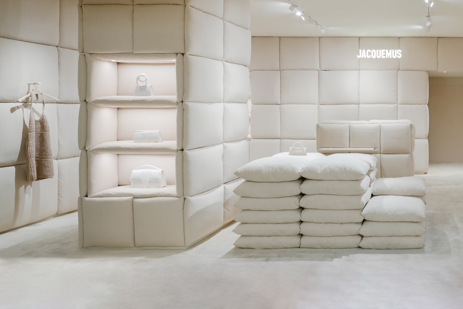
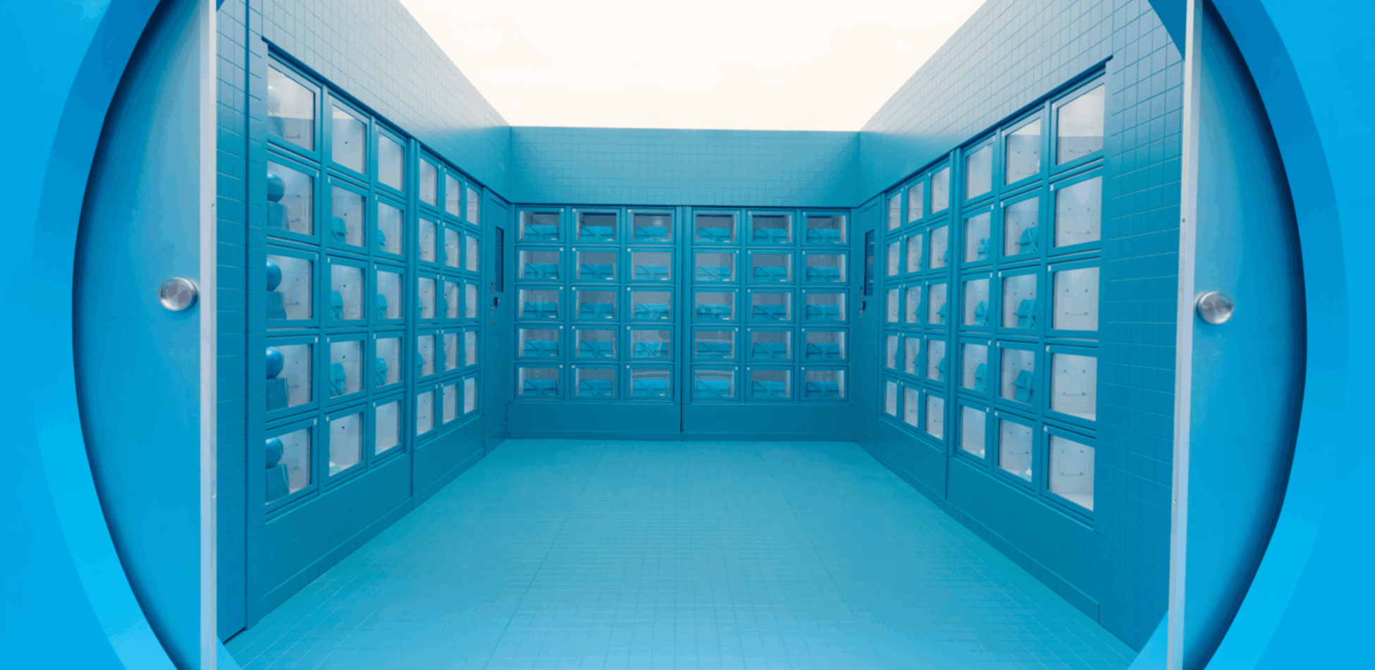
The design of the Jacquemus boutiques in London and Paris showcase the minimalist principle of a considered palette and are exercises in testing the limits of working with a single material. From pillows, to terracotta, to blue tiles each Jacquemus store is designed to evoke a clear emotional response in the customer through immersion in a single colour.
At the Paris store the walls and furniture are clad with a softly enveloping layer of fluffy white cushions and plump pillows in a reference to the textile heritage of Provence. The whimsical décor delivering a playful yet relaxing atmosphere through soothing repetition and tactile evocation of environments of sleep. In the brand’s London outpost within Selfridges, walls, display plinths and tables all finished in terracotta plaster in a tonal palette of shades drawn from the brand founder Simon Porte Jacquemus’ home in the South of France. In both cases, the materials dictate their presence in the space and whilst the stores are designed around a singularity of finish, careful thought is given as to the sensory experience evoked by the forms the textures are applied to.
(Image courtesy of Benoit Florençon)
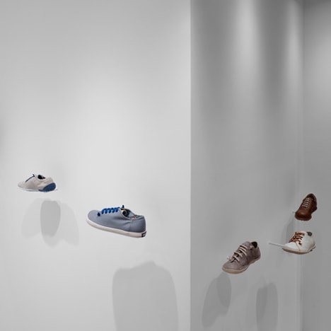
The Japanese design studio Nendo have designed several stores for shoe brand Camper, in each case creating their own evocation of minimalism whilst retaining a playfulness that perfectly suits the Spanish brand’s personality.
At the Osaka store, the space is so minimal and installation-like it is almost ethereal. Inspired by the brand ambition to contribute to the simple pleasure of walking the interior of the store uses pared back repetition to physically bring this to life in the way the product is showcased. Invisibly, almost weightlessly held, footwear is displayed on barely discernible stands- slim metal plates affixed to thin tubes rising out of the floor. The shoes seem to float in the air and stroll about the environment a whimsical landscape created from the most minimal components.
Similarly, the Malmo concept design features displays that appear as lightweight, paper-like sculptures giving a sense that the shoes are balancing weightlessly. Taking a soft, thin, flat material and giving it form reflects the shoemaking process. Here the material is a 2mm-thick white resin flooring sheet, rolled into spirals to create self-supporting structures. Variations in not only the height and size, but in the degree of openness of the spiralling forms, result in a visually rich aesthetic despite it’s using only a single colour and material throughout.
Each concept is a carefully staged environment rich in nuanced storytelling, achieved through minimal material use. The spaces focus on the product, refining the presentation to the most essential forms, allowing the shoes to inhabit fantastic dreamscapes.
(Image courtesy of Dezeen)
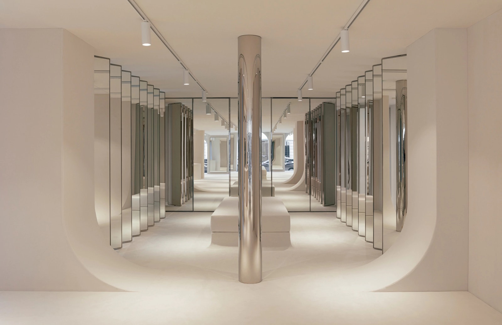
This store might be an unexpected choice as an example of minimalism, but the whole space is an exercise in defining and evoking a vernacular with just the most essential elements. The store takes the essence of the reference aesthetic- sixties futurism and a seventies nightclub- and distils down to its most elemental components, thus refining to the point of abstraction whilst leaving the core of the vernacular recognisable.
The store concept draws on the brand’s 1960s legacy to conjure a space-age ethos by inserting upside-down arches through the space to create zones of activity and interest. Chrome-edged mirrored panels reflect to infinity, a chromed pillar adds a further the nod to the disco theme, and plush carpet underfoot and fabric mounted on walls add texture in keeping with the retro inspiration.
Here we admire the clarity of intention shown through a simple palette. The whole interior is a symphony in chrome and off-white, with just the right amount of reference to the visual source material.
(Image courtesy of Romain Laprade)
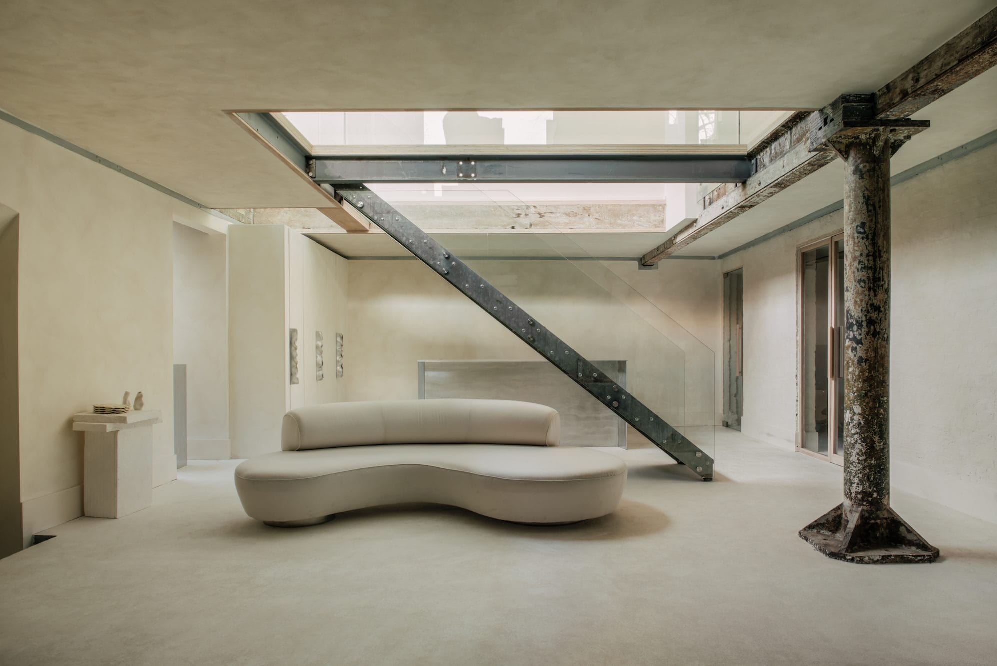
The London flagship of jewellery brand Completed Works responds to their customer’s desire for a more intimate shopping experience where they can meet the designer and the team and browse product immersed in the brand world. The store is created across two floors of a former North Marylebone pub with a concept that aims to bring the brand personality to life and create a home for the brand that typifies and represents their brand purpose and truths. The concept does this by looking to the iconic products for visual inspiration to evoke the reductionist principles of the brand and its wares. The space is detail-oriented yet laid-back- a brand-ship whose interiors and details complement and reference the jewellery perfectly. Folded and hammered cupboard handles, for example, are inspired by the brand’s crumpled ‘Cohesion’ earrings. Clean-lined displays throughout juxtapose against the stark shell of the repurposed building’s architecture. Fixtures are upholstered in hand-printed lilac linen in certain areas to further create a visual tension through a playful juxtaposition of materials and forms.
(Image courtesy of Genevieve Lutkin)
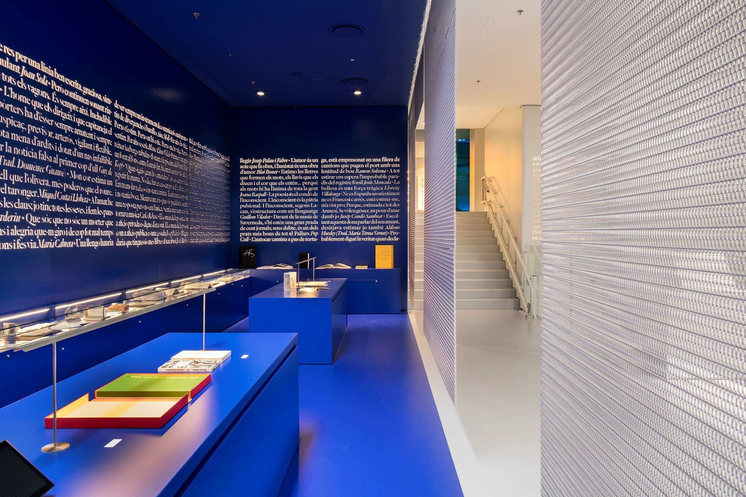
Ona is a well-known bookstore established in Barcelona in 1962 and now an important resource to the safeguarding of Catalan cultural heritage. The 2019 renovation aimed to elevate the brand by retaining a strong bond between the Ona of the past century, and a vision for the future.
The new library is a space where literature becomes a shared experience as each room of the library conveys both brand’s character and the product categories and invites discussion with it’s design choices. The carefully chosen bold and vibrant colour and typographic application in each case use minimal references and detail to evoke the room persona. For example, the children’s literature room uses a sunshine yellow to inspire creativity, while those for the main book collections are wrapped in a brilliant clear blue that invites reflection and serenity.
We love this store as it illustrates that concepts can incorporate identity or heritage within a minimalist style and so still feel unique and identifiable. Minimalism doesn’t have to mean white or concrete. Joyful colour can be minimal in its application when the concept keeps detail clean and focusses on the enveloping visual power of a single monochromatic expression.
(Image courtesy of Genevieve Lutkin)
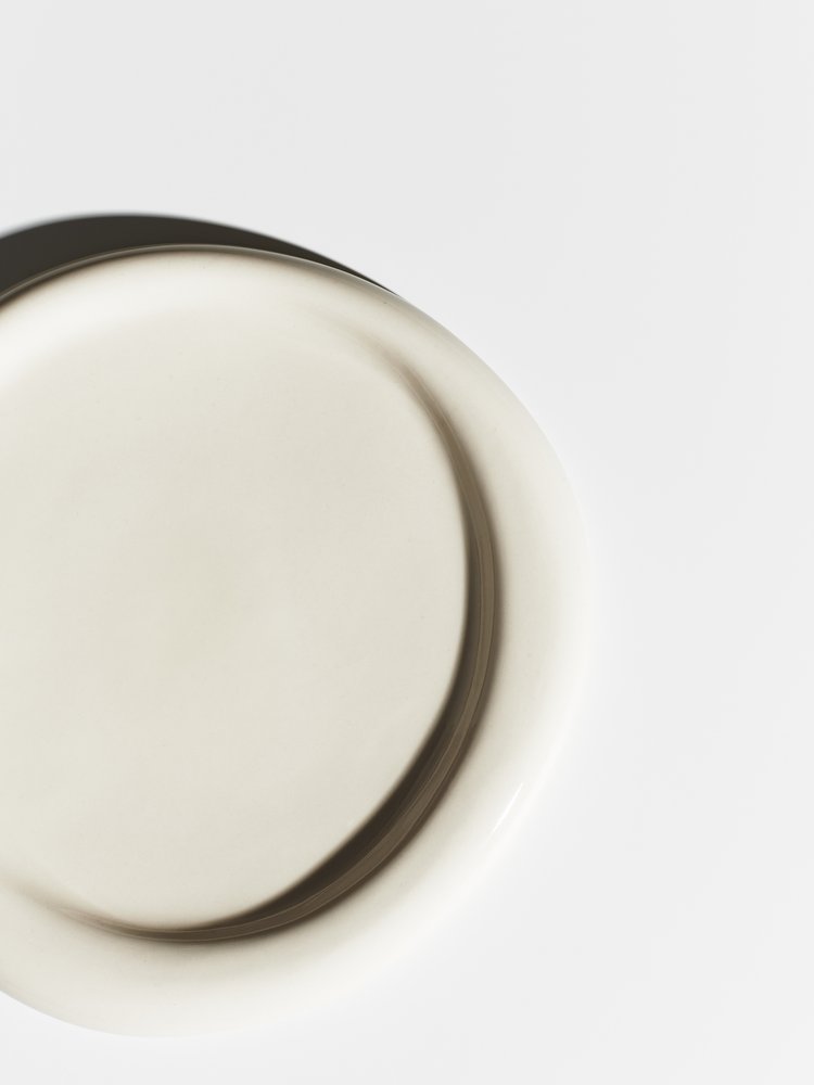
Mag.a.sin is a visually-driven take on retail curation- an online design boutique founded by art buyer and photographer Holly Hay. The small gallery-shop features only a handful of items in each collection, all photographed in a creative, conceptual or beautiful manner. The purpose of the retail offer is to explore the role imagery and presentation play in desire and consumption through limited new edits of objects throughout the year, each featuring a new theme and new photographic approach. The first curated collection ranges from a pair of metal sunglasses by boutique British eyewear brand Blyszak, to a leather pouch with a cloudlike silhouette, by New York-based Porto. Despite the differences in category, cost, and size, all are from independent makers who often have limited outlets for selling their work.
This tight edit of attractive but useful objects allows customers to appraise and appreciate the items more fully and brings to life one of the most important aspects of minimalist retail design: It’s not just an aesthetic, but a lifestyle. Minimalist ideologies discourage unnecessary consumption and instead promote living in a more considered manner. Retail offers that support this ambition with a carefully considered edit allow customers to prioritise important decisions in a distraction-filled world. In the most choice-abundant time in our history, the quality of our decisions is suffering from overload. This retail offer, and others such as the limited menu at Burger & Lobster, can help us simplify, reduce mental fatigue, and ultimately make better decisions.
(Image courtesy of George Harvey)
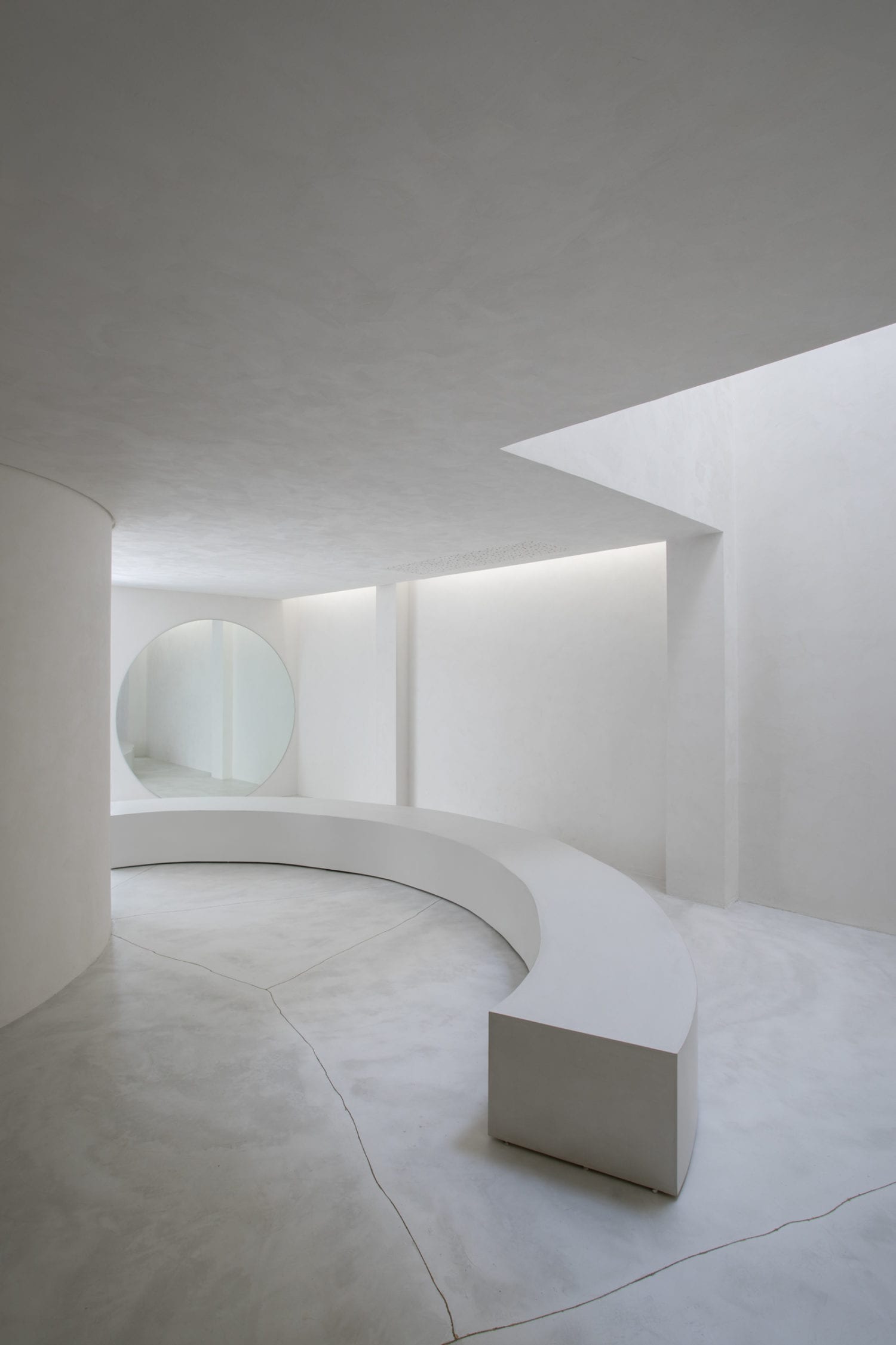
The white cement and limestone interiors of São Paulo’s Selo evoke an art gallery rather than a shoe store but look closer and it is not as stark as you might think. Thoughtful use of materiality and considered details throughout show reverence for the hand of the maker and the value of craft.
As a handmade shoe company Selo required a space that bought to life this facet of their brand and made clear the product roots as well as the care and attention that each article receives during production. The concept retains the building’s existing concrete floor, but it has been repaired using the Japanese technique of kintsugi, which traditionally involves mending cracks with lacquer mixed with gold powder. As a result, dark grey veins run across the shop’s floor- highlighting the process of mending rather than replacing.
In addition to the textural touches to delight, the scheme borrows from the work of James Turrell, installing a circular window in the space that allows shoppers to peep out at the sky above for a moment of whimsical diversion in a space that initially appears stark and staid.
We love this concept design as we feel that customers are now more interested than ever in materiality and are craving a sense of human touch. The care and energy required to craft artefacts is a driver to purchase and we want to know the makers, their inspiration, and their process. Even minimal environments can reveal the personality of the craftsman in careful presentation of tactile detail and honest personality-filled moments. A circular peep-hole skylight, a rough-hewn handrail, the brush strokes in whitewashed walls can all reveal the hand of the maker and form a more human connection.
(Image courtesy of MNMA Studio and Andre Klotz)
In July, we will be delving into the world of minimalism including its drivers, how minimalism is translated into the graphics and retail space and concluding by exploring minimalism’s wider impact.
Part One – Minimalism: What’s Driving the Trend?
Part Two – Minimalism in Retail (You are here)
Part Three – Minimalism in Graphic Design
Part Four – Minimalism: The Wider Impact
We understand how important it is for brands to differentiate themselves from their competitors. If you are a brand or retailer with a vision to execute a best-in-class store or retail activation that responds to the future of retail and creates hype within your industry and the wider retail sector, we can help you bring that vision to life…