Part Three of Five
Maximalism, NOW
In Part Three of this series, we share our favourite maximalist retail designs and experiences and why…
In Part Three of this series, we share our favourite maximalist retail designs and experiences and why…
From the conception of the creative movement, maximalism has returned time and again, evolved, changed and been re-invented to remain a disruptive and contemporary.
We want to take you on a journey around some of our favourite maximalist retail experiences and interior aesthetics. From traditional maximalism, with its opulent details and timeless allure, to the mesmerizing world of retro-chic maximalism, where vibrant colours and bold patterns reign supreme. But we don’t stop there – we invite you to immerse yourself in the captivating allure of modern interpretations, where minimalism meets maximalism, and boundaries are pushed to create awe-inspiring environments. Let us guide you through these realms of design innovation, where every step is a celebration of abundance, creativity, and the power to redefine retail experiences.
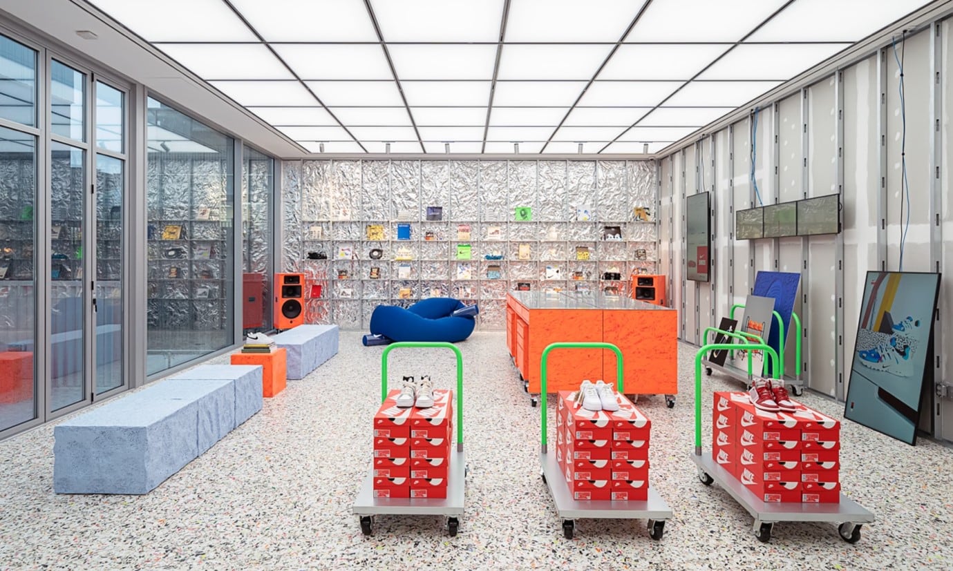
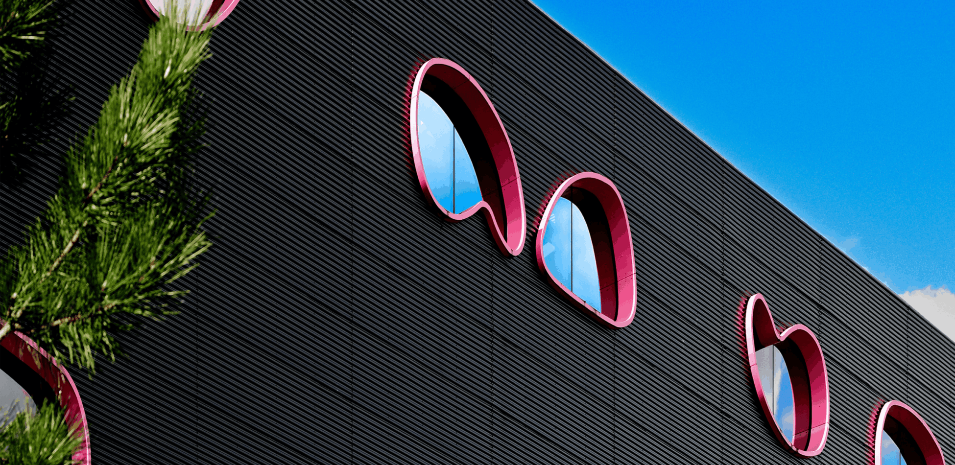
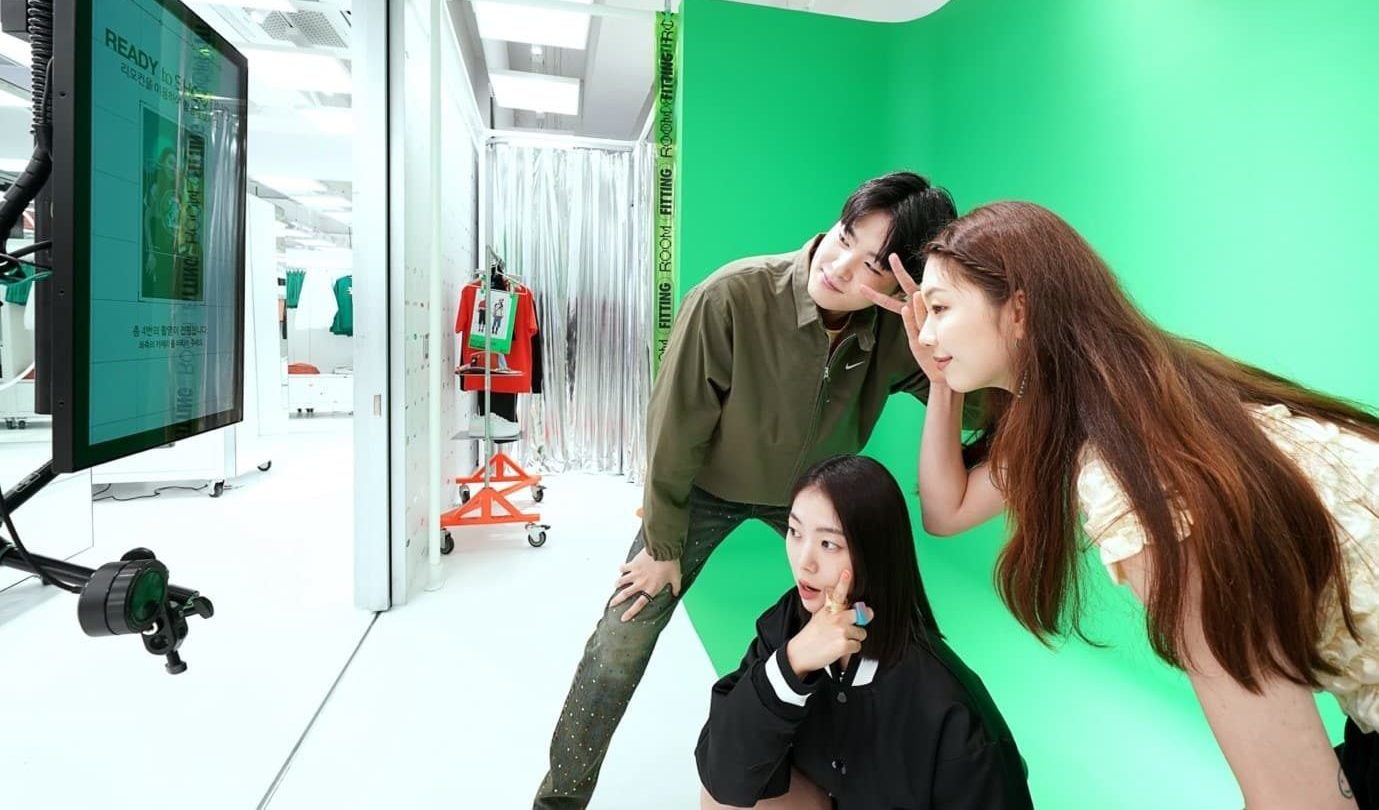
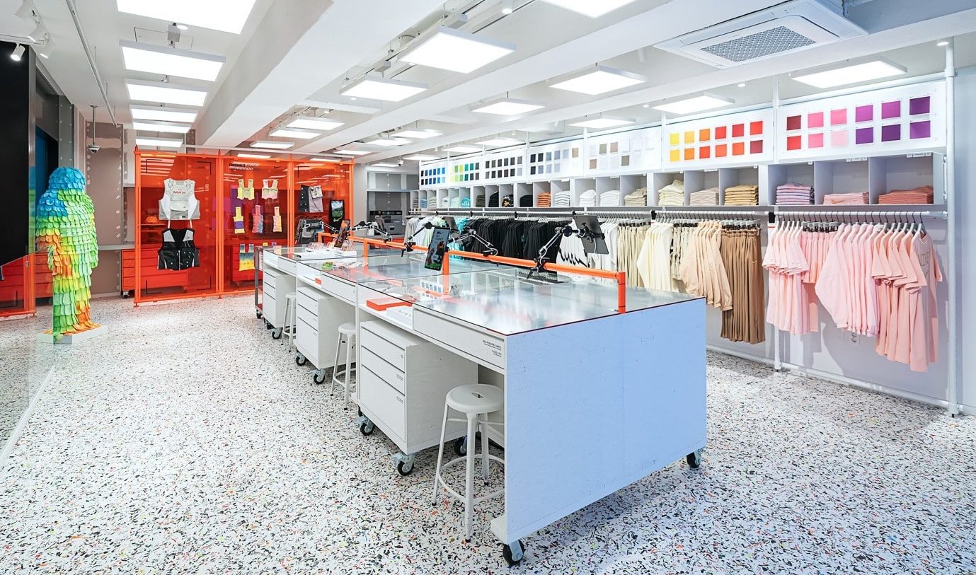
One exceptional example of contemporary maximalist design that captures our admiration is the NikeStyle store. This retail space effortlessly combines elements from various design eras, resulting in a captivating fusion of past and future aesthetics. What sets this store apart is its fearless exploration of new and improvised materials, which not only elevate the visual appeal but also push the boundaries of what is possible in retail design. The store’s ingenious use of physical and digital experiences adds another layer of immersive engagement, creating a harmonious blend of the tangible and the virtual. Moreover, the NikeStyle store dares to embrace a vibrant and audacious colour palette, breathing life into the space and evoking a sense of energy and enthusiasm. This deliberate integration of colour amplifies the overall maximalist experience, transforming the store into a neo-maximalist haven where boldness and innovation thrive.
We love this experience as it invites you into this extraordinary space where design meets visibly sustainable materiality and immerses you in a retro-futuristic atmosphere that is as captivating as it is inspiring. Beyond the visual landscape the space if enriched by moments for customisation and creativity, be it in a physical studio moment or an engaging green screen space for user generated content to be created and shared onwards.
(Images courtesy of Nike)
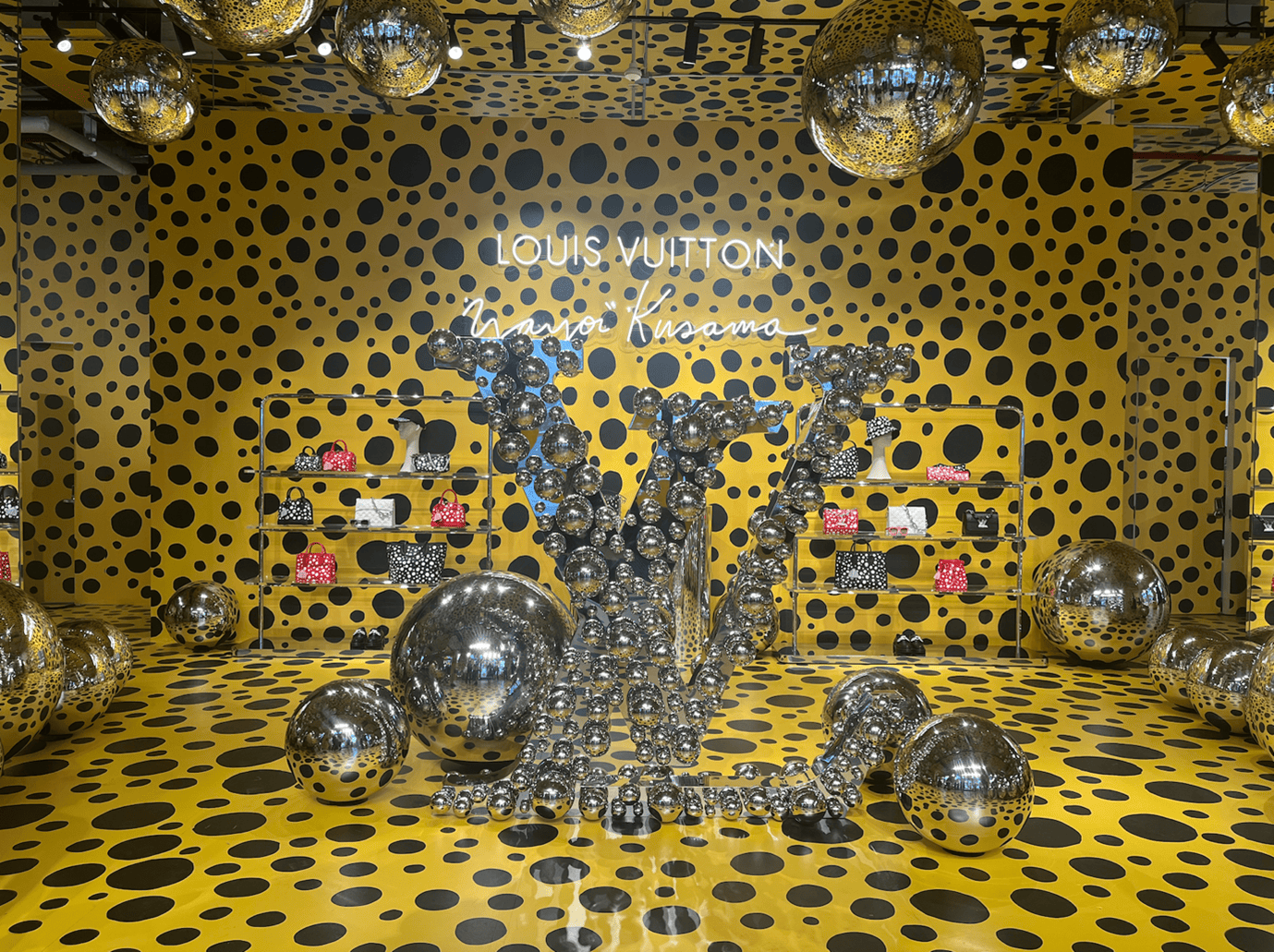
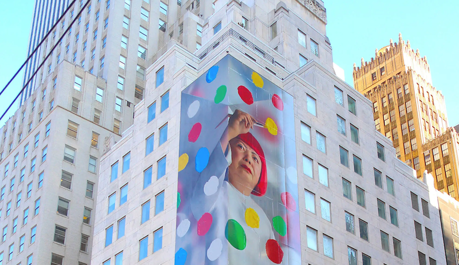
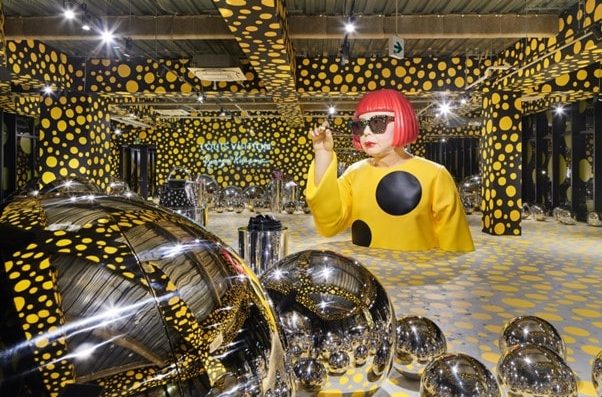
The LV x Yayoi Kusama global pop-ups are a jubilant celebration of two identities converging, where Kusama San’s unencumbered artwork floods the space, transporting viewers to otherworldly realms. These retail experiences transcend the conventional, evolving into immersive art exhibitions that disrupt traditional boundaries. Yayoi Kusama’s full bleed patterns take over the environment, creating visual disruption and immersing shoppers in a captivating sensory journey. The fusion of art and commerce invites active participation, as visitors become part of a transformative dialogue. Step into this enchanting realm, where the convergence of art, retail, and self-expression intertwines to create an unforgettable experience.
We love this retail experience because the brand takes a step back to celebrate the art of Yayoi Kusama. LV act as a platform for the local community to get closer to art, making it accessible for fans of the brand and artist to come together, in an intrinsically shareable space that commands attention.
(Images courtesy of Louis Vuitton)
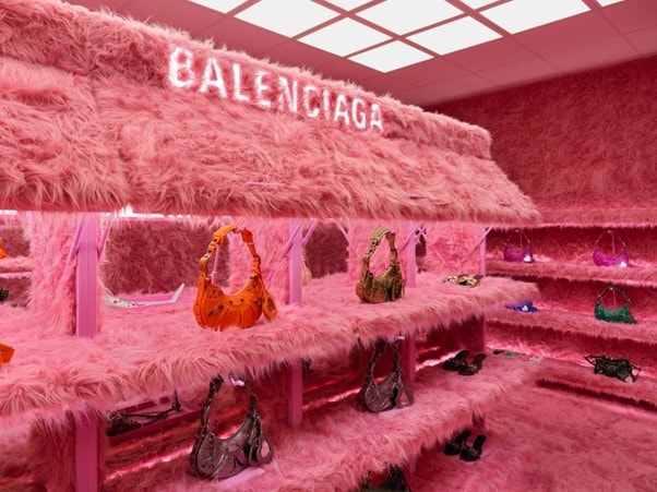
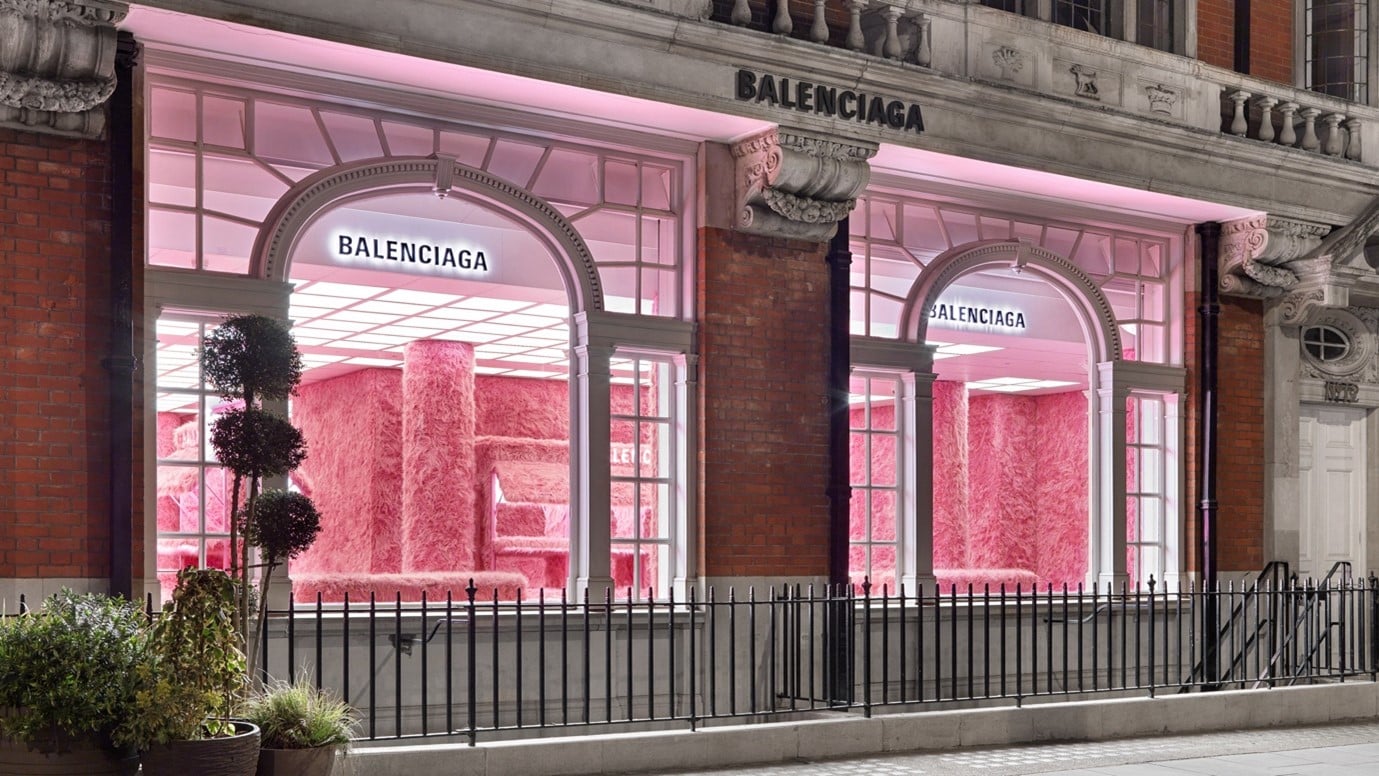
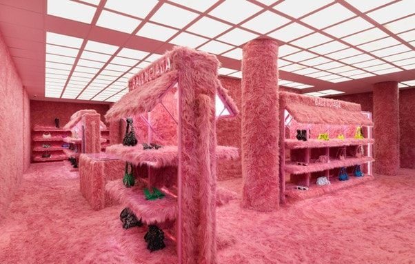
Balenciaga’s Mount Street store, is a true embodiment of modern maximalism. This space immerses you in a pink overload, where every corner pulsates with a vibrant hue that ignites your senses. The tactility of the pink fur enveloping the environment adds a luxurious dimension, inviting you to indulge in its plush embrace. What sets this design apart is the bold commitment to a single colour and texture, creating a cohesive visual narrative that leaves a lasting impression. Abundance reigns supreme as the space becomes a testament to opulence, lavishly embellished with a singular design aesthetic that exudes the brands identity, wit and boundary pushing style.
One of the things we absolutely love about this store, is the fact there is no need for an obligatory ‘selfie’ moment, no need for costly digital disruption methods. The whole store is a pure expression of the brand and every nook and cranny of the space is worth documenting on social platforms. Store designs like this one, restore faith in bricks and mortar retail as destinations to experience first-hand.
(Images courtesy of Balenciaga)
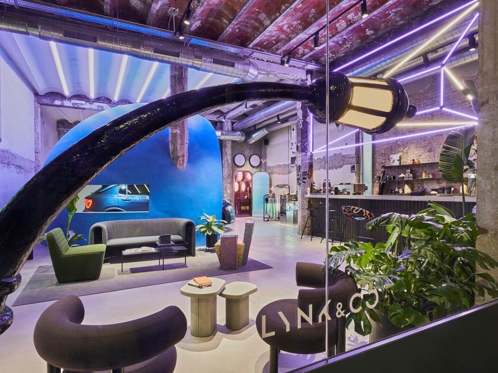
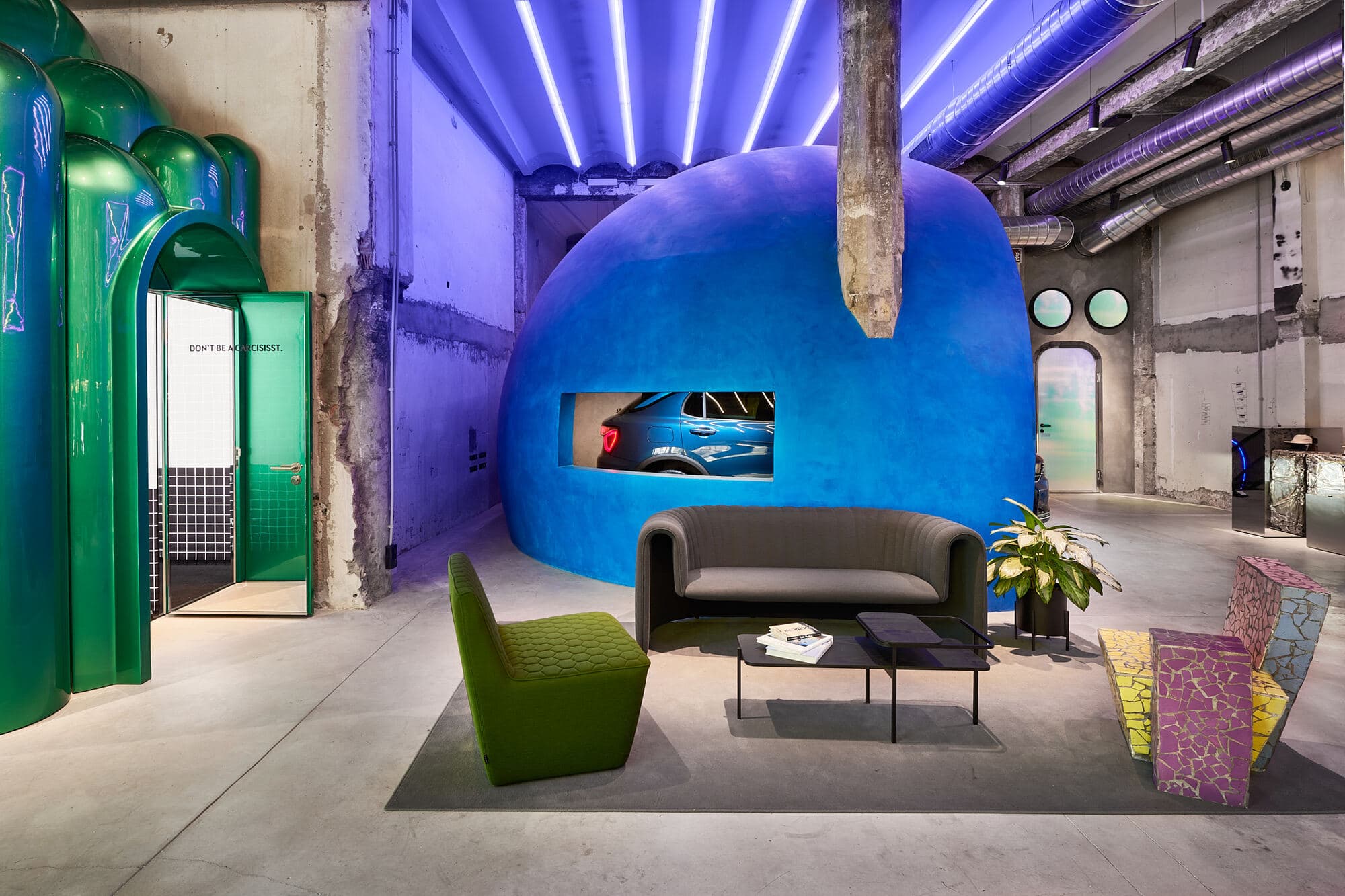
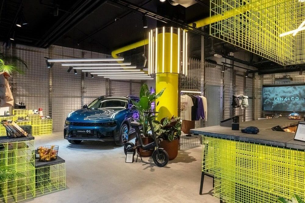
The Lynk & Co. club space juxtaposes a mix of bold elements that are inherently graphic in nature. What should feel disparate, feels connected and witty, with the unexpected around every turn. Nurturing a sense of discovery through characterful zones, each space is enlivened beyond its core function. From ‘underwater’ themed private meeting spaces to architectural blue domes, the space is punctuated with statement interior choices, yet without ever feeling cluttered or overwhelming.
With the brand challenging the conventions of the automotive industry, bringing innovation to drivers through new ways to get behind the wheel, it makes total sense that their showroom should reflect this. The store completely turns the negative stereotype of a car showroom on its head, presenting more as a trendy club space with a car in it rather than a glossy, sales-focused dealership. It looks and functions like the sort of space the brand’s target demographic wants to inhabit. It encourages the shopper to dwell longer, relaxing them and putting them in the right frame of mind to properly consider the benefits and make a big decision such as buying/subscribing to a car. It is this clever link to the brand’s challenger status and innovative offer that makes this one of our favourite retail spaces.
(Images courtesy of Lynk & Co.)
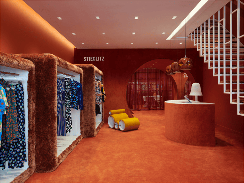
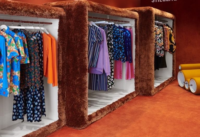
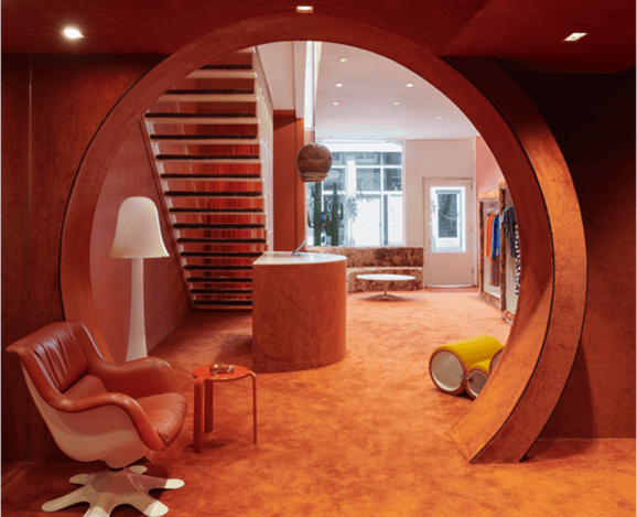
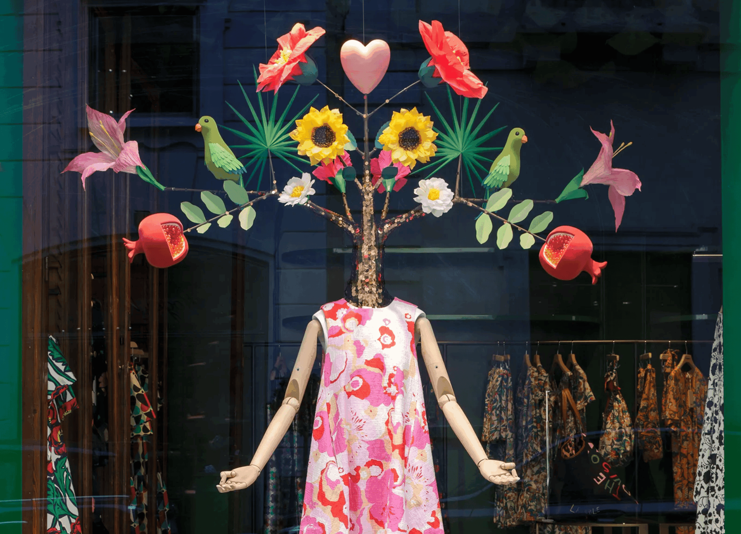
Boutique women’s fashion brand ‘Stieglitz’, transformed their Amsterdam store into a hyper-stylised vision of the 1970’s. The rich tonal use of colour and texture envelops the space, creating a combination of comforting nostalgia and contemporary bold forms. The interior challenges the shopper, drawing attention with stark white moments that frame the garments, the brand and interaction points. The space is maximalist through its commitment to colour and texture, with almost ‘shag-pile’ carpeted fixtures and plush flooring spilling up onto the counters and walls.
The deep terracotta tones richly adorn the space and provide a bold yet singular canvas for the garments to stand out from. Round forms punctuate the space, playing with scale, from statement furniture pieces and lighting accessories to an inviting architectural portal. The space feels like an instance out of time, with an undeniably retro flair, yet somehow modern in its application.
Some of the key factors that make this store design so successful in our opinion is its sense of bravery, it’s commitment and clarity of vision. The brand has navigated the path between form and function, coming out on top in terms of delivering a space that both tells the shopper who the brand is, taking an ownable and memorable stance in the marketplace.
(Images courtesy of Stieglitz)
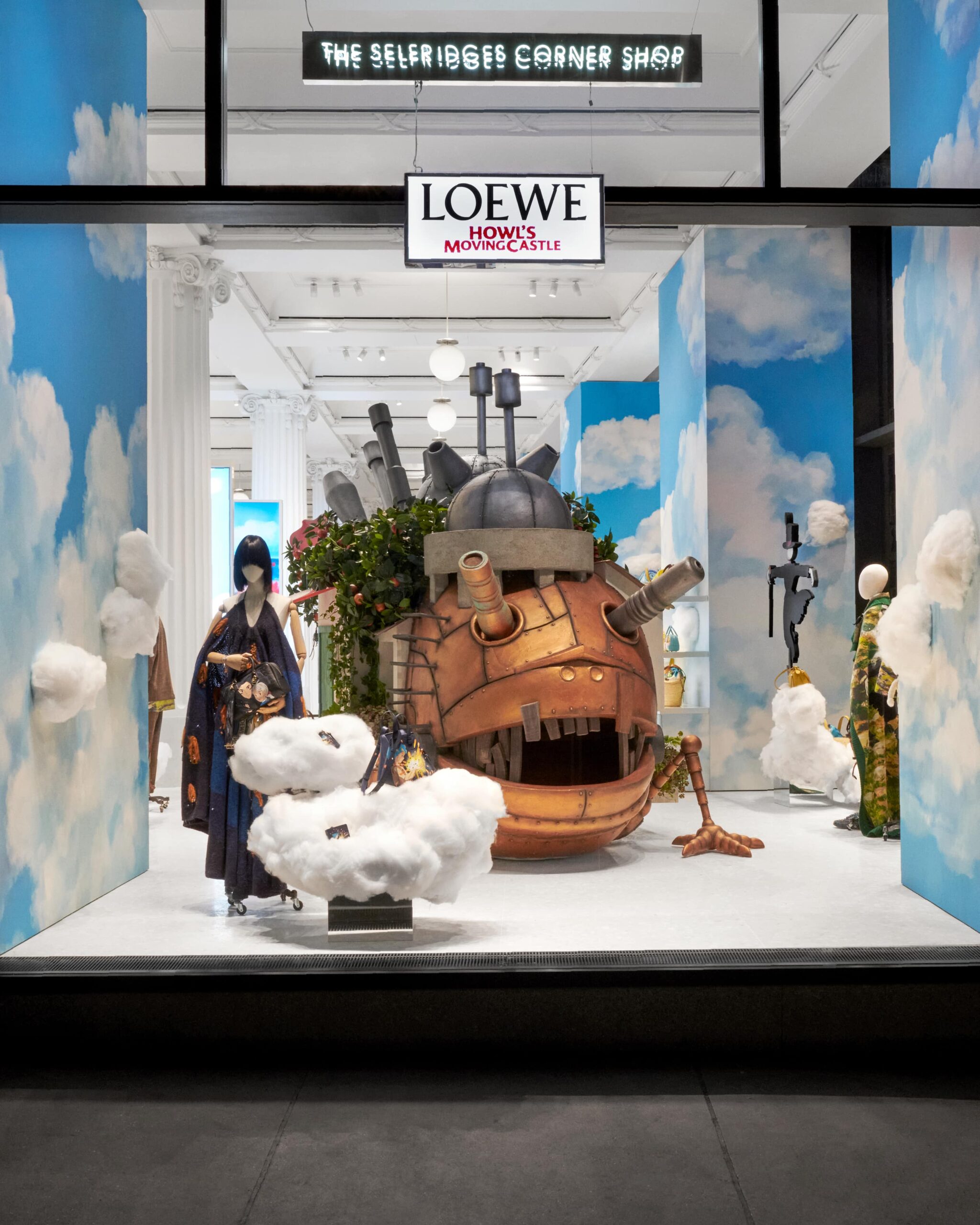
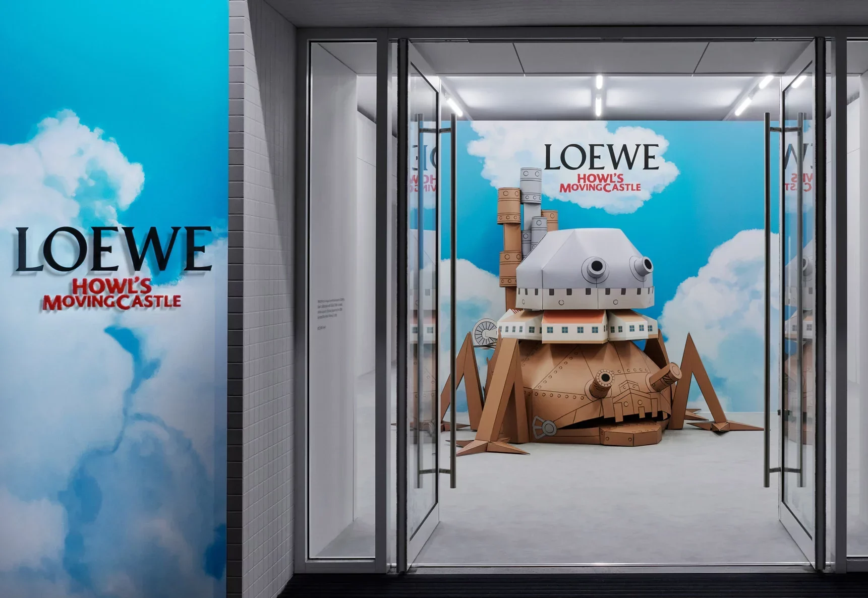
The collaboration between Loewe and the anime feature movie by Studio Ghibli is a whimsical coming together of minds to celebrate the film’s much loved narrative. The physical manifestation of the collab is a series of pop-up experiences. The brand took over the Selfridges corner shop to great effect and saw a fanatical following of shoppers attend to grab a piece from the limited edition collection. The space itself though heavily thematic, is a masterclass in ‘more is more’, with moment after moment referencing the iconic movie. The attention to detail from the rails down to the legs of the VM tables, exude story and tell a rich narrative, bringing to life the aesthetic and experience.
We are enamored with this pop-up for its ability to inspire curiosity and prompt us to delve deeper into the motivations behind luxury brand Loewe’s investment in a thematically unconventional experience. By targeting “glocal” and culturally curious millennials, luxury brands aim to captivate this demographic by tapping into their intersecting interests in media and culture. With many millennials growing up on a diet of beloved Japanese anime such as Studio Ghibli, Naruto, Sailor Moon, and Dragon-Ball-Z, luxury brands see an opportunity to attract this community and cultivate new customer relationships as they establish themselves financially. Loewe’s collaboration and dedication to this narrative pay homage to the joy and nostalgia experienced by fans of Studio Ghibli, positioning the brand as more than a heritage luxury label, but as one that resonates with the evolving and emerging consumer landscape.
(Images courtesy of Selfridges)

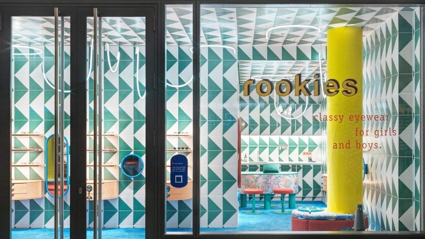
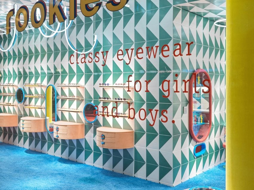
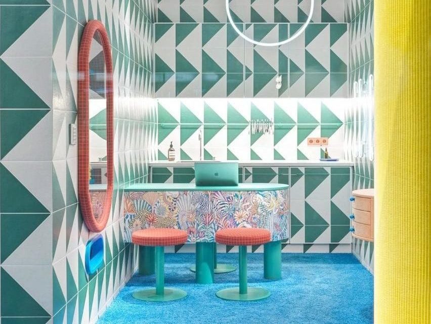
Stephanie Thatenhorst’s retail design for Rookies, a children’s optician in Munich, showcases a captivating maximalist and graphic aesthetic that immerses young visitors in a world of imagination and wonder. With vibrant colours, intriguing textures, and bold patterns, the interior becomes a playful paradise tailored specifically for children. The use of triangular tiles in green and white envelops the walls and ceilings, creating a visually dynamic environment.
Apricot-coloured shelves sparingly showcase glasses, allowing each piece to stand out. A ribbed yellow column with a bench seat adds a striking visual element, while U-shaped neon lights evoke the imagery of monkey swings in a zoo, infusing the space with a sense of adventure. Rounded showcases and mirrors with blue frames not only enhance the aesthetic coherence but also ensure a child-friendly environment without any sharp edges. The eyewear-dispensing machine, framed by red-checkered fabric, becomes a highlight of the space, as children eagerly await their new glasses.
What captures our attention most is the meticulous attention to detail and an immersive design narrative. Rookies transcends the traditional expectations of a children’s optician, transforming it into a magical destination that sparks joy and captivates young hearts, a destination where the target audience want to be.
(Images courtesy of Rookies Eyewear)
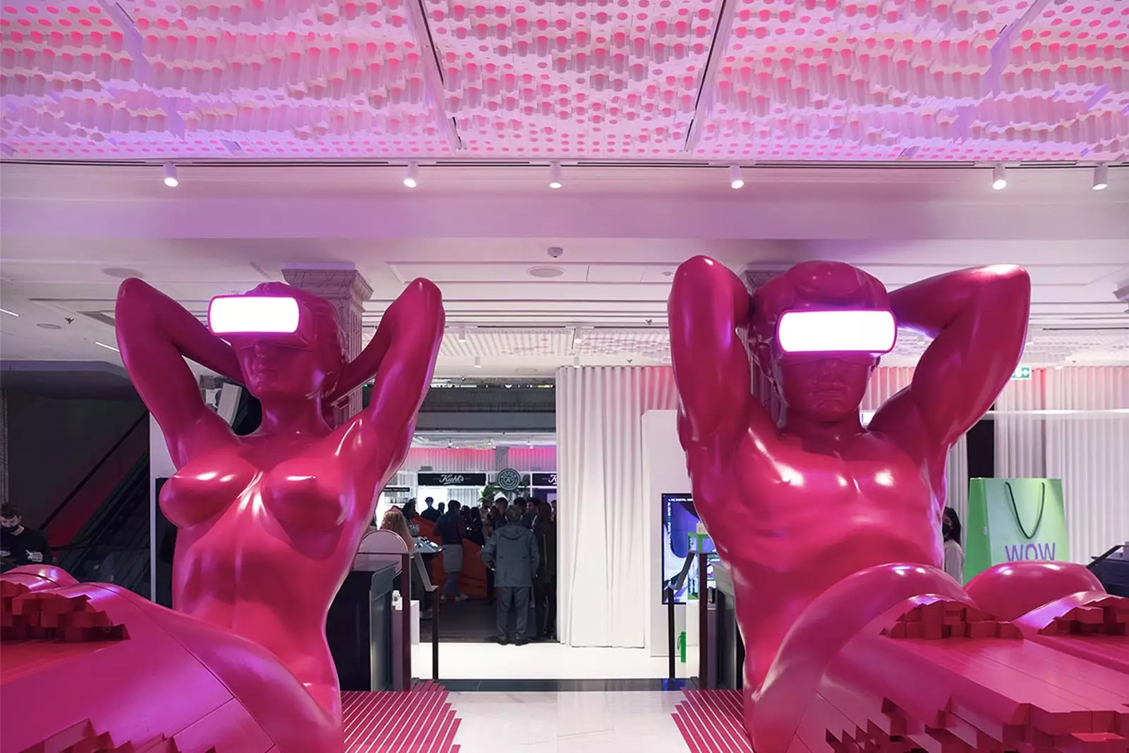
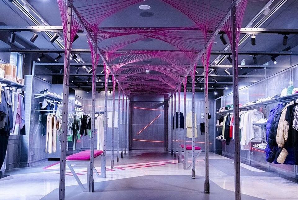
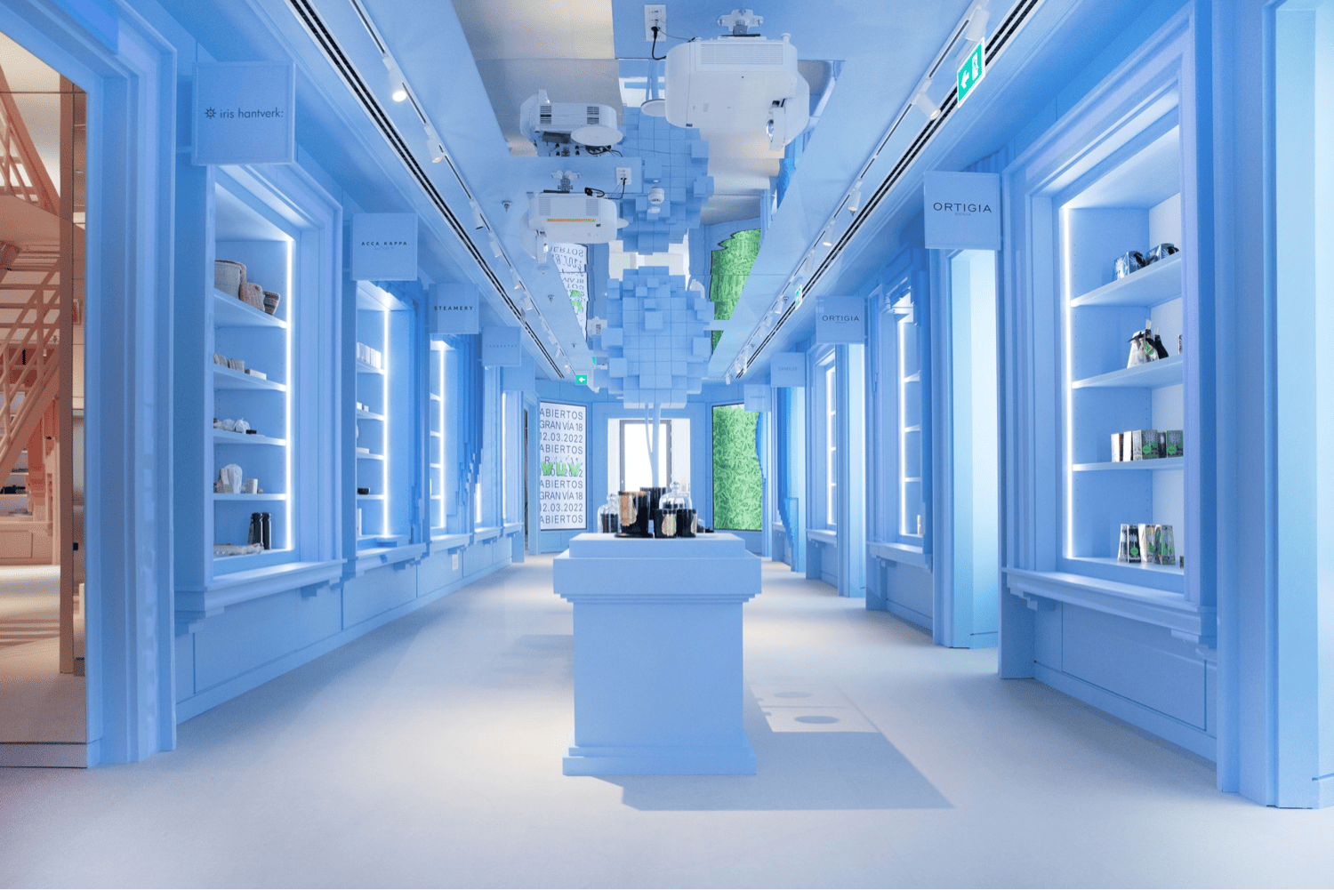
WOW, the retail concept by Dimas Gimeno Álvarez, offers a captivating shopping experience tailored for tech-savvy Millennials and Generation Z. With innovative interior design by External Reference, WOW seamlessly blends brick-and-mortar and digital elements to create visually stunning settings that resonate with its target audience. From a mesmerizing marine coral landscape on the ground floor to dynamic fashion displays on the second floor, WOW embraces technology and continuously transforms its aesthetic. Homeware collections, streetwear, and two restaurants complete the immersive experience. WOW represents a dynamic, evolving retail space that captures the imagination of its visitors.
This department store truly shows off with its eclectic mix of visual styles spanning each floor and its artful installations that anchor each space. With every floor offering something different, both visually and in terms of experience, shoppers are intrigued to dwell longer exploring every moment, as each floor delivers the unexpected. The abundance of striking aesthetics converging in a single retail destination showcases the power of maximalism in its varied forms to attract and retain customers. This amalgamation of captivating design elements demonstrates how maximalism can be harnessed to create an irresistible allure, enticing new customers while ensuring their continuous return.
(Images courtesy of WOW)
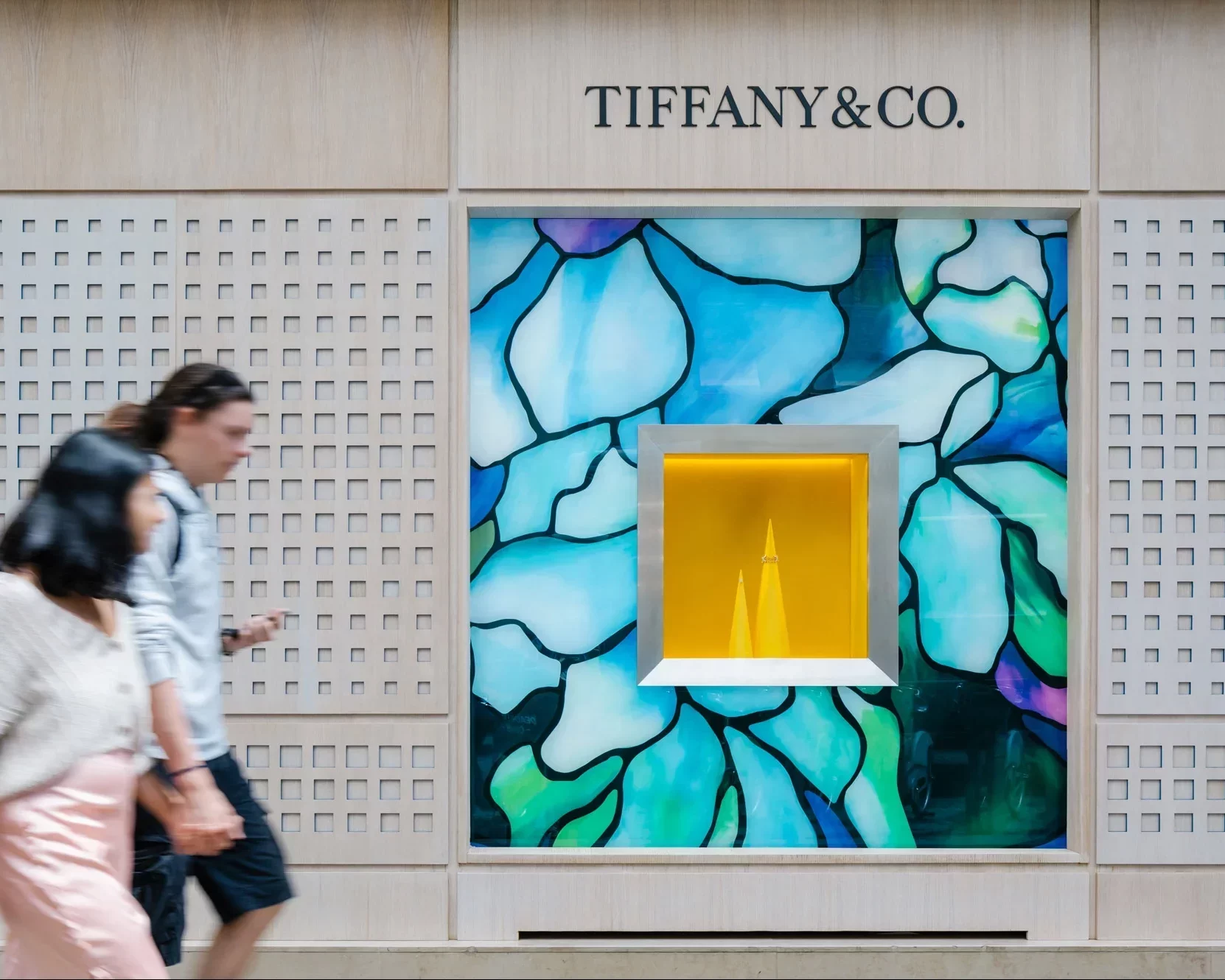
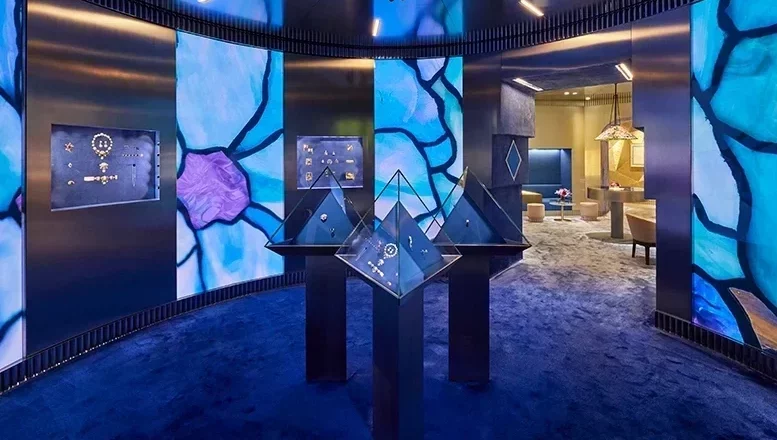
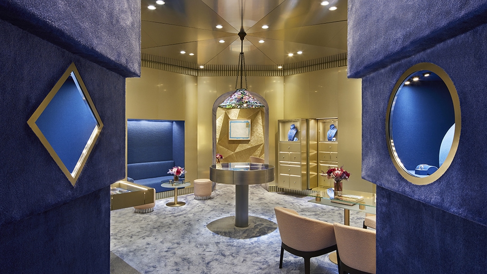
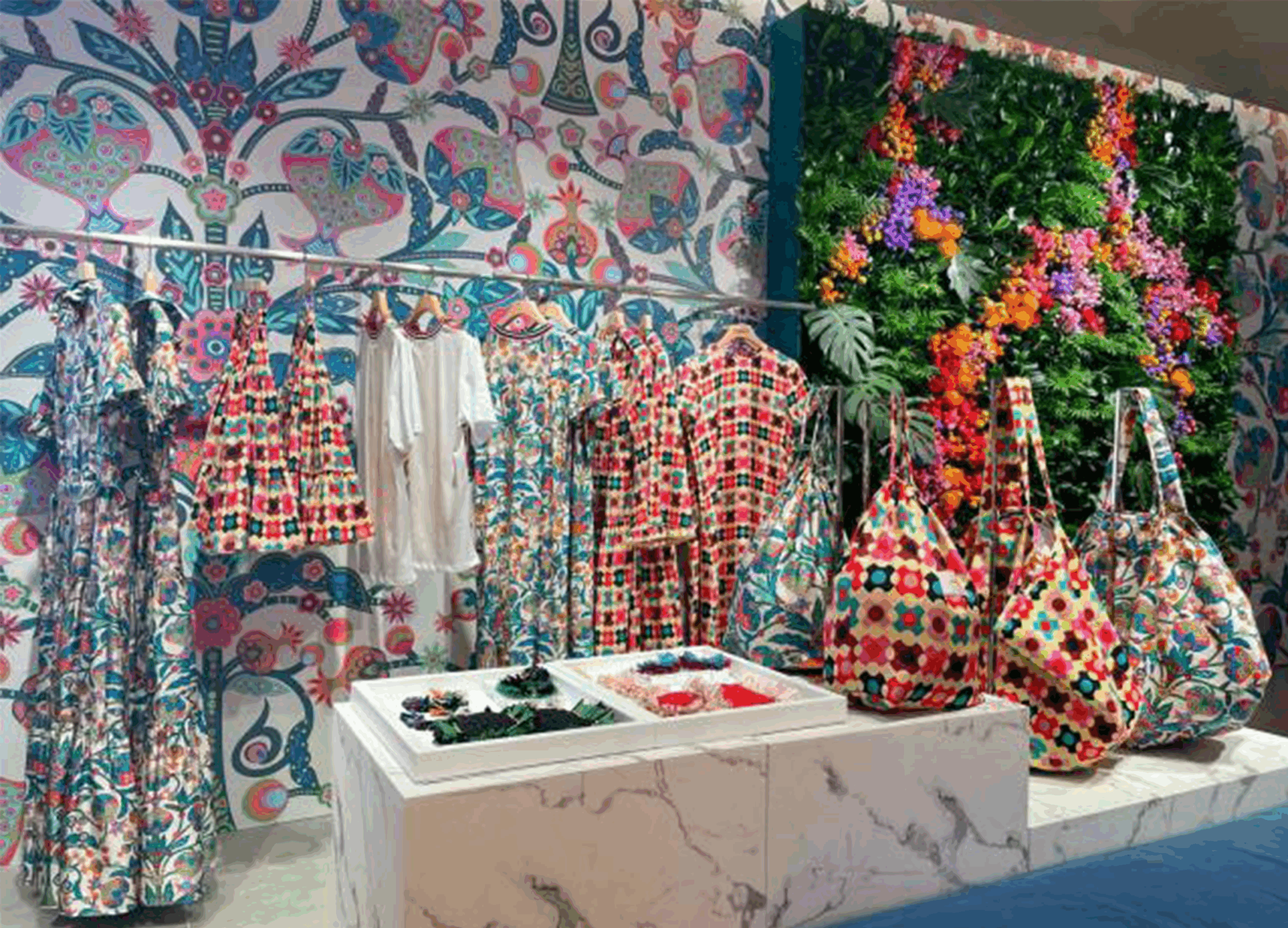
Nestled in the heart of Paris, the pop-up shop for Tiffany & Co is a testament to maximalist design. Seamlessly blending a boutique and an exhibition, it takes visitors on a captivating journey through the jeweller’s illustrious 185-year history. The deep-blue rotunda showcases archival jewellery designs in pyramidal glass cases, while a gold-toned room dazzles with Tiffany’s current collection amidst pale-pink furnishings and a vintage stained-glass pendant light. Transitioning to an intimate space with faceted metallic walls and a powder-blue carpet, high-jewellery appointments are held in a setting that exudes opulence and sophistication. This immersive experience invites customers to indulge in the world of Tiffany & Co, where timeless elegance meets exquisite craftsmanship.
With its rich heritage and commitment to design excellence, Tiffany & Co’s pop-up shop in Paris embodies the essence of maximalism. The carefully curated displays and attention to detail create a visually stunning environment that captures the brand’s legacy and allure. From the captivating rotunda to the opulent gold-toned room, each space offers a distinct aesthetic, celebrating the past and present of Tiffany’s renowned jewellery collection. The luxurious materials, thoughtful lighting, and exquisite furnishings create an ambiance that is both inviting and awe-inspiring. This pop-up shop is a true testament to the power of maximalist design in captivating the imagination and evoking a sense of wonder and elegance.
(Images courtesy of Tiffany & Co.)
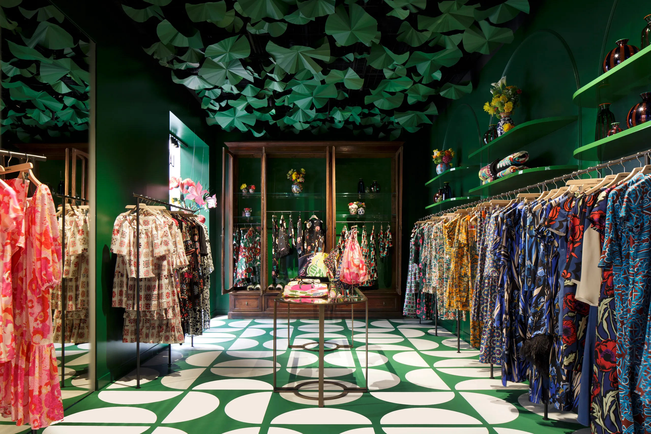
Nestled in Milan’s prestigious luxury district, J.J. Martin’s flagship store for La DoubleJ is a delightful haven that exudes cheerfulness. The ground-floor space welcomes visitors with a whimsical display of green paper lily pads suspended from the ceiling, mirroring the playful pattern of 1960s-inspired circles adorning the tiled floor. Martin’s vibrant and print-clashing clothing line beckons from the racks, urging customers to embrace the joyful spirit of self-expression.
In an adjacent room, the ambiance shifts to one of conviviality and creativity. Porcelain pieces, tablecloths, and cushions adorn the space, inviting customers to envision hosting their own dinner parties. The riotously attired table sets the stage for lively conversations filled with mischievous jokes and clever banter. The entire experience at La DoubleJ’s flagship store captures the essence of Martin’s design philosophy—embracing the power of colour, pattern, and whimsy to bring joy and playfulness into everyday life.
One of the main reasons we love this store is its boldness, its unapologetic attitude that isn’t afraid to offend. By taking a visual stand the store becomes more than just a shop, it becomes a destination, empowering authenticity. By marching to the beat of its own drum the store disrupts the luxury shopping streets of Milan and avoids falling into mundanity.
(Images courtesy of Vogue)
In June, we touch on into maximalism’s roots, explore what design choices define maximalism, analyse maximalism in graphic and retail design and finally, outline the current drivers that are influencing this movement in 2023.
Part One – Maximalism: What’s The Trend?
Part Two – Maximalism: The Toolkit
Part Three – Maximalism in Retail (You are here)
Part Four – Maximalism in Graphic Design (coming soon)
Part Five – Maximalism: Drivers for change (coming soon)
We are a retail design agency that understands the importance of responding to the future of retail and keeping up-to-date with the latest physical and digital trends to create best-in-class brand experiences and customer journeys.