D4R give Kuwait Bookstore updated brand identity
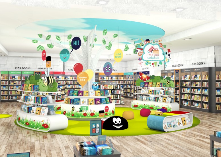
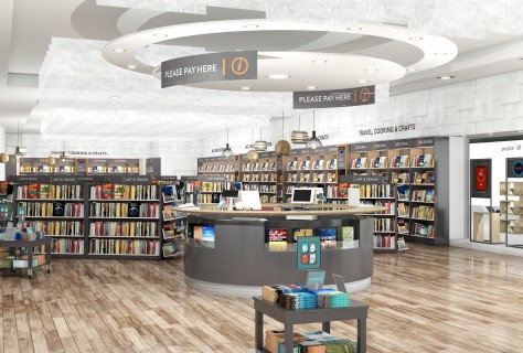
Following a successful pitch we were given the opportunity to work alongside That Al Salasil a leading bookstore in the Middle East. We were asked to redesign the whole store identity from in store communications to store fixtures and a brand new children’s area.
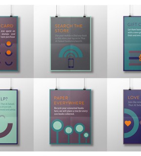
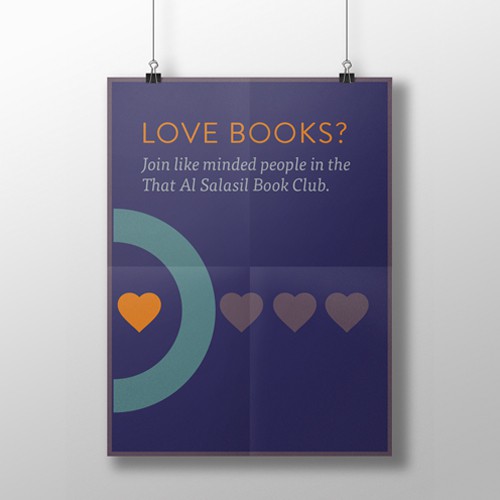
Working with the existing blue and orange logo which is so recognised In the Middle East, we added a secondary colour pallet which would complement this and form the basis or all in store graphic communication.
We wanted the graphics to be warm and friendly and help highlight services and events taking place in store.
We have provided a simple and easy way to navigate and given an overall professional feel to the store which feels authoritative whilst maintaining a friendly tone.
The children’s has area has been designed through the eyes of a child and is playful and theatrical and acts as a destination in store. We have again used the existing logo for Children’s and added fun icons and welcoming messages as well as ‘the tree of knowledge’ which takes centre stage!
Due to Launch in January 2016 we are all excited to have helped such a lovely brand with their in store identity. Watch this space!