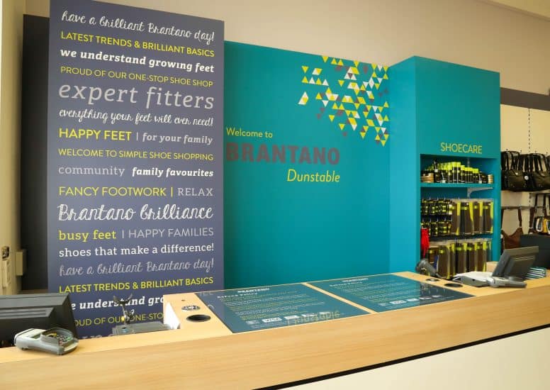
Brantano Dunstable
We won an initial pitch last year to help Brantano evolve their store identity to appeal to all, new and existing customers.
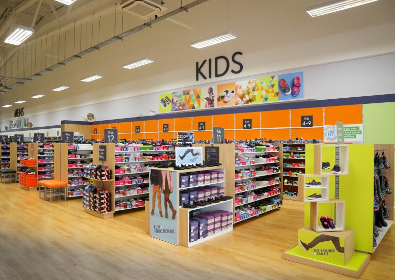
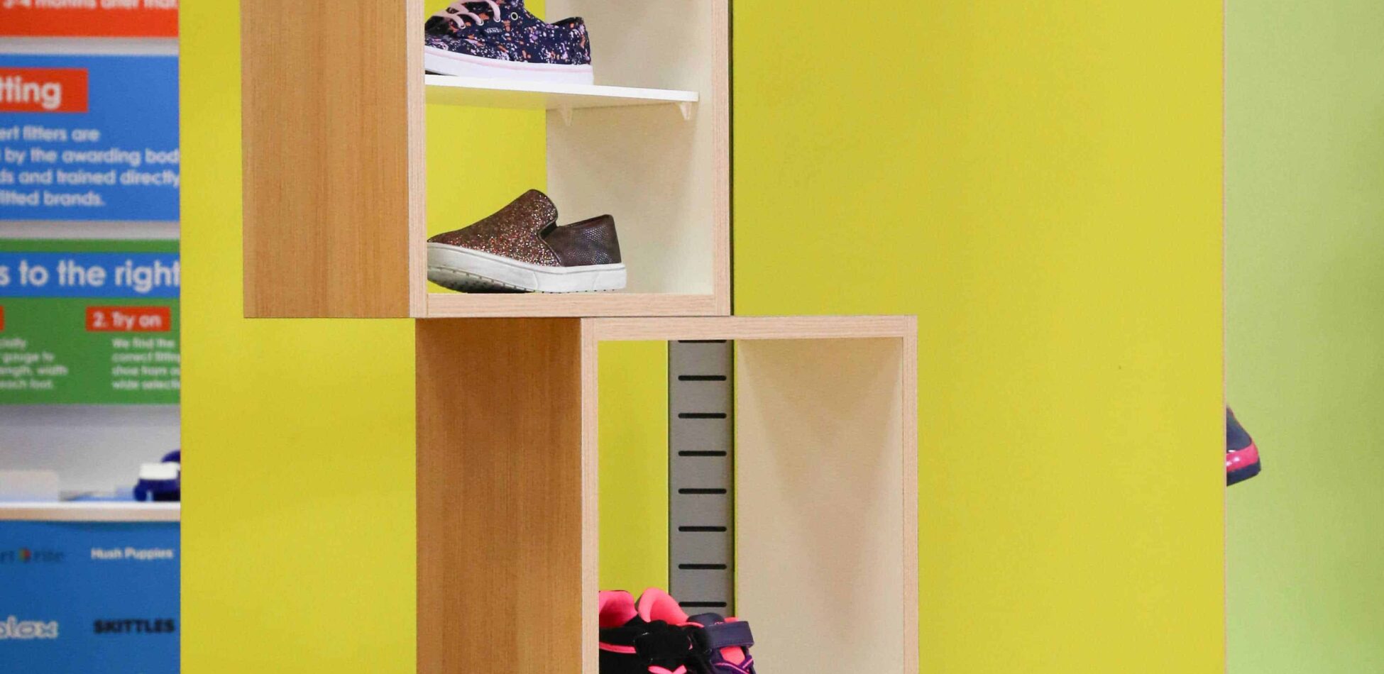
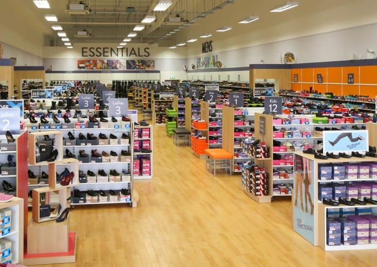
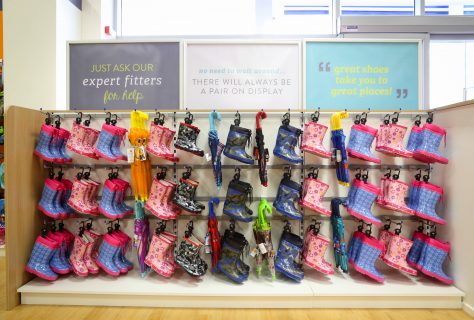
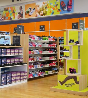
We concentrated on the navigation hierarchy and added in high level navigation to help navigate to the 4 in store categories, Men’s, Women’s, Kids and Essentials. We added a soft ‘on trend’ grey paint at high level and a darker grey to break up the high level and merchandising. We worked on colour coding in store by adding a subtle brand pattern and relevant photography which feels inclusive and friendly. We added other features such as wardrobes which help break out the long bays which appear in the big box format stores synonymous with the Brantano brand.
The cash desk was completely overhauled with brand messaging and eye catching turquoise which is part of the new brand colour palette. Shoe care has been included into the area to aid after sales and keep the product together.
Although we haven’t changed the fascia’s at this stage the windows have been given a makeover with promotional stands to highlight product and simple window vinyl’s to call out brand messages.
A new softer floor has been added which makes the store feel light and airy. Overall the store has evolved and is now easier to shop with more focus on customer navigation and messaging. We are now looking at roll out which will happen over the next year.