D4R help Air Ambulance with Retail Identity _
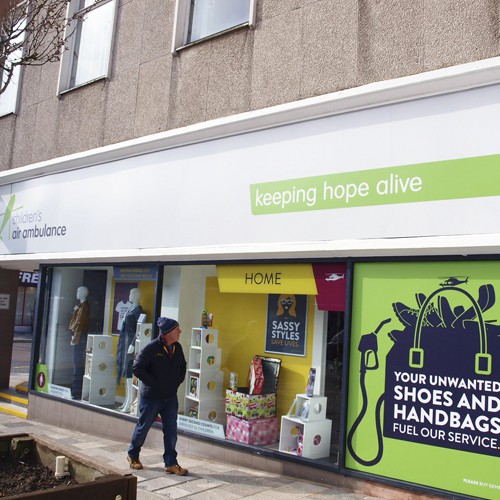
We have recently help launch a new retail identity for The Air Ambulance. Working with the existing logos for ‘your local air ambulance’ and ‘Children’s Air Ambulance’ we were tasked with combining retail and brand messaging to help drive footfall in store, drive sales and encourage donations.
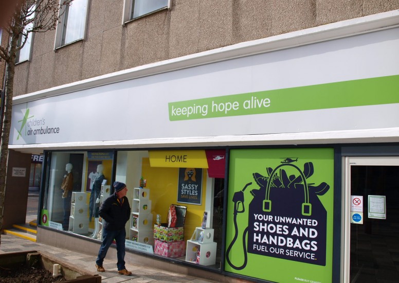
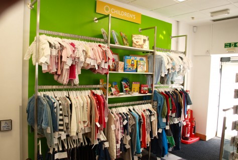
We introduced a bold colour palette and introduced icons consistent with the website. The stores were split into sub brands, home, every day and boutique with each one carrying slightly different POS and messaging. We introduced a strong tone of voice throughout the POS which appears on window posters and in store. This helps deliver a strong brand identity. We interspersed this will fun retail and donation messaging.
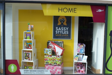
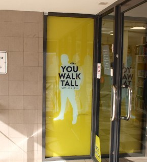
Inside the store we made the till are the destination and used colour blocking to make shopping more customer friendly. Changing rooms were given a special treatment and looked like a locker room with ‘uniform’ hanging up. To complete the look we designed new tags and bags.
The first store to receive the full makeover was Hemel store and there are plans to roll out to more stores this year!
It’s been a great experience working with such a worthwhile cause and learning about all the missions the Air Ambulance undertake purely through donations
To learn more visit https://www.theairambulanceservice.org.uk/